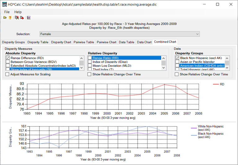
The Combined Chart tab gives a graphical depiction of the data combined with Absolute Disparity Measures and/or Relative Disparity Measures. Use the check boxes to indicate which measures and groups should be included. For either choice, the Relative Change Over Time can be displayed. Disparity measures can be adjusted for scaling with the corresponding checkbox.

