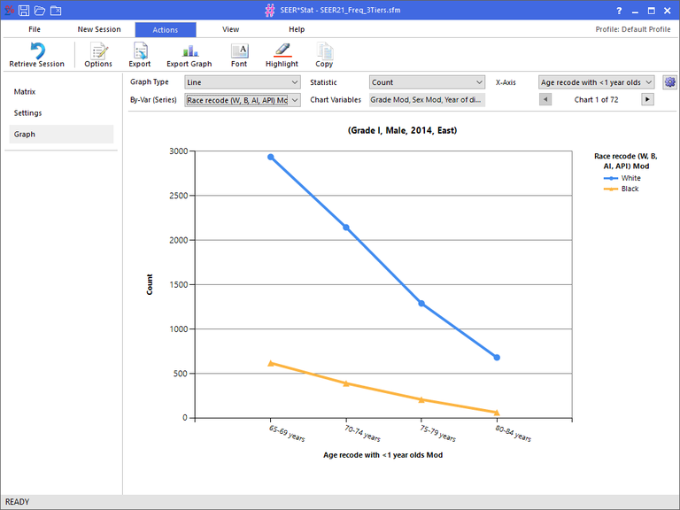
The Graph tab allows you to construct a graph for the data displayed in the Result Matrix.
Controls available in this window:
- Graph Type combo box - Allows you to select either a Column or Line graph.
- Statistic combo box - Allows you to select the statistic you want displayed along the Y-Axis.
- X-Axis combo box - Allows you select the variable to display along the X-Axis.
- Graph Values button (cog) - This command displays the Graph Values section. The Graph Values section allow you to select specific values to display in the graph. This button is a toggle, so click it to both see the Graph Values section, and to hide it. See below for more information.
- By-Var (Series) combo box - This selection allows you to pick a variable to be used for the different series. Each series is displayed in a different color and with a different Point Marker on the graph. This option may be blank if your matrix does not contain enough variables.
- Chart Variables display box - This box displays any additional variables that exist in your matrix. Each unique combination of values from these variables will generate a separate chart (graph). The name of the chart indicates which values are used in the chart variables.
- Chart selection arrows - This section displays how many charts are available for viewing. This section will be disabled if there is only a single chart. Otherwise, it will allow you to scroll through the different charts.
- Graph - The graph is created using the selection you choose above and using the actual data from your matrix. The graph itself is read-only and cannot be directly manipulated. You can resize your window to make the graph larger.
Controls available in the Graph Values section:
- Show Point Markers check box - This option indicates whether you want to see Point Markers displayed at each data point on the graph. Each series gets it's own symbol for display.
- Auto-Scale check box - This option will scale the graph based on the actual values used. For example if you are graphing percentages, then the scale is normally from 0% to 100%. If you turn on Auto-Scale, then the scale of Y-Axis will be based on the actual minimum and maximum in the data.
- Values To Display tree - This tree allows you to select the actual values displayed in the graph. Each variable is display with a listing of all of it's values underneath it. For example, you might want to turn off a data point that represents "Total", because a total value will be very large and bury the smaller values in the graph. When you turn values on or off, the graph is immediately re-created.

