

Population cohorts ages 18-27 and ages 75 and over are both revised downward approximately 3%. Other age cohorts are revised upward approximately 0.6% in Vintage 2023 compared to Vintage 2022. The revisions in county and census tract populations may be greater in some instances.
Vintage 2023 Populations
Each year, SEER uses updated populations to calculate its cancer statistics. Two types of population estimates are produced annually:
- Intercensal estimates that incorporate both the recent decennial Census and the previous one.
- Postcensal estimates that project forward from the recent decennial Census to the current data year and therefore start with that Census year. These are updated every year and referred to as Vintage populations.
Both types of populations estimates are typically produced by the Census Bureau. However, since the completion of Census 2020, Census Bureau has delayed the release of 2010-2019 intercensal population. To ensure continuity in population estimates, consequently in cancer statistics, the National Cancer Institute has contracted Woods and Poole Economics, Inc. to produce the necessary 2010-2019 intercensal populations benchmarked to each post-2020 census vintage populations, starting with Vintage 2022. The methodology used follows previously published Census methodologies, which are described in the Methodology for the intercensal population and housing unit estimates.
Specifically this year, SEER statistics use W&P intercensal population estimates benchmarked to Vintage 2023 for the years 2010 to 2019 and Vintage 2023 estimates for 2020 forward.
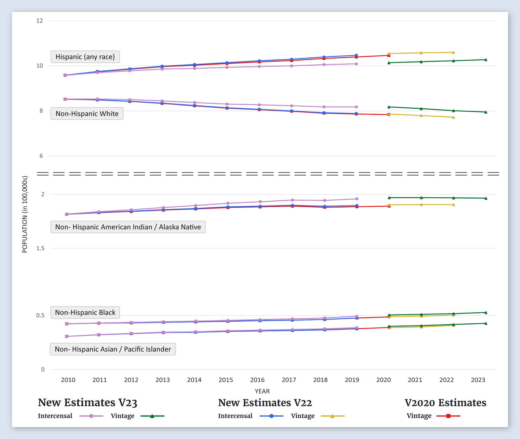
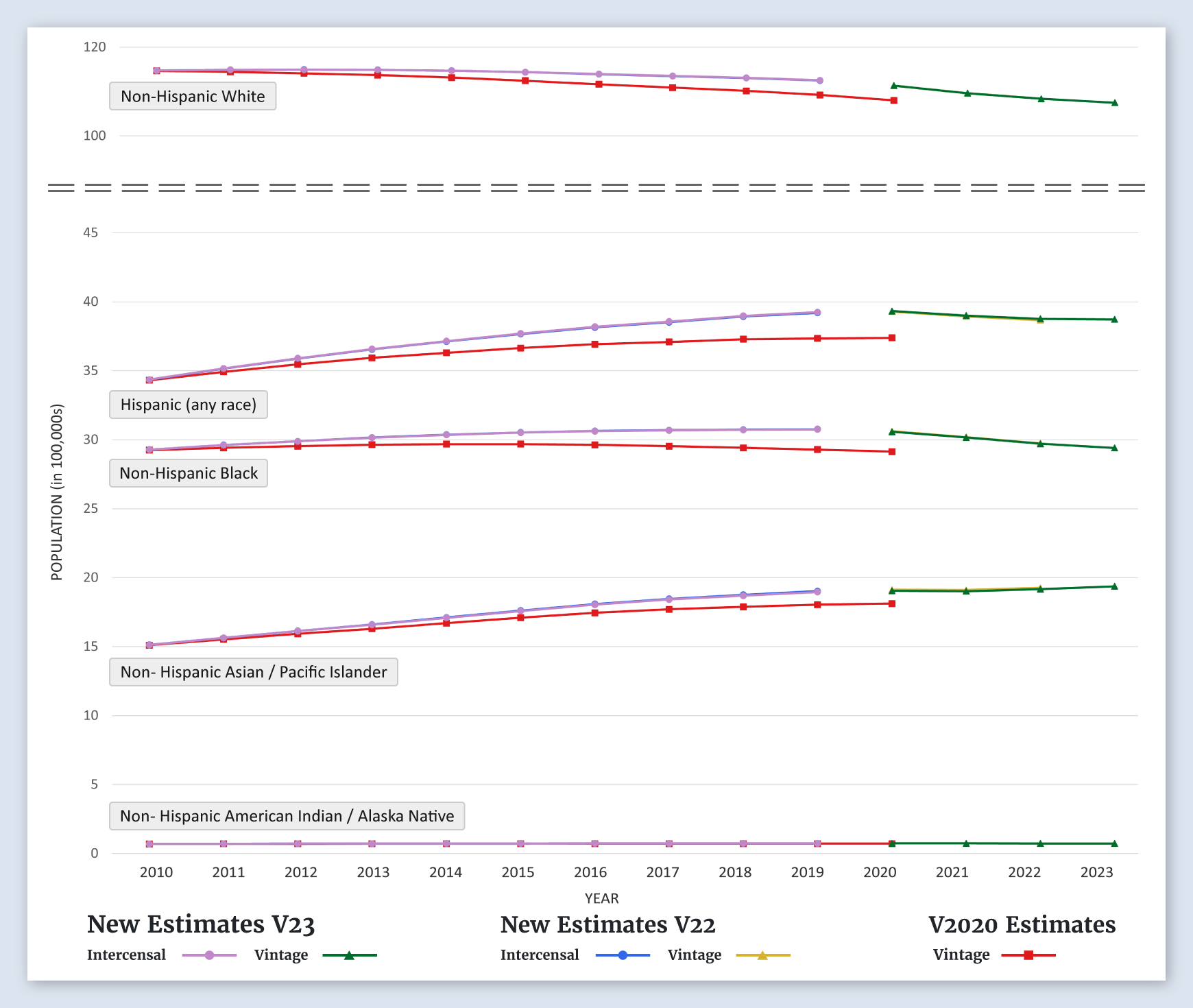
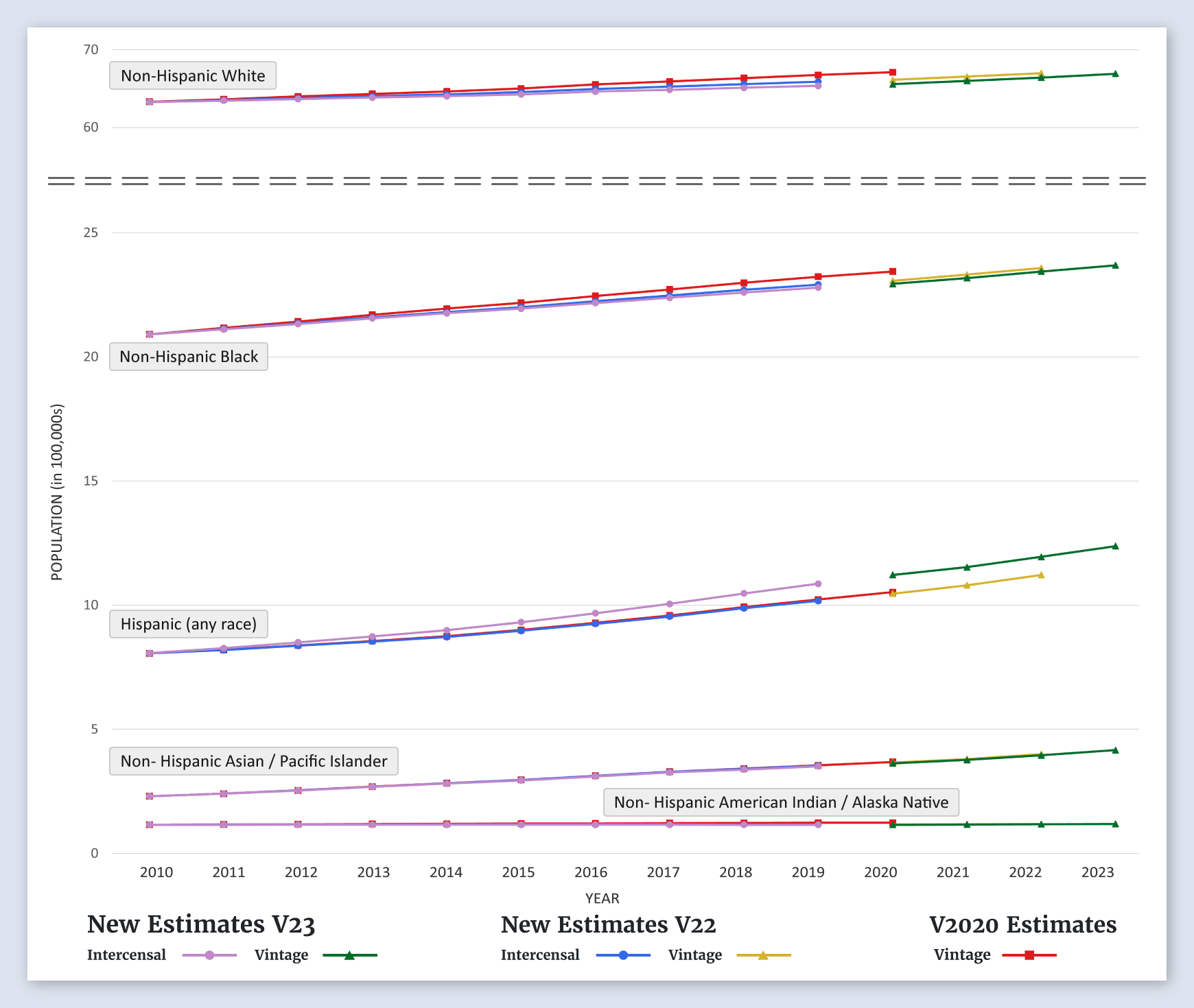
Graphs Comparing New Population Estimates to Previous Estimates
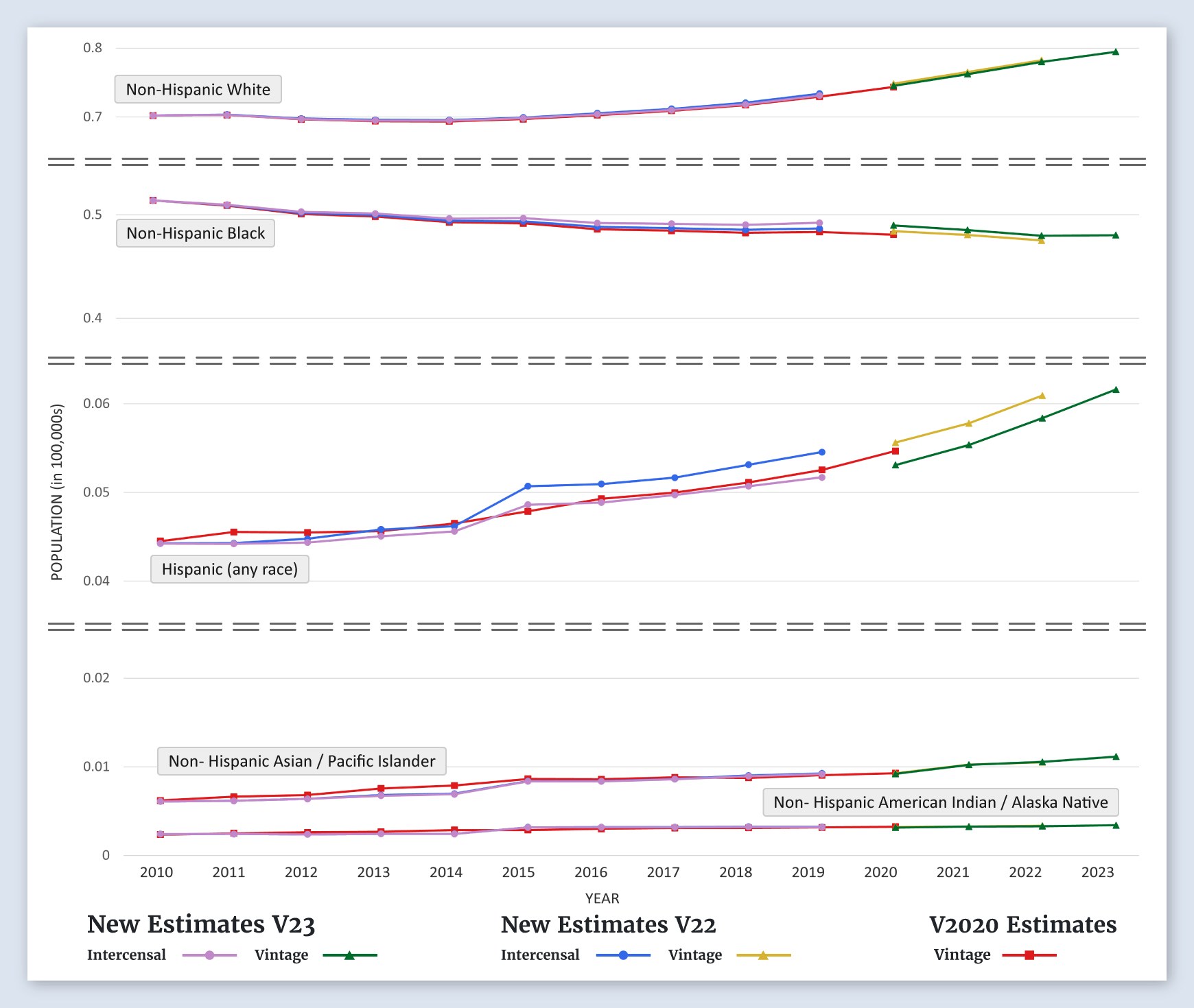
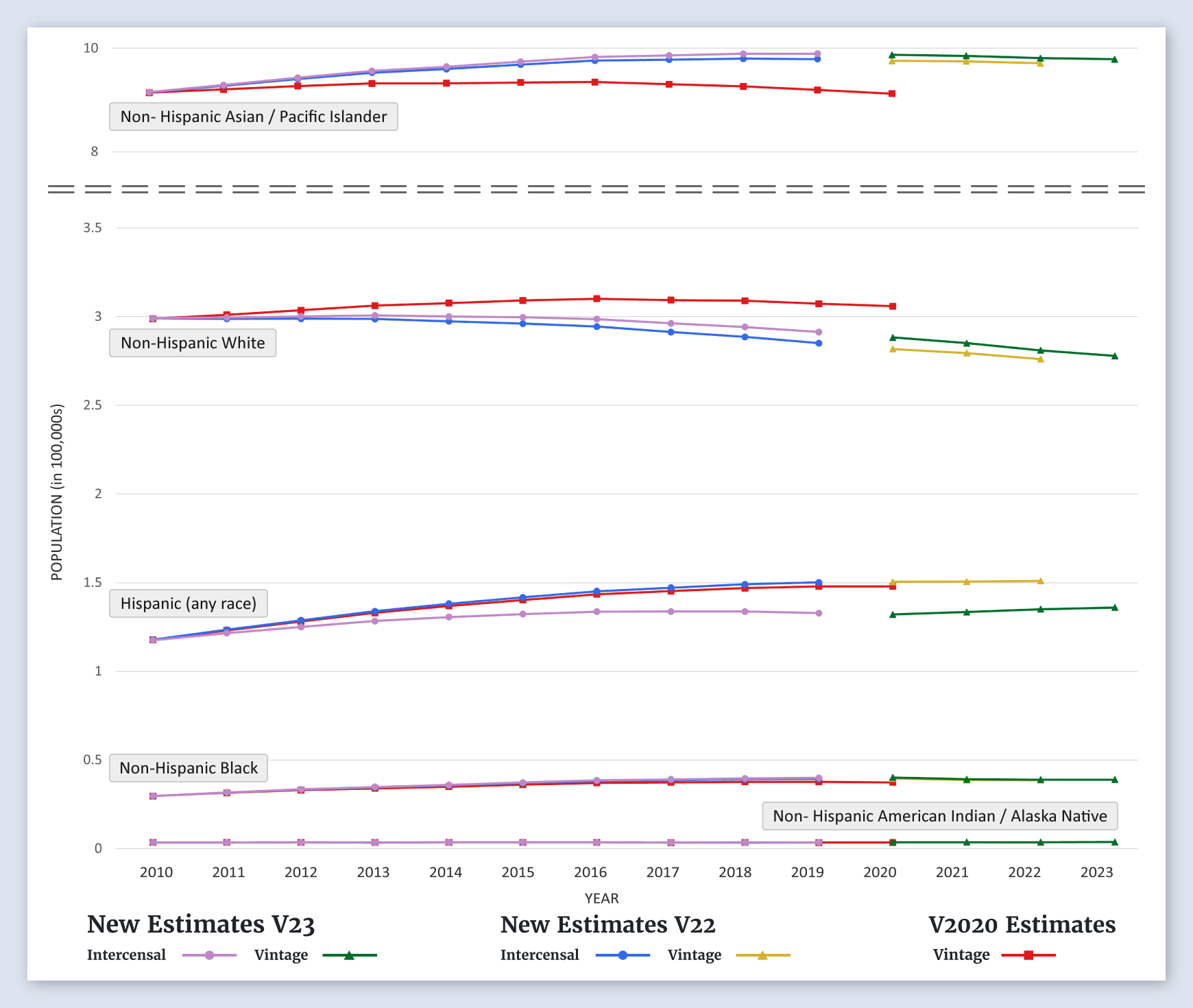
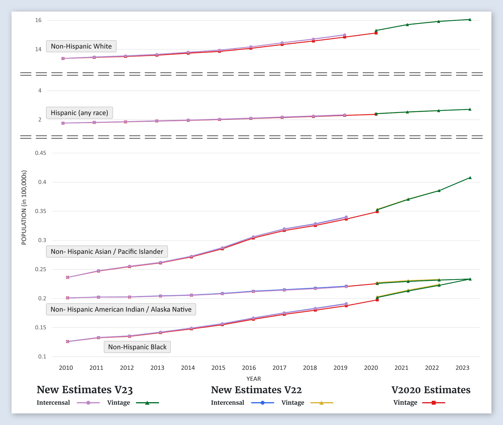
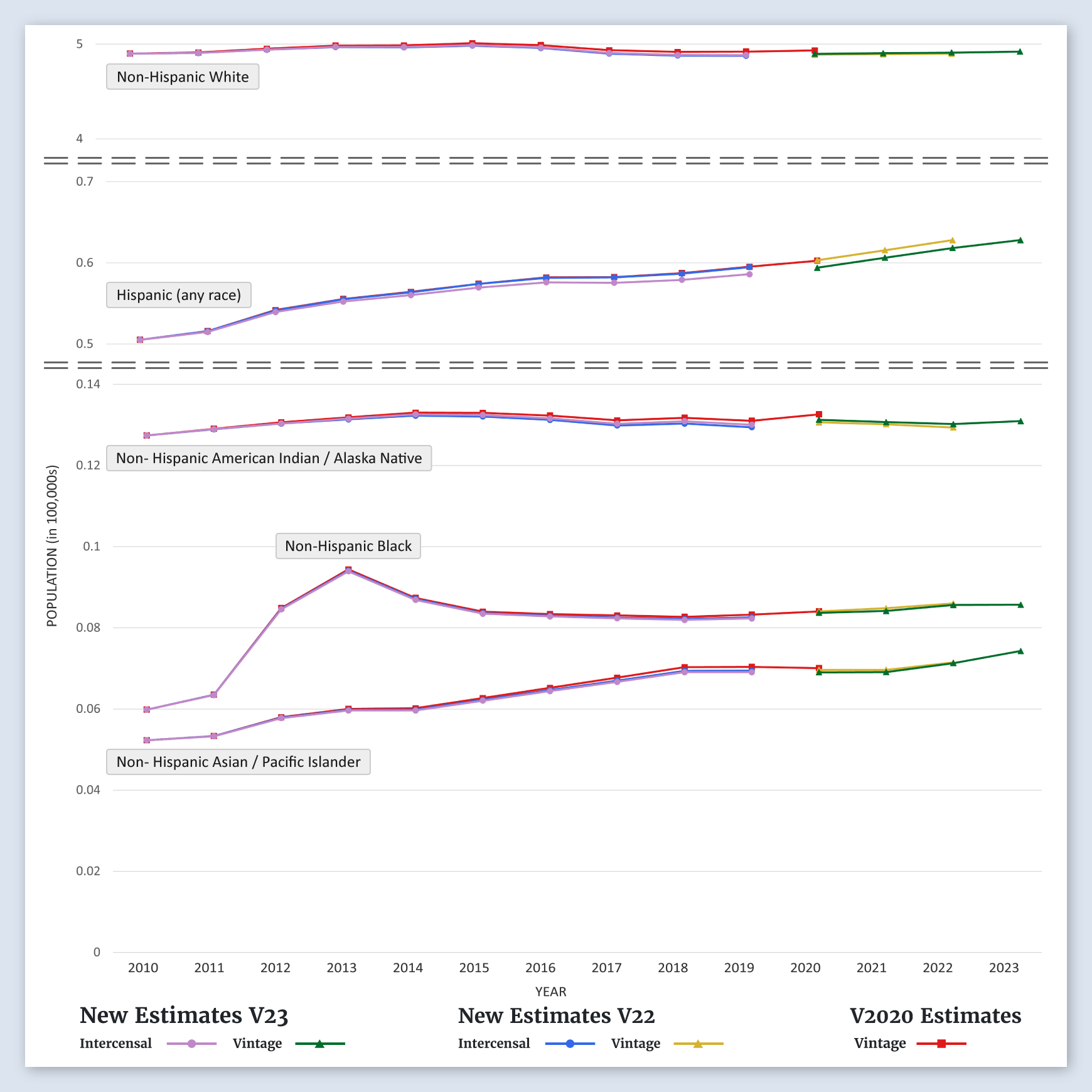
To summarize the differences between the new estimates and the previous estimates, we have generated a set of time-series graphs for each of the 50 states, the District of Columbia, the SEER registry areas, and the SEER registry groupings. The graphs are shown by age and by race/ethnicity.
The graphs show trends in the population estimates over time. There are three types of estimates shown:
- Population estimates from Vintage 2020 (Last year of forward projections using Census 2010)
- Intercensal population estimates produced in both 2022 and 2023 (Revised estimated populations going back in time using both Census 2010 and Census 2020)
- Population estimates that are forward projections using Census 2020. Produced both in Vintage 2022 and Vintage 2023.
In general, the Vintage 2023 population estimates used this year are very close to the previous Vintage 2022 estimates, although this varies by state. Since estimating net migration between censuses is difficult, there tends to be more of a difference in the estimates for the more mobile younger populations.
-
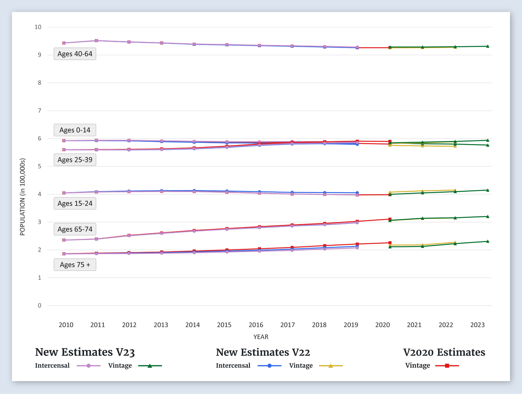
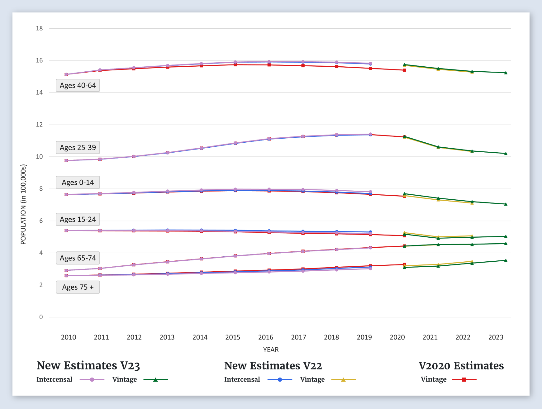
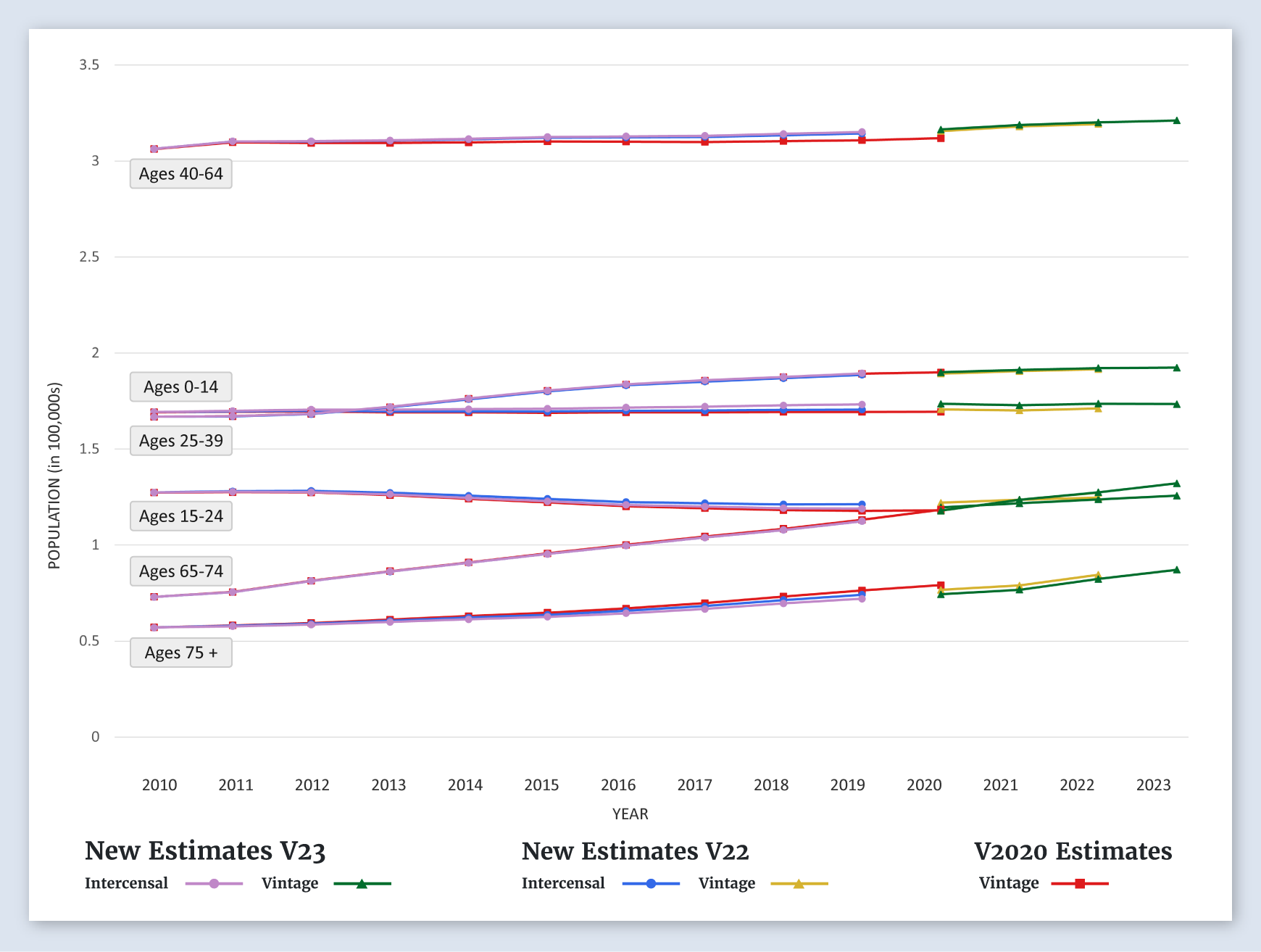
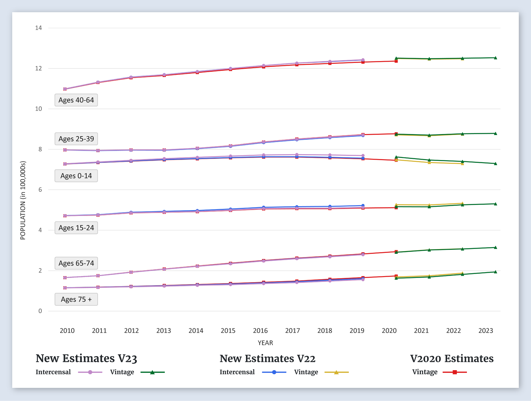
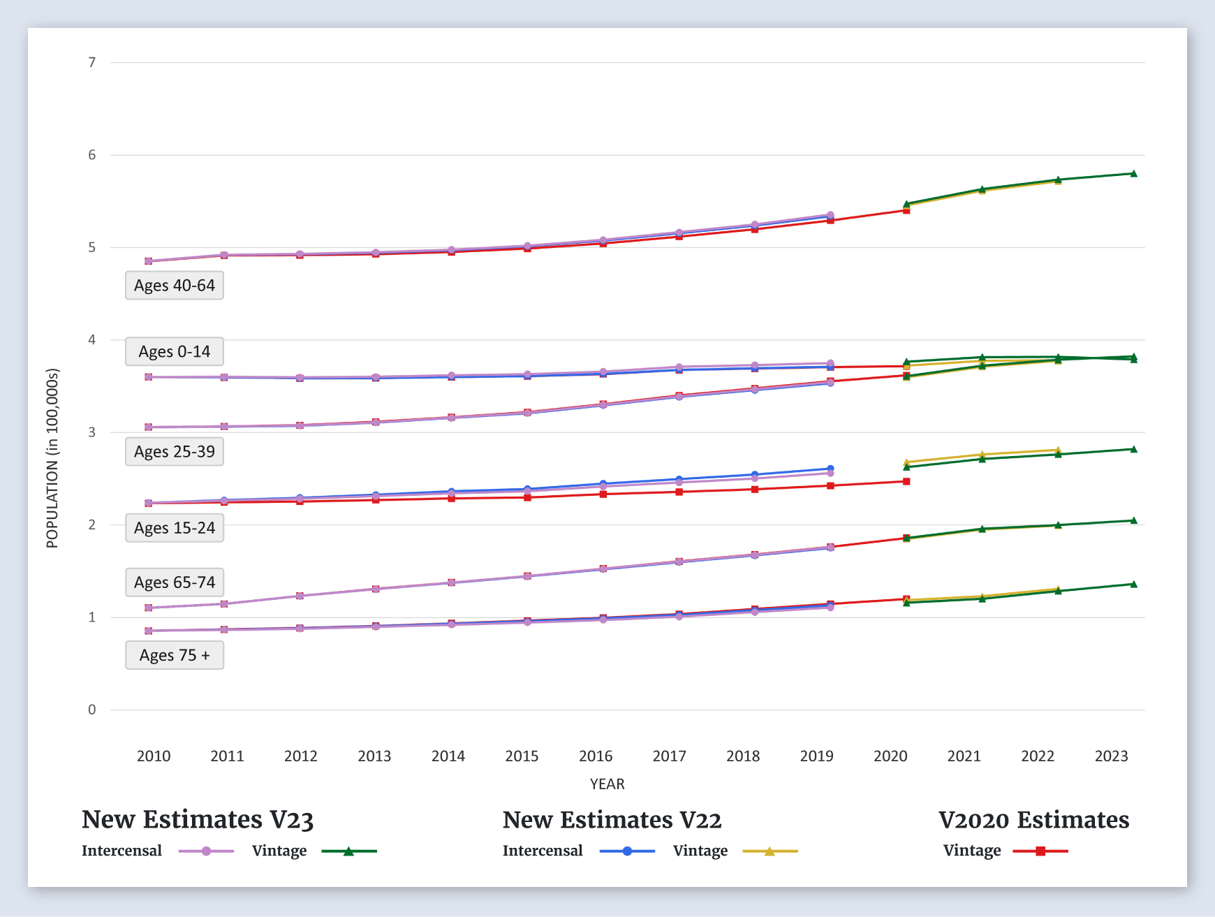
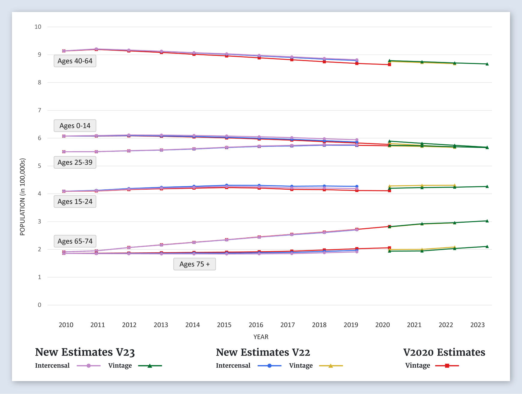
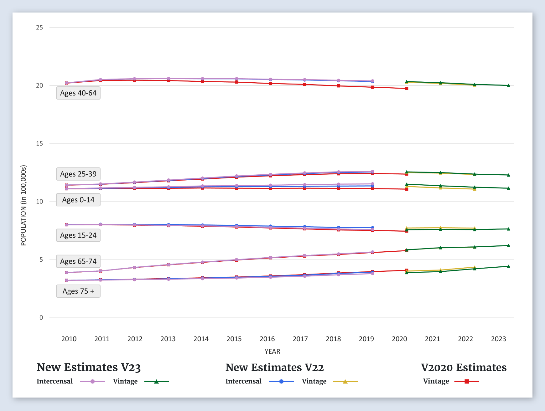
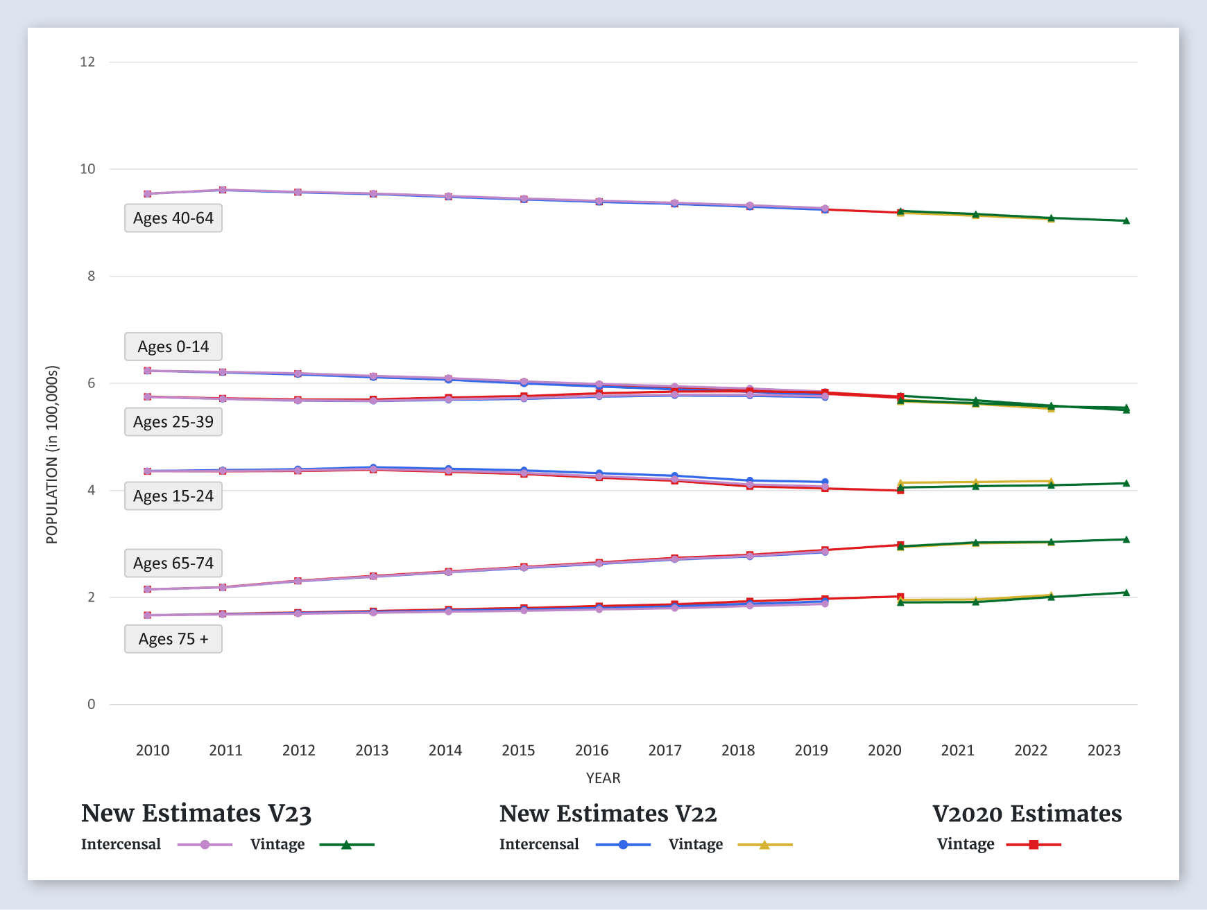
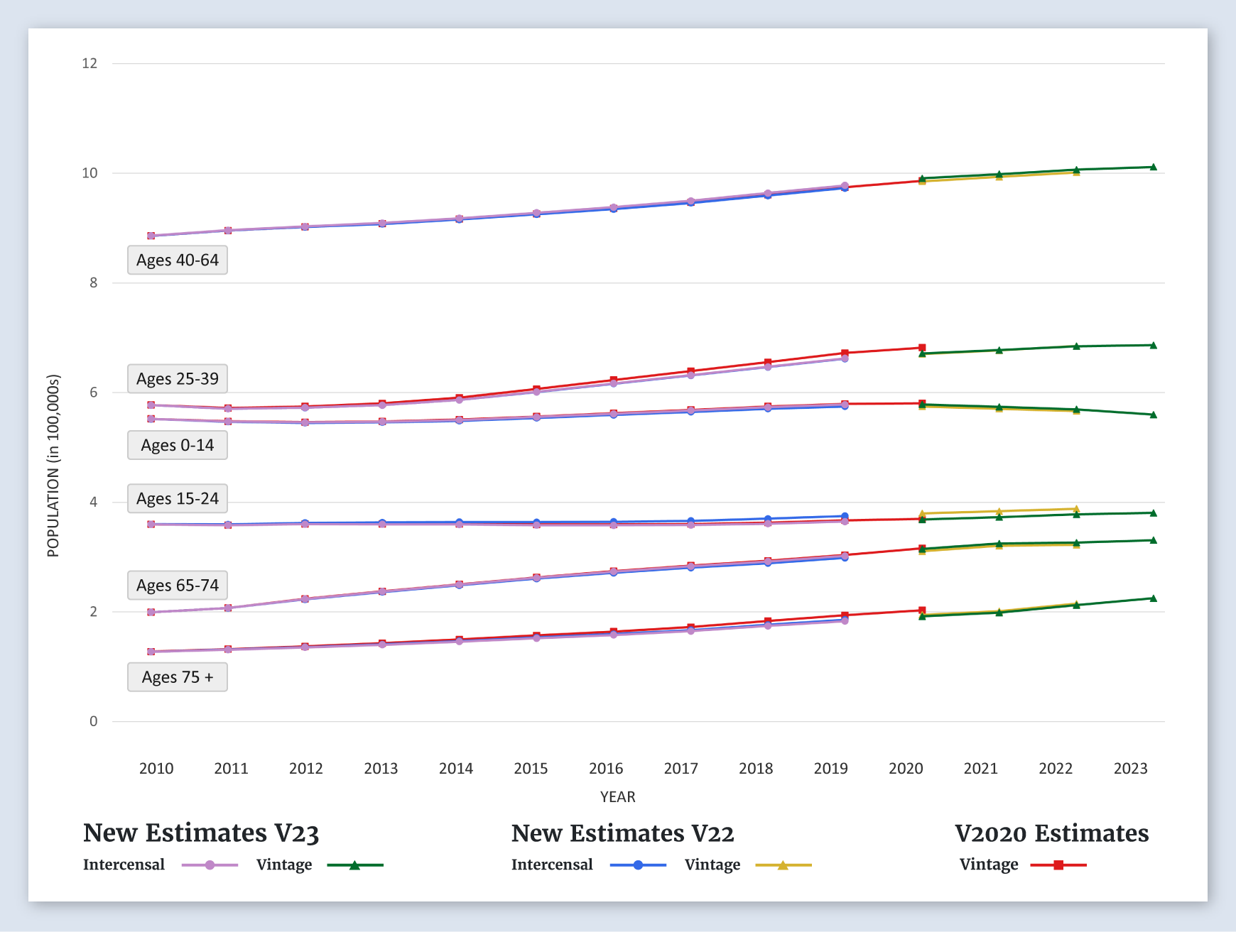
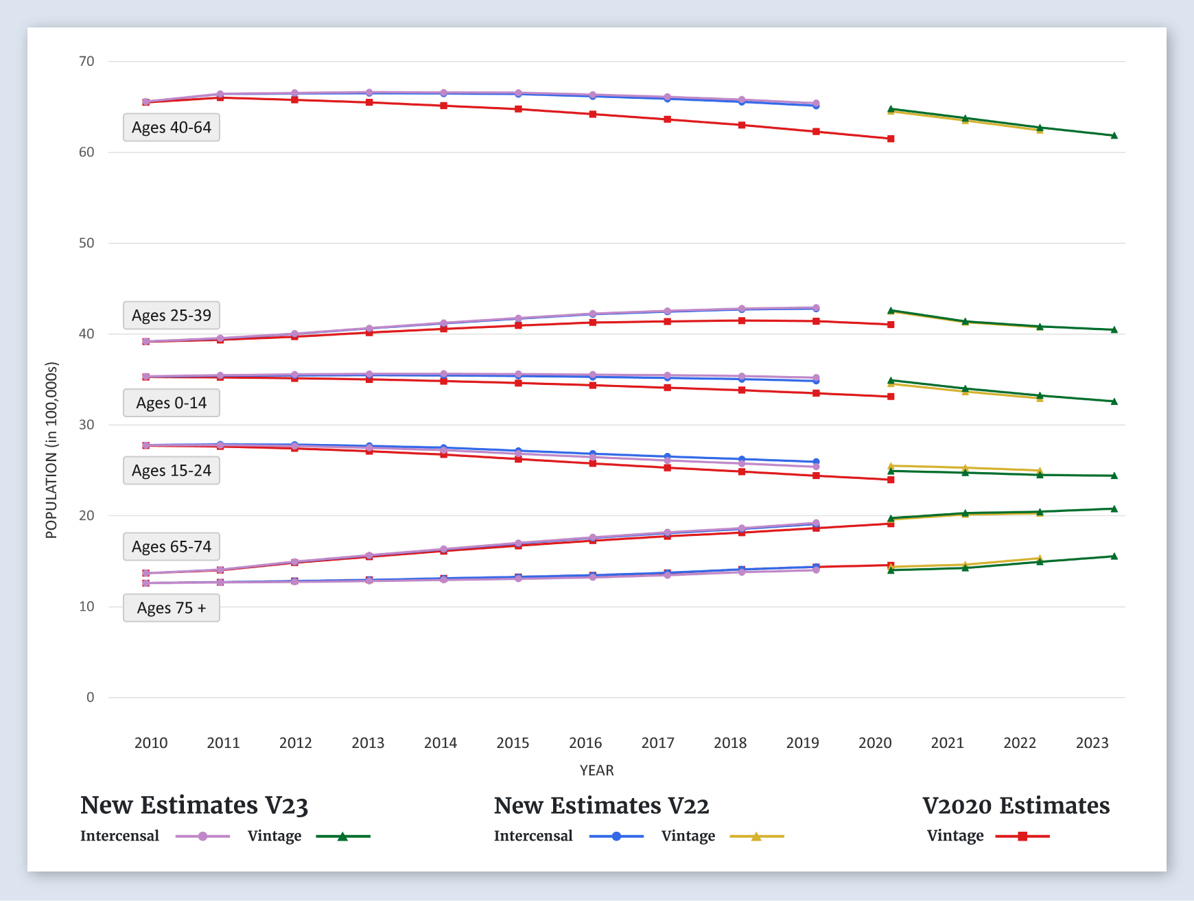
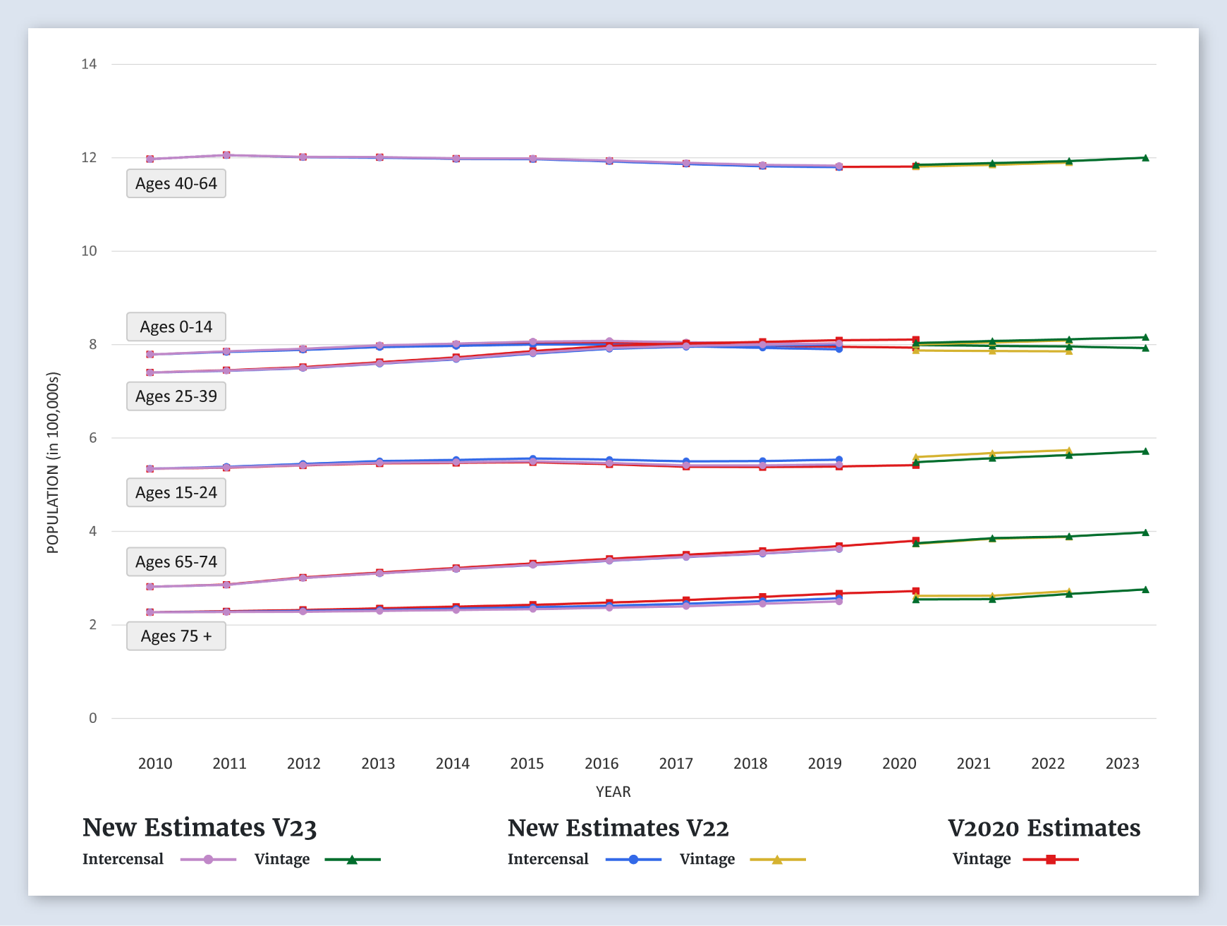
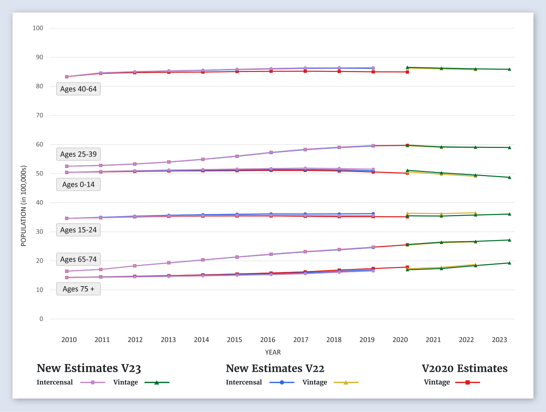
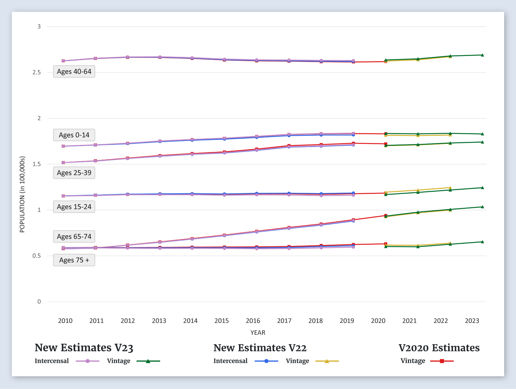
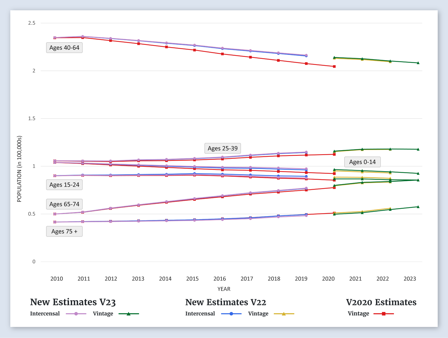
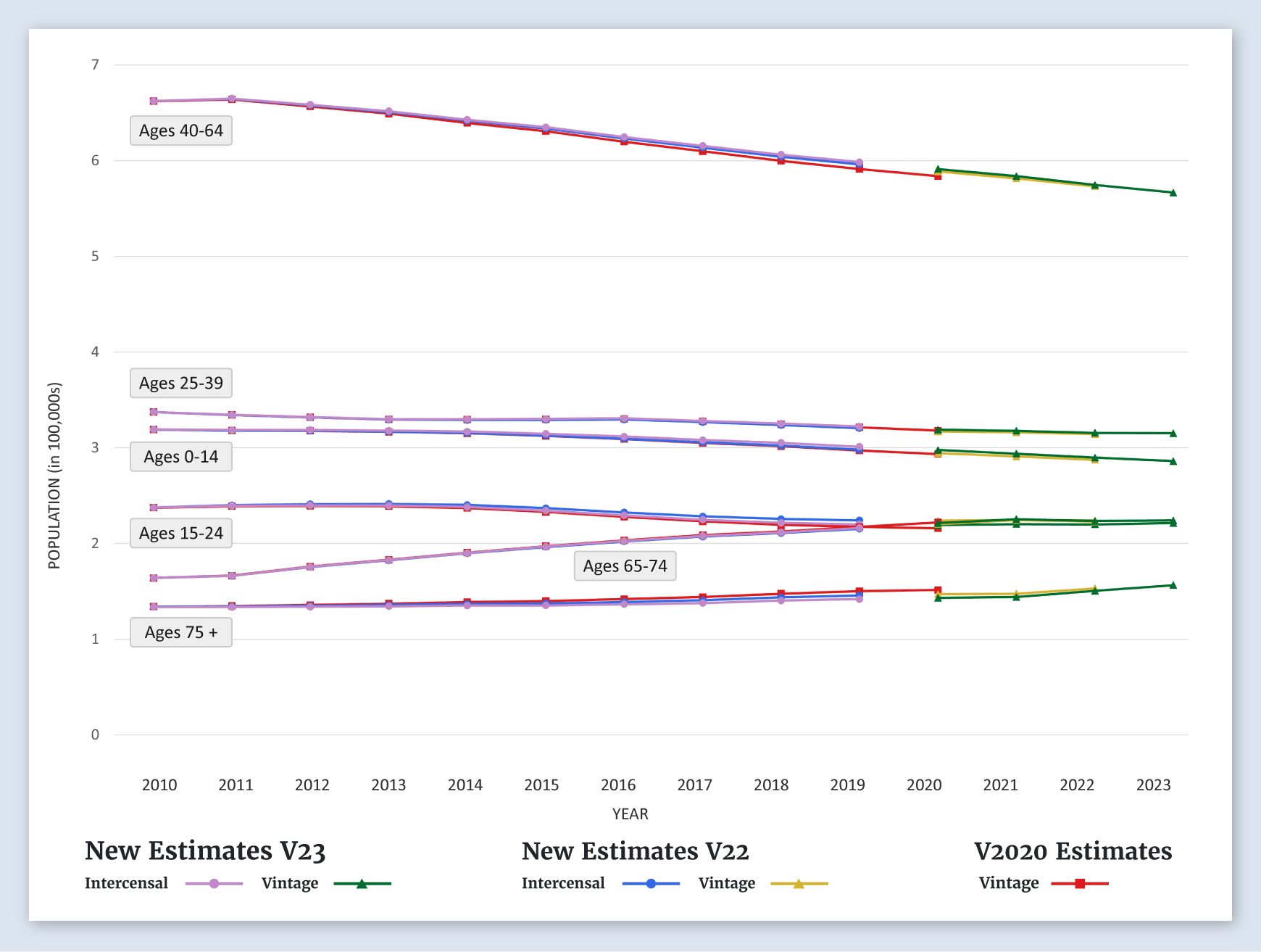
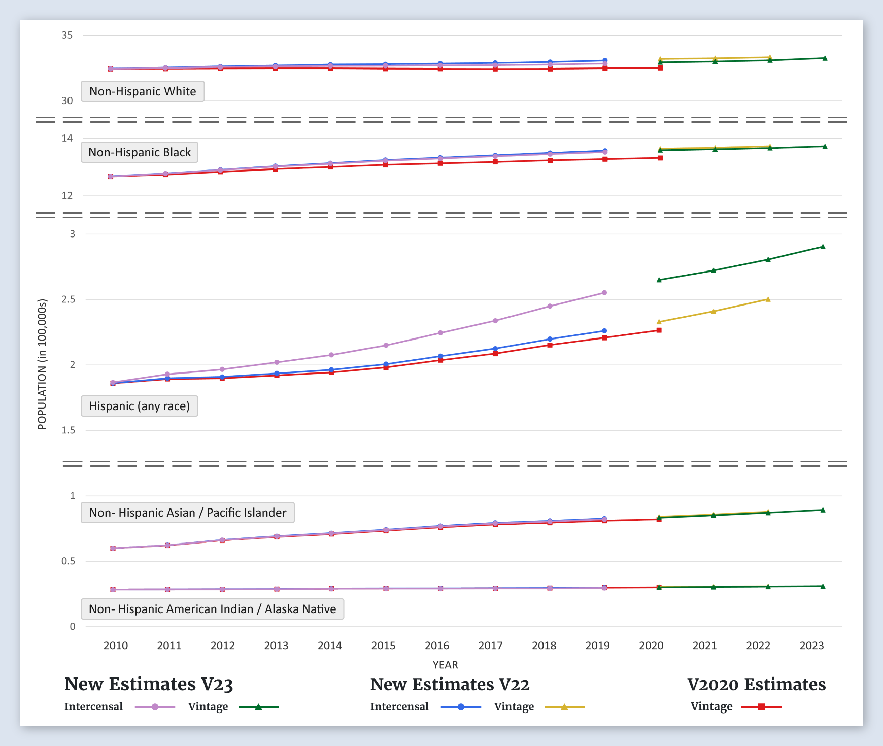
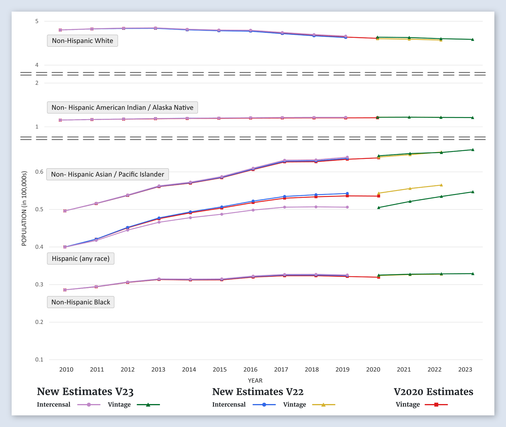
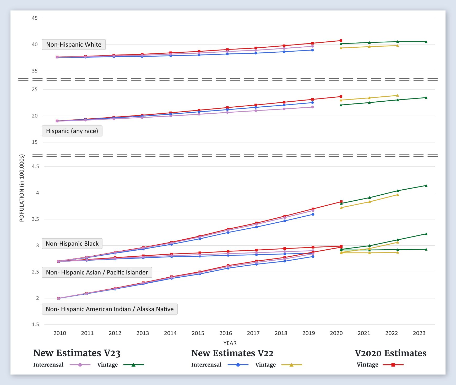
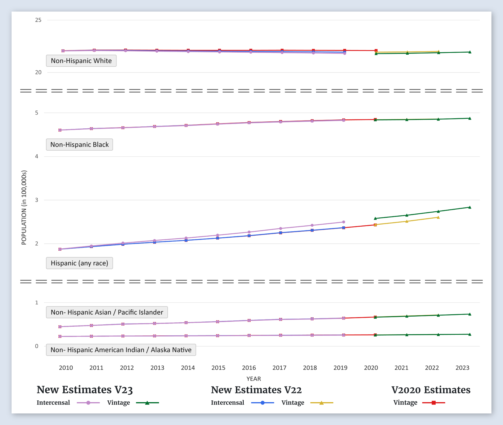
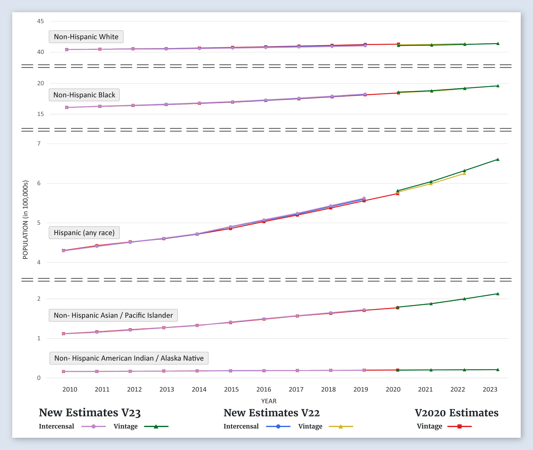
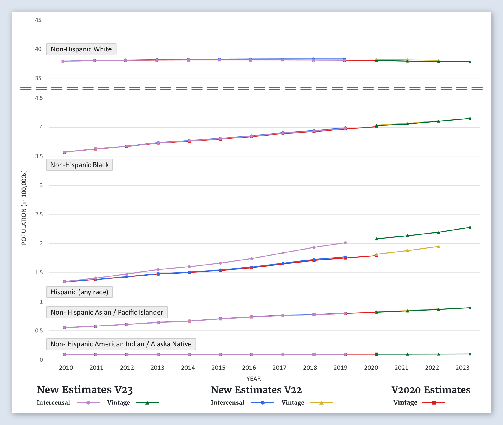
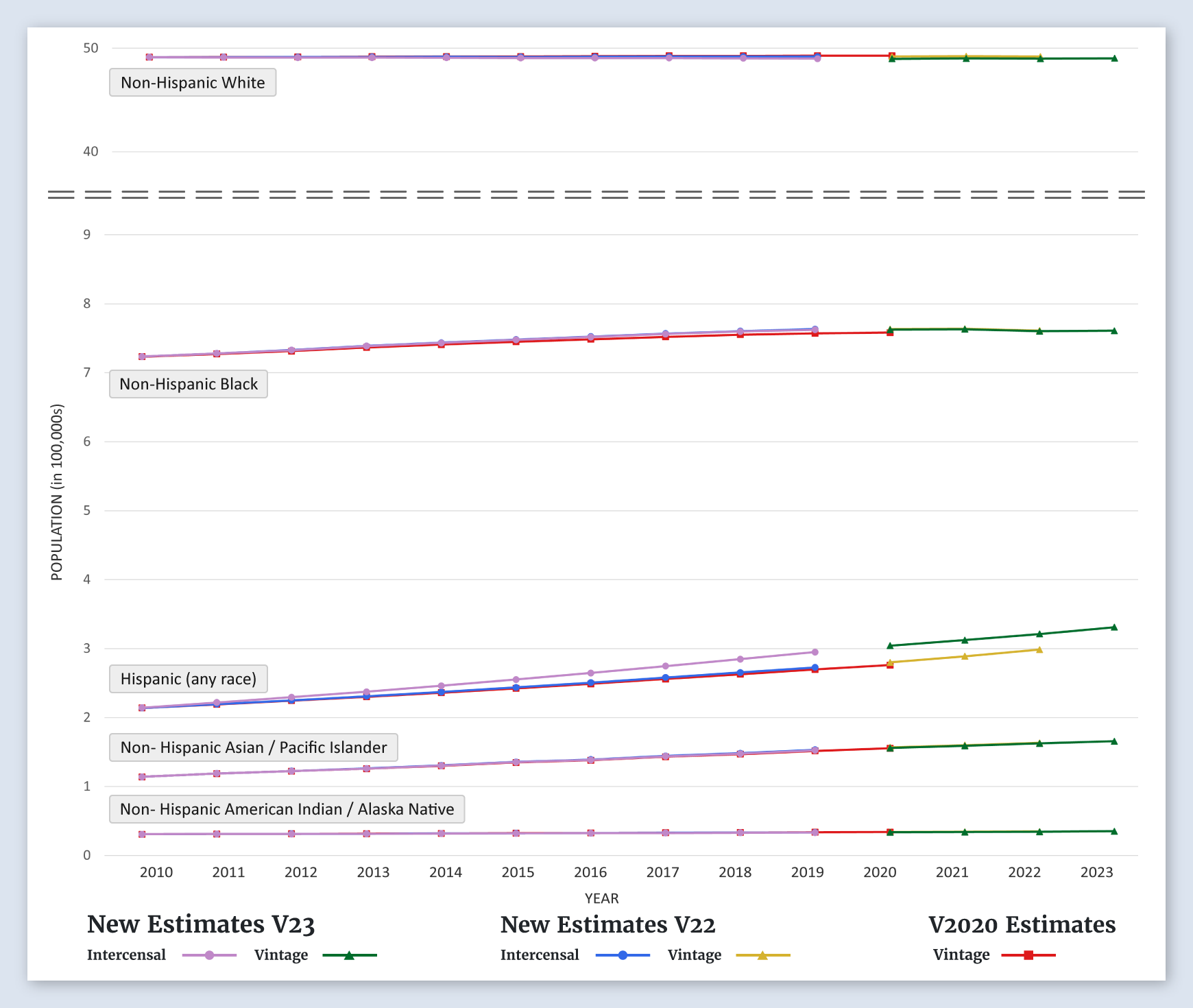
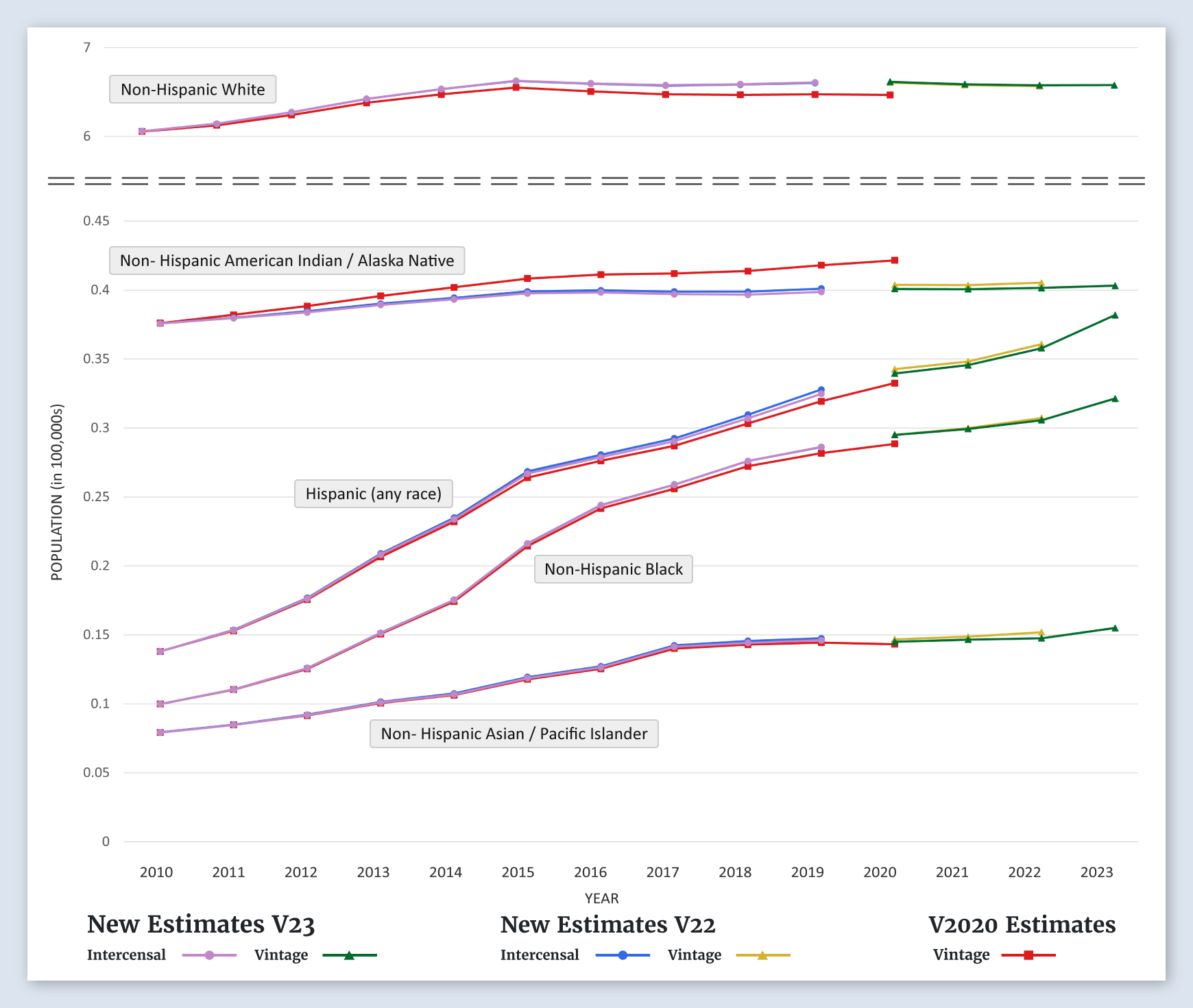
Total United States
Populations by Age
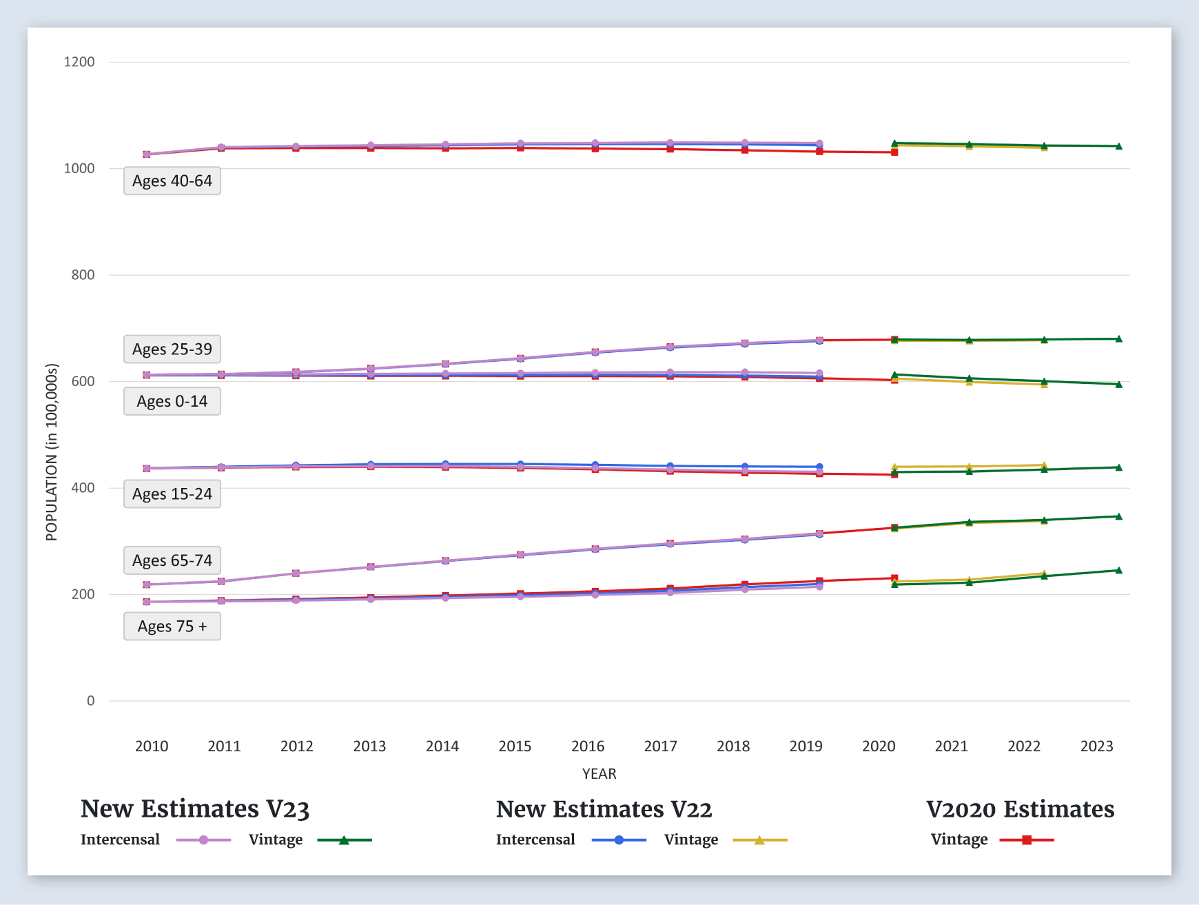
For the United States, the new estimates for all age groups, age 0-14, 15-24, 25-39, 40-64, 65-74, and 75+, are about the same as the previous estimates.
-
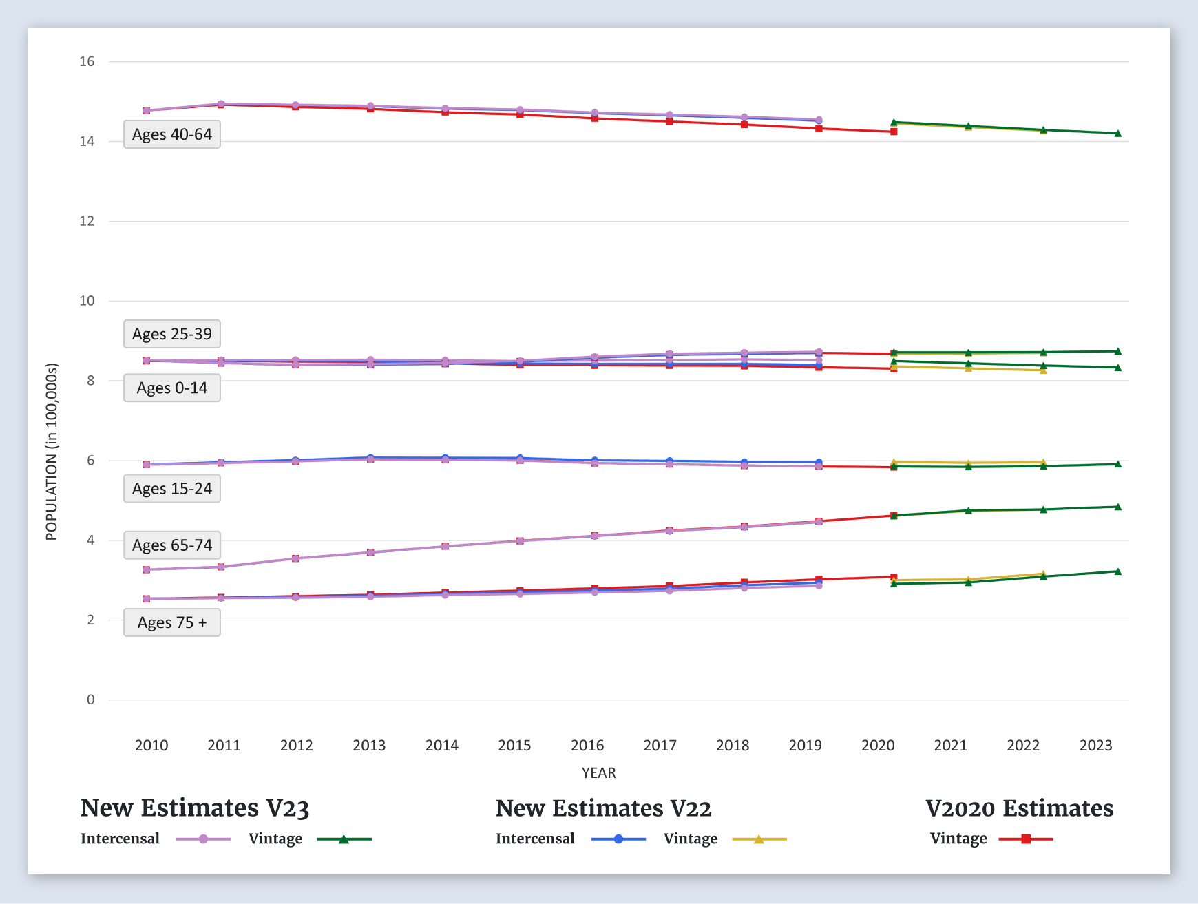
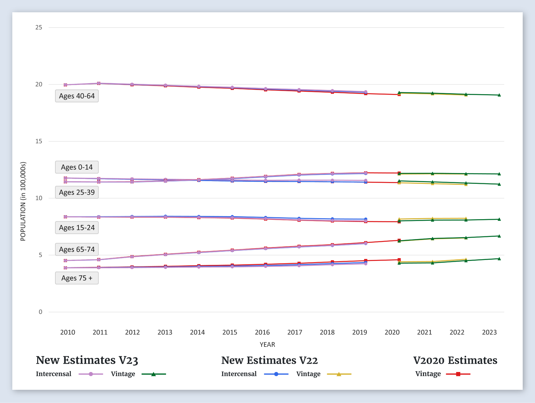
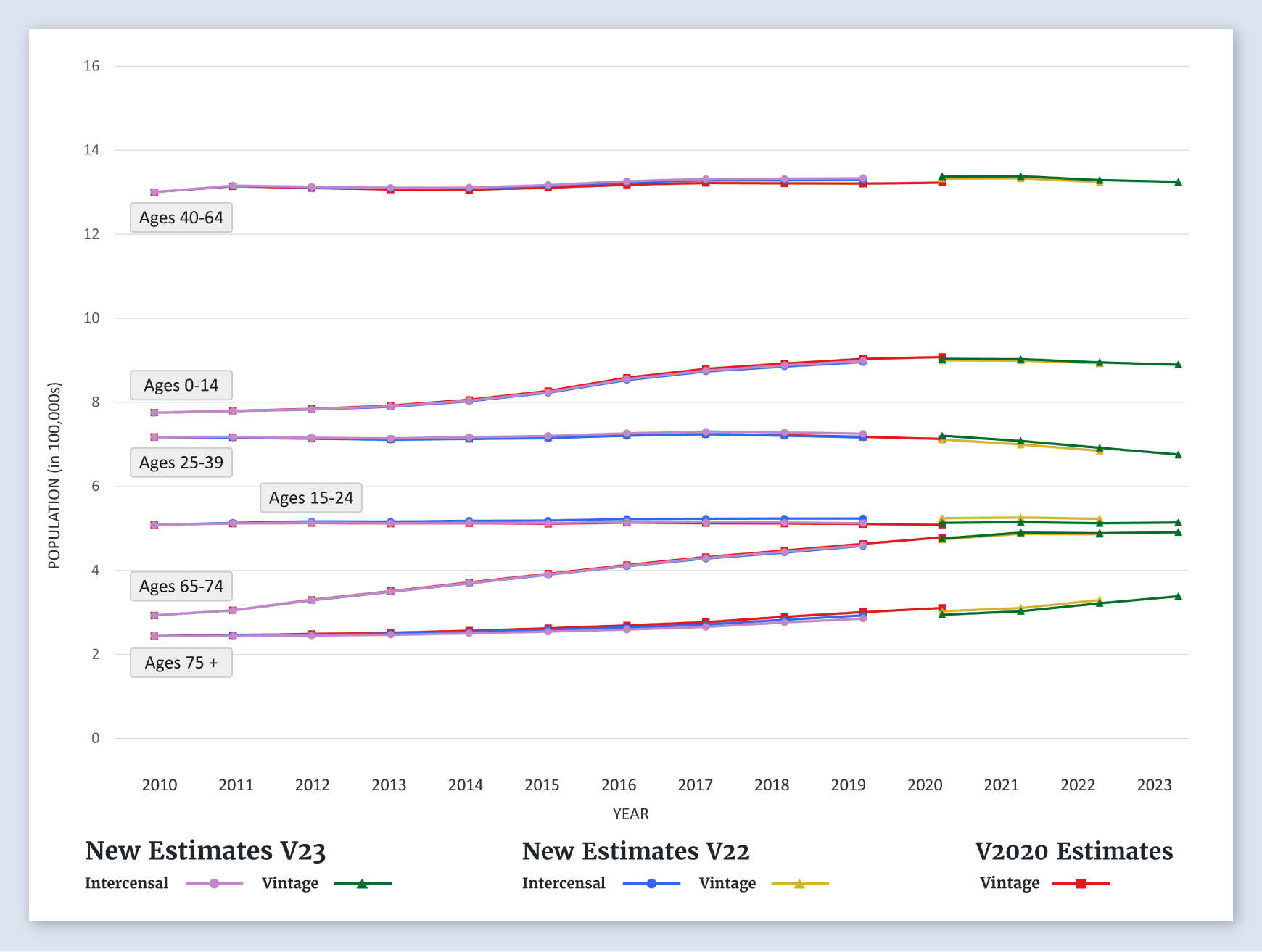
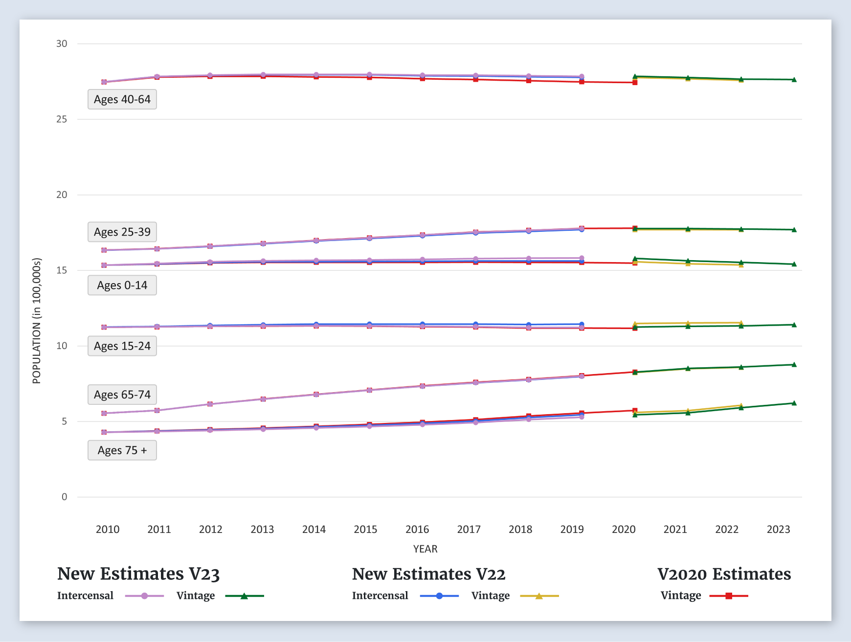
Alabama
Populations by Age
For Alabama, the new estimates for ages 0-14, 25-39, 65-74, and 75+ are about the same as the previous estimates. The new estimates for ages 15-24 and 40-64 are higher than the previous estimates.
-
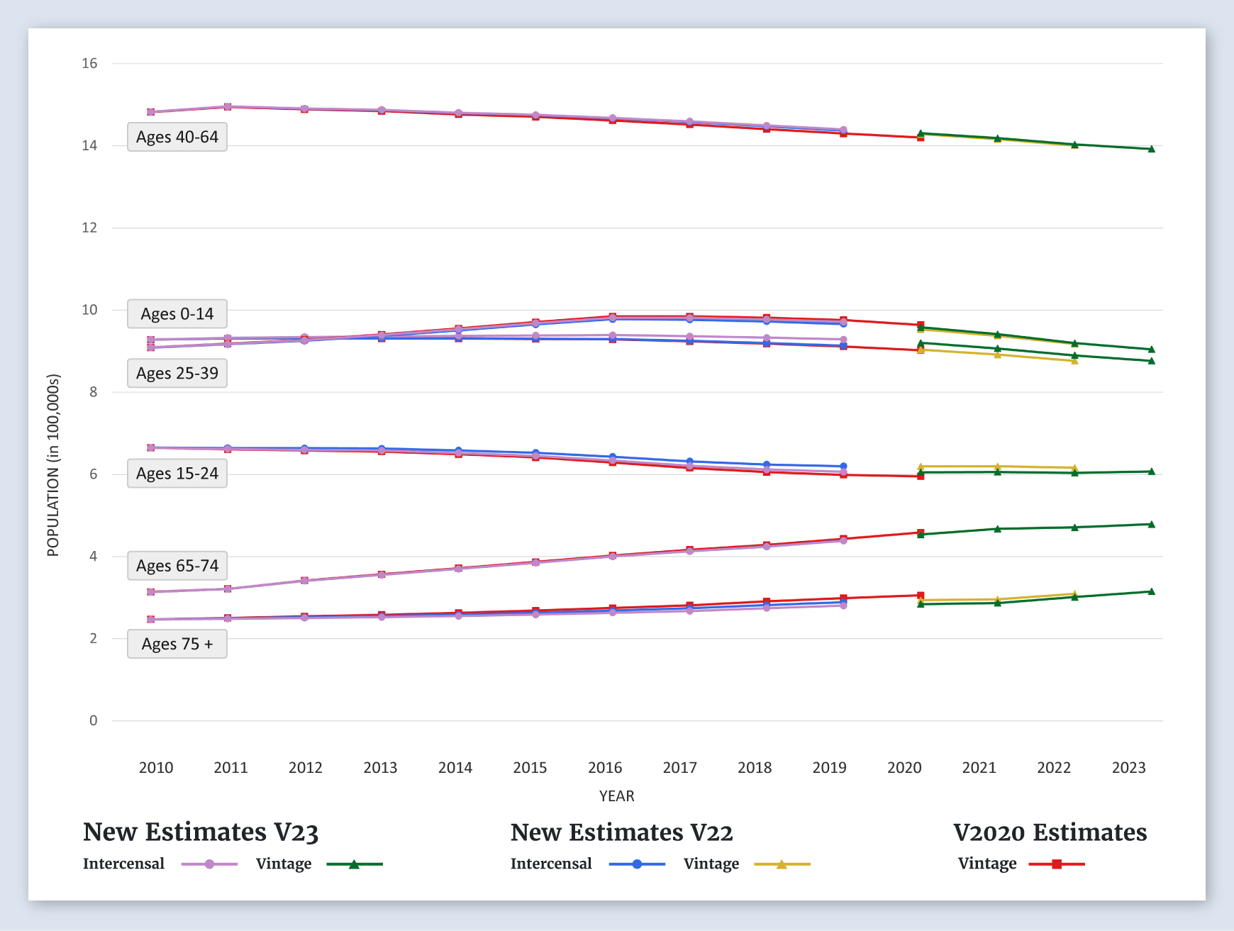
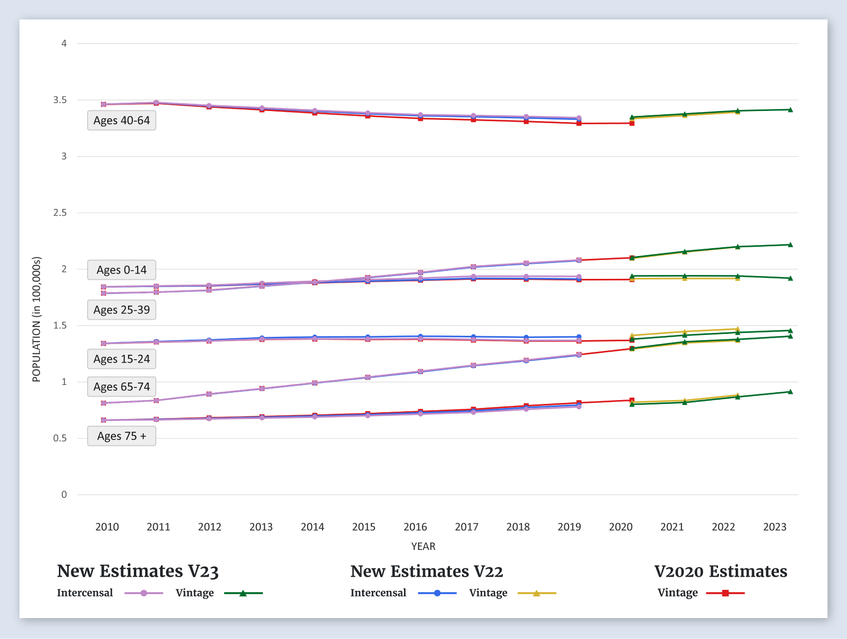
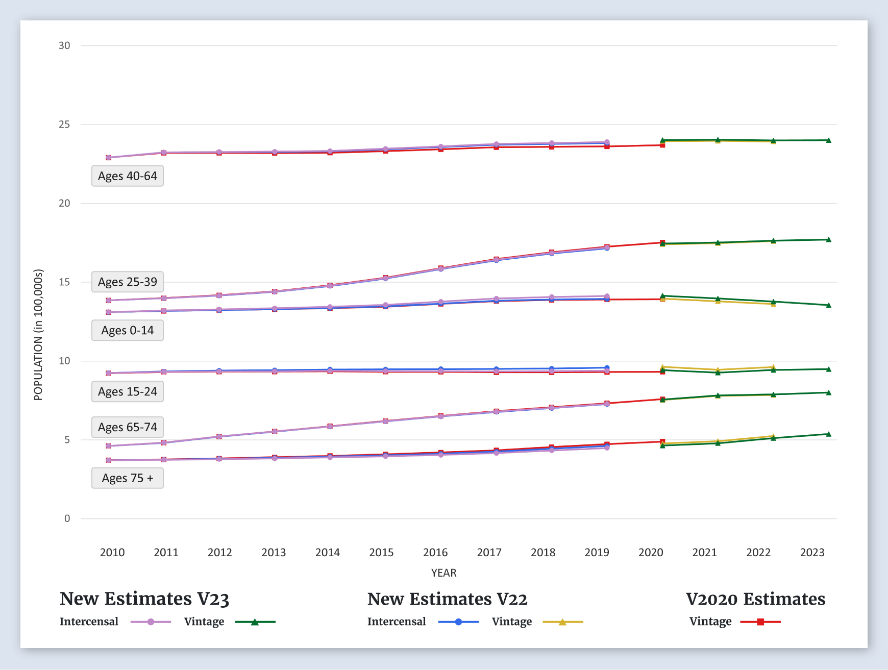
Alaska
Populations by Age
For Alaska, the new estimates for all age groups, age 0-14, 15-24, 25-39, 40-64, 65-74, and 75+, are about the same as the previous estimates.
-
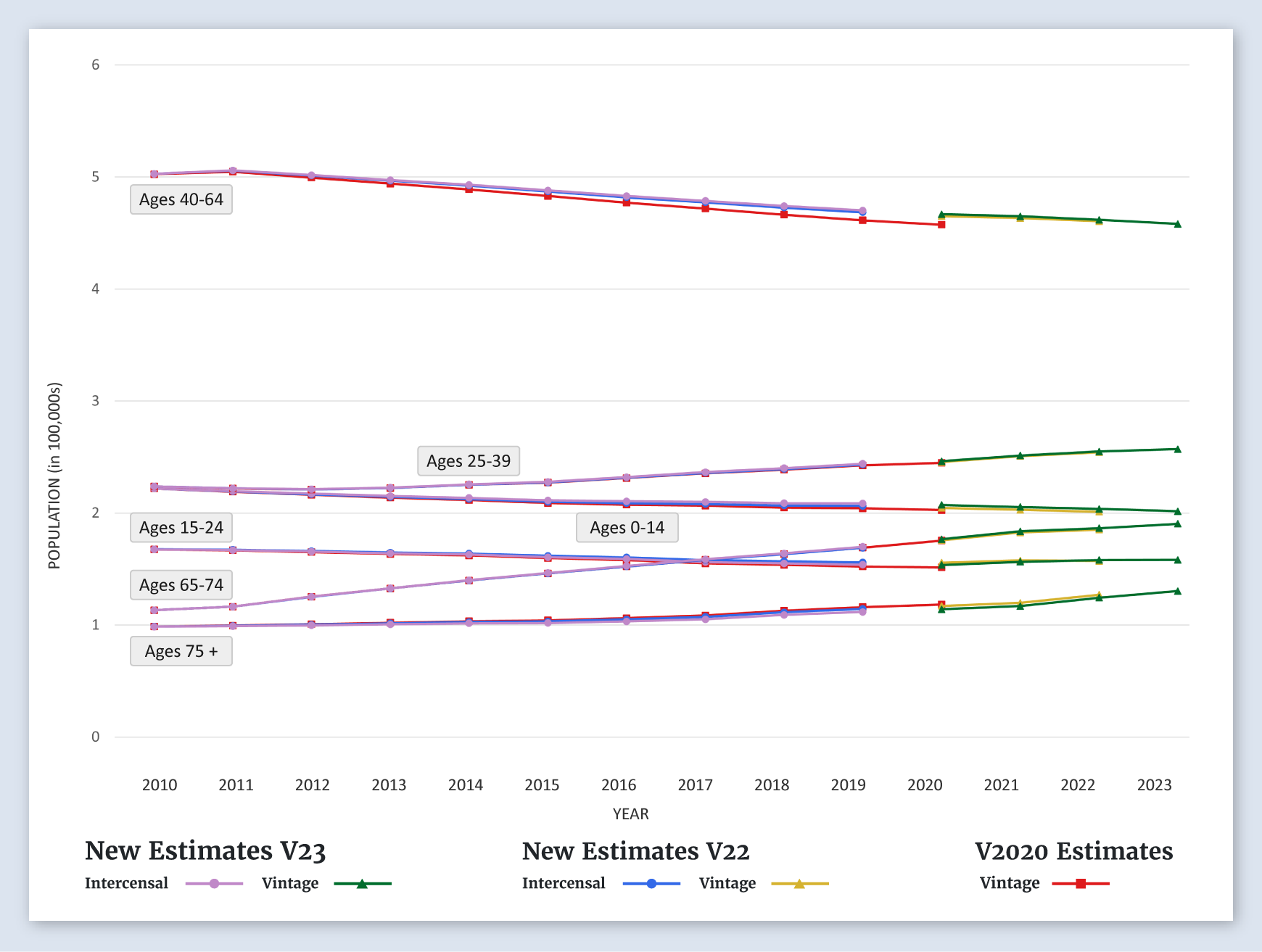
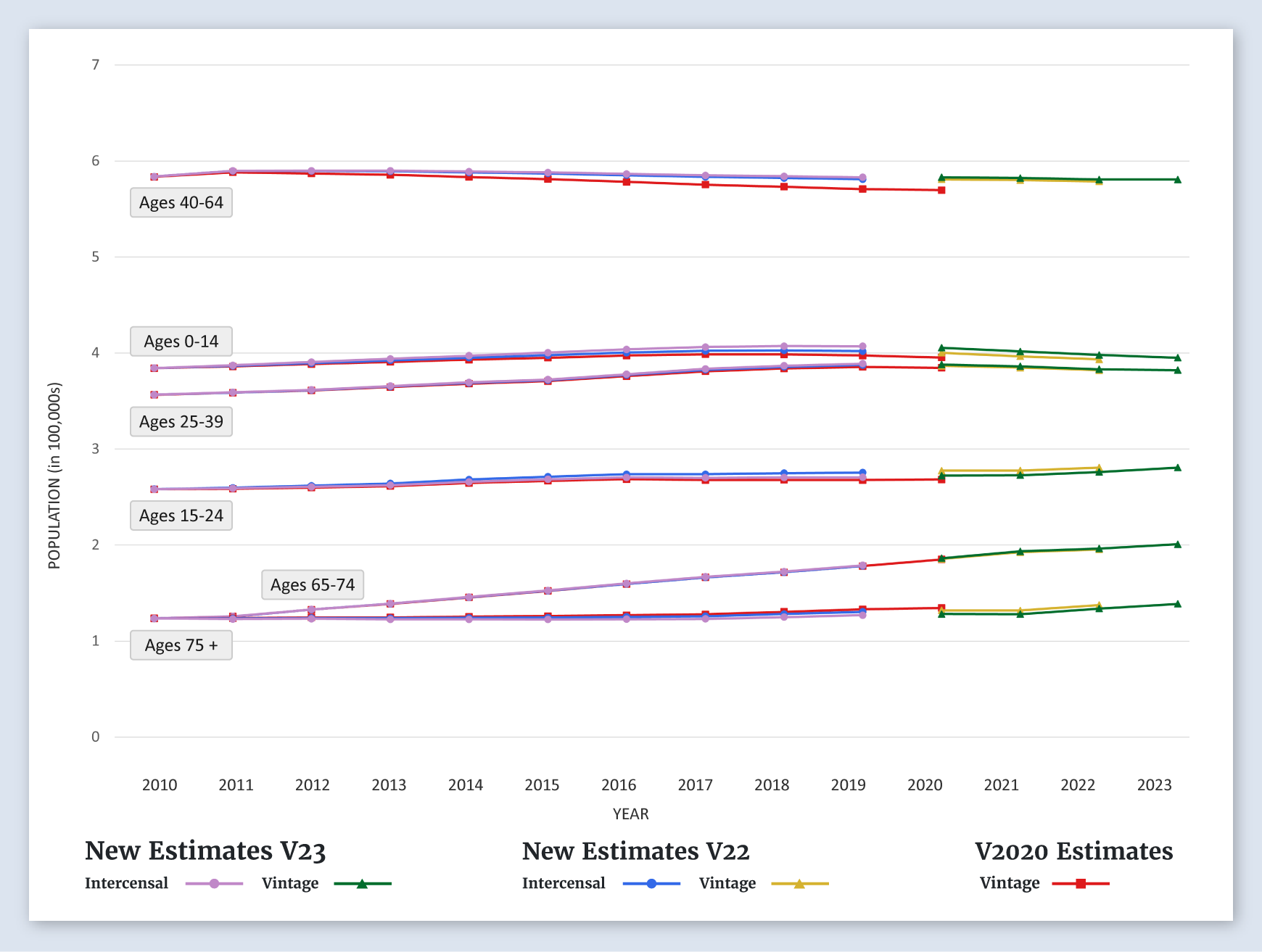
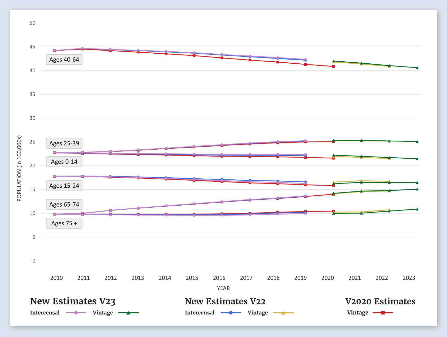
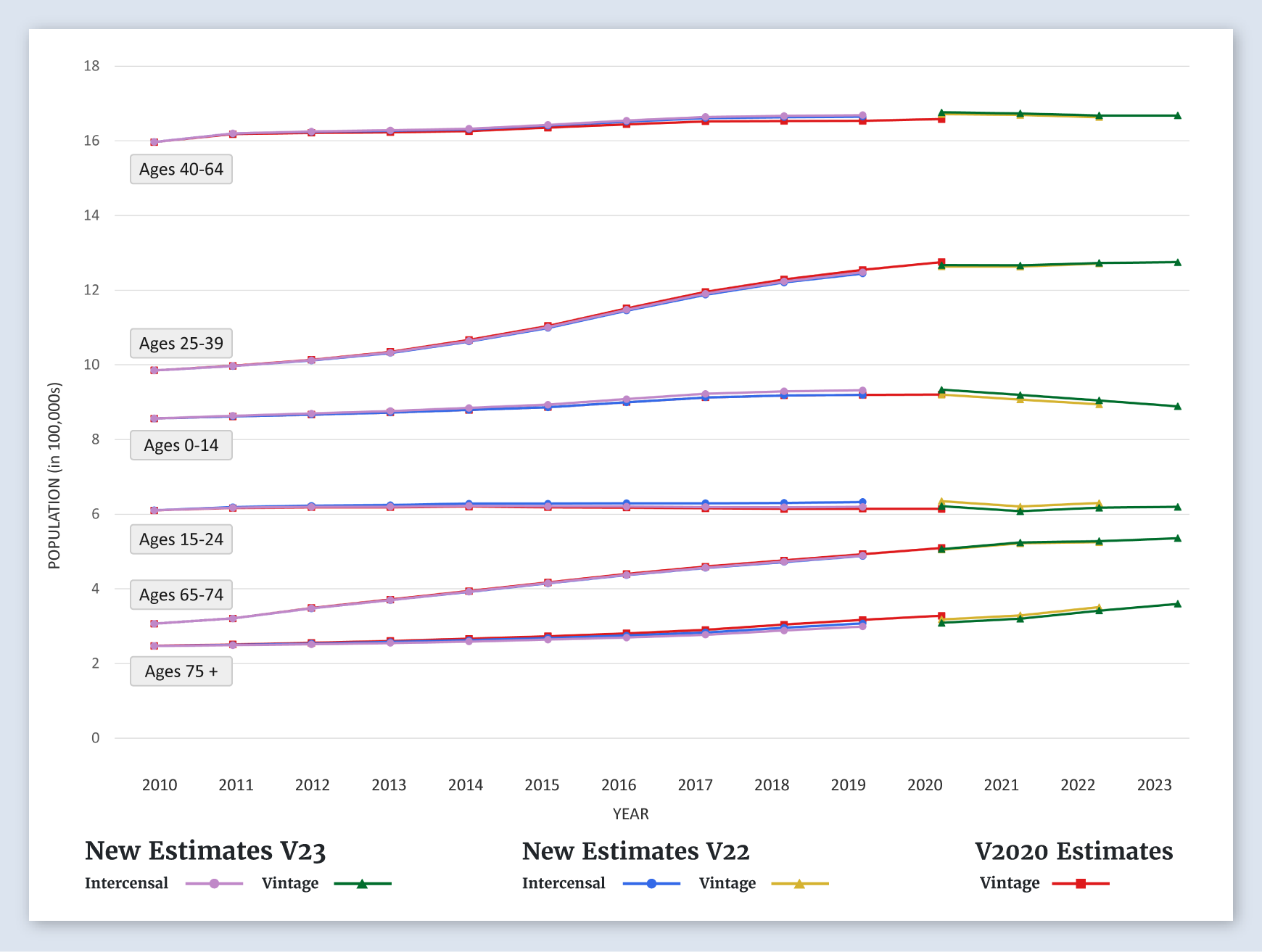
Arizona
Populations by Age
For Arizona, the new estimates for all age groups, age 0-14, 15-24, 25-39, 40-64, 65-74, and 75+, are lower than the previous estimates.
-
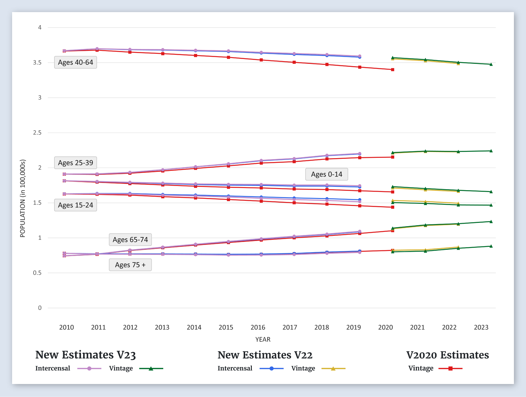
Arkansas
Populations by Age
For Arkansas, the new estimates for all age groups, age 0-14, 15-24, 25-39, 40-64, 65-74, and 75+, are about the same as the previous estimates.
-
California
Populations by Age
For California, the new estimates for all age groups, age 0-14, 15-24, 25-39, 40-64, 65-74, and 75+, are about the same as the previous estimates.
-
Greater California SEER Area
Populations by Age
For the greater California SEER area, the new estimates for all age groups, age 0-14, 15-24, 25-39, 40-64, 65-74, and 75+, are about the same as the previous estimates.
-
Los Angeles SEER Area
Populations by Age
For the Los Angeles SEER area, the new estimates for all age groups, age 0-14, 15-24, 25-39, 40-64, 65-74, and 75+, are about the same as the previous estimates.
-
San Francisco-Oakland SMSA SEER Area
Populations by Age
For the San Francisco-Oakland SMSA SEER area, the new estimates for all age groups, age 0-14, 15-24, 25-39, 65-74, and 75+, are about the same as the previous estimates. The estimates for ages 40-64 are higher than the previous estimates.
-
San Jose-Monterey SEER Area
Populations by Age
For the San Jose-Monterey SEER area, the new estimates for all age groups, age 0-14, 15-24, 25-39, 65-74, and 75+, are about the same as the previous estimates. The estimates for ages 40-64 are higher than the previous estimates.
-
Colorado
Populations by Age
For Colorado, the new estimates for all age groups, age 0-14, 15-24, 25-39, 40-64, 65-74, and 75+, are about the same as the previous estimates.
-
Connecticut
Populations by Age
For Connecticut, the new estimates for all age groups, age 0-14, 15-24, 25-39, 65-74, and 75+, are about the same as the previous estimates. The estimates for ages 40-64 are higher than the previous estimates.
-
Delaware
Populations by Age
For Delaware, the new estimates for all age groups, age 0-14, 15-24, 25-39, 40-64, 65-74, and 75+, are about the same as the previous estimates.
-
District of Columbia (Washington, D.C.)
Populations by Age
For the District of Columbia, the new estimates for ages 0-14, 65-74, and 75+ are about the same as the previous estimates. The estimates for ages 15-24, 25-39 and 40-64 are lower than previous estimates.
-
Florida
Populations by Age
For Florida, the new estimates for all age groups, age 0-14, 15-24, 25-39, 40-64, 65-74, and 75+, are about the same as the previous estimates.
-
Georgia
Populations by Age
For Georgia, the new estimates for all age groups, age 0-14, 15-24, 25-39, 40-64, 65-74, and 75+, are about the same as the previous estimates.
-
Atlanta (Metropolitan) SEER Area
Populations by Age
For the Atlanta (Metropolitan) SEER area, the new estimates for all age groups, age 0-14, 15-24, 25-39, 40-64, 65-74, and 75+, are about the same as the previous estimates.
-
Greater Georgia SEER Area
Populations by Age
For the greater Georgia SEER area, the new estimates for all age groups, age 0-14, 15-24, 25-39, 40-64, 65-74, and 75+, are about the same as the previous estimates.
-
Rural Georgia SEER Area
Populations by Age
For the rural Georgia SEER area, the new estimates for all age groups, age 0-14, 15-24, 25-39, 40-64, 65-74, and 75+, are about the same as the previous estimates.
-
Hawaii
Populations by Age
For Hawaii, the new estimates for ages 0-14, 25-39, 65-74, and 75+ are about the same as the previous estimates. The estimates for ages 15-24 and 40-64 are higher than the previous estimates.
-
Idaho
Populations by Age
For Idaho, the new estimates for ages 0-14, 25-39, 40-64, 65-74, and 75+ are about the same as the previous estimates. The estimates for ages 15-24 are higher than the previous estimates.
-
Illinois
Populations by Age
For Illinois, the new estimates for all age groups, age 0-14, 15-24, 25-39, 65-74, and 75+, are about the same as the previous estimates. The estimates for ages 40-64 are higher than the previous estimates.
-
Indiana
Populations by Age
For Indiana, the new estimates for all age groups, age 0-14, 15-24, 25-39, 40-64, 65-74, and 75+, are about the same as the previous estimates.
-
Iowa
Populations by Age
For Iowa, the new estimates for all age groups, age 0-14, 15-24, 25-39, 40-64, 65-74, and 75+, are about the same as the previous estimates.
-
Kansas
Populations by Age
For Kansas, the new estimates for all age groups, age 0-14, 15-24, 25-39, 40-64, 65-74, and 75+, are about the same as the previous estimates.
-
Kentucky
Populations by Age
For Kentucky, the new estimates for all age groups, age 0-14, 15-24, 25-39, 40-64, 65-74, and 75+, are about the same as the previous estimates.
-
Louisiana
Populations by Age
For Louisiana, the new estimates for all age groups, age 0-14, 15-24, 25-39, 40-64, 65-74, and 75+, are about the same as the previous estimates.
-
Maine
Populations by Age
For Maine, the new estimates for all age groups, age 0-14, 15-24, 25-39, 40-64, 65-74, and 75+, are about the same as the previous estimates.
-
Maryland
Populations by Age
For Maryland, the new estimates for ages 0-14, 15-24, 25-39, 65-74, and 75+ are about the same as the previous estimates. The estimates for ages 40-64 are higher than the previous estimates.
-
Massachusetts
Populations by Age
For Massachusetts, the new estimates for ages 0-14, 15-24, 25-39, 65-74, and 75+ are about the same as the previous estimates. The estimates for ages 40-64 are higher than the previous estimates.
-
Michigan
Populations by Age
For Michigan, the new estimates for all age groups, age 0-14, 15-24, 25-39, 40-64, 65-74, and 75+, are about the same as the previous estimates.
-
Minnesota
Populations by Age
For Minnesota, the new estimates for all age groups, age 0-14, 15-24, 25-39, 40-64, 65-74, and 75+, are about the same as the previous estimates.
-
Mississippi
Populations by Age
For Mississippi, the new estimates for all age groups, age 0-14, 15-24, 25-39, 40-64, 65-74, and 75+, are about the same as the previous estimates.
-
Missouri
Populations by Age
For Missouri, the new estimates for all age groups, age 0-14, 15-24, 25-39, 40-64, 65-74, and 75+, are about the same as the previous estimates.
-
Montana
Populations by Age
For Montana, the new estimates for all age groups, age 0-14, 15-24, 25-39, 40-64, 65-74, and 75+, are about the same as the previous estimates.
-
Nebraska
Populations by Age
For Nebraska, the new estimates for ages 15-24, 25-39, 65-74, and 75+ are about the same as the previous estimates. The estimates for ages 0-14 and 40-64 are higher than the previous estimates.
-
Nevada
Populations by Age
For Nevada, the new estimates for all age groups, age 0-14, 15-24, 25-39, 40-64, 65-74, and 75+, are about the same as the previous estimates.
-
New Hampshire
Populations by Age
For New Hampshire, the new estimates for all age groups, age 0-14, 15-24, 25-39, 40-64, 65-74, and 75+, are about the same as the previous estimates.
-
New Jersey
Populations by Age
For New Jersey, the new estimates for ages 65-74 and 75+ are about the same as the previous estimates. The estimates for ages 0-14, 15-24, 25-39, and 40-64 are higher than the previous estimates.
-
New Mexico
Populations by Age
For New Mexico, the new estimates for all age groups, age 0-14, 15-24, 25-39, 40-64, 65-74, and 75+, are about the same as the previous estimates.
-
New York
Populations by Age
For New York, the new estimates for ages 65-74 and 75+ are about the same as the previous estimates. The estimates for ages 0-14, 15-24, 25-39, and 40-64 are higher than the previous estimates.
-
North Carolina
Populations by Age
For North Carolina, the new estimates for all age groups, age 0-14, 15-24, 25-39, 40-64, 65-74, and 75+, are about the same as the previous estimates.
-
North Dakota
Populations by Age
For North Dakota, the new estimates for all age groups, age 0-14, 15-24, 25-39, 65-74, and 75+, are about the same as the previous estimates. The estimates for ages 40-64 are higher than the previous estimates
-
Ohio
Populations by Age
For Ohio, the new estimates for all age groups, age 0-14, 15-24, 25-39, 40-64, 65-74, and 75+, are about the same as the previous estimates.
-
Oklahoma
Populations by Age
For Oklahoma, the new estimates for all age groups, age 0-14, 15-24, 25-39, 40-64, 65-74, and 75+, are about the same as the previous estimates.
-
Oregon
Populations by Age
For Oregon, the new estimates for all age groups, age 0-14, 15-24, 25-39, 40-64, 65-74, and 75+, are about the same as the previous estimates.
-
Pennsylvania
Populations by Age
For Pennsylvania, the new estimates for ages 0-14, 15-24, 25-39, 65-74, and 75+ are about the same as the previous estimates. The estimates for ages 40-64 are higher than the previous estimates.
-
Rhode Island
Populations by Age
For Rhode Island, the new estimates for ages 65-74 and 75+ are about the same as the previous estimates. The estimates for ages 0-14, 15-24, 25-39, and 40-64 are higher than the previous estimates.
-
SEER 8 Registries
Populations by Age
For the SEER 8 registries, the new estimates for all age groups, age 0-14, 15-24, 25-39, 40-64, 65-74, and 75+, are about the same as the previous estimates.
-
SEER 17 Registries
Populations by Age
For the SEER 17 registries, the new estimates for all age groups, age 0-14, 15-24, 25-39, 40-64, 65-74, and 75+, are about the same as the previous estimates.
-
SEER 21 Registries
Populations by Age
For the SEER 21 registries, the new estimates for all age groups, age 0-14, 15-24, 25-39, 40-64, 65-74, and 75+, are about the same as the previous estimates.
-
South Carolina
Populations by Age
For South Carolina, the new estimates for all ages, age 0-14, 15-24, 25-39, 40-64, 65-74, and 75+, are lower than the previous estimates.
-
South Dakota
Populations by Age
For South Dakota, the new estimates for all age groups, age 0-14, 15-24, 25-39, 40-64, 65-74, and 75+, are about the same as the previous estimates.
-
Tennessee
Populations by Age
For Tennessee, the new estimates for all age groups, age 0-14, 15-24, 25-39, 40-64, 65-74, and 75+, are about the same as the previous estimates.
-
Texas
Populations by Age
For Texas, the new estimates for all age groups, age 0-14, 15-24, 25-39, 40-64, 65-74, and 75+, are about the same as the previous estimates.
-
Utah
Populations by Age
For Utah, the new estimates for all age groups, age 0-14, 15-24, 25-39, 40-64, 65-74, and 75+, are about the same as the previous estimates.
-
Vermont
Populations by Age
For Vermont, the new estimates for ages 0-14, 15-24, 25-39, 65-74, and 75+ are about the same as the previous estimates. The estimates for ages 40-64 are higher than the previous estimates.
-
Virginia
Populations by Age
For Virginia, the new estimates for all age groups, age 0-14, 15-24, 25-39, 40-64, 65-74, and 75+, are about the same as the previous estimates.
-
Washington
Populations by Age
For Washington, the new estimates for all age groups, age 0-14, 15-24, 25-39, 40-64, 65-74, and 75+, are about the same as the previous estimates.
-
Seattle (Puget Sound) SEER Area
Populations by Age
For the Seattle (Puget Sound) SEER area, the new estimates for all age groups, age 0-14, 15-24, 25-39, 40-64, 65-74, and 75+, are about the same as the previous estimates.
-
West Virginia
Populations by Age
For West Virginia, the new estimates for all age groups, age 0-14, 15-24, 25-39, 40-64, 65-74, and 75+, are about the same as the previous estimates.
-
Wisconsin
Populations by Age
For Wisconsin, the new estimates for ages 0-14, 15-24, 25-39, 40-64, 65-74, and 75+ are about the same as the previous estimates.
-
Wyoming
Populations by Age
For Wyoming, the new estimates for all age groups, age 0-14, 15-24, 25-39, 40-64, 65-74, and 75+, are about the same as the previous estimates.
-
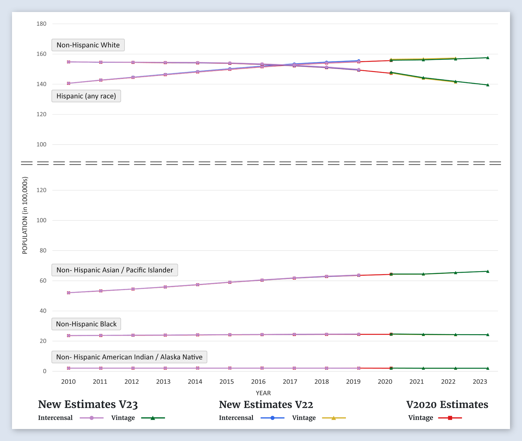
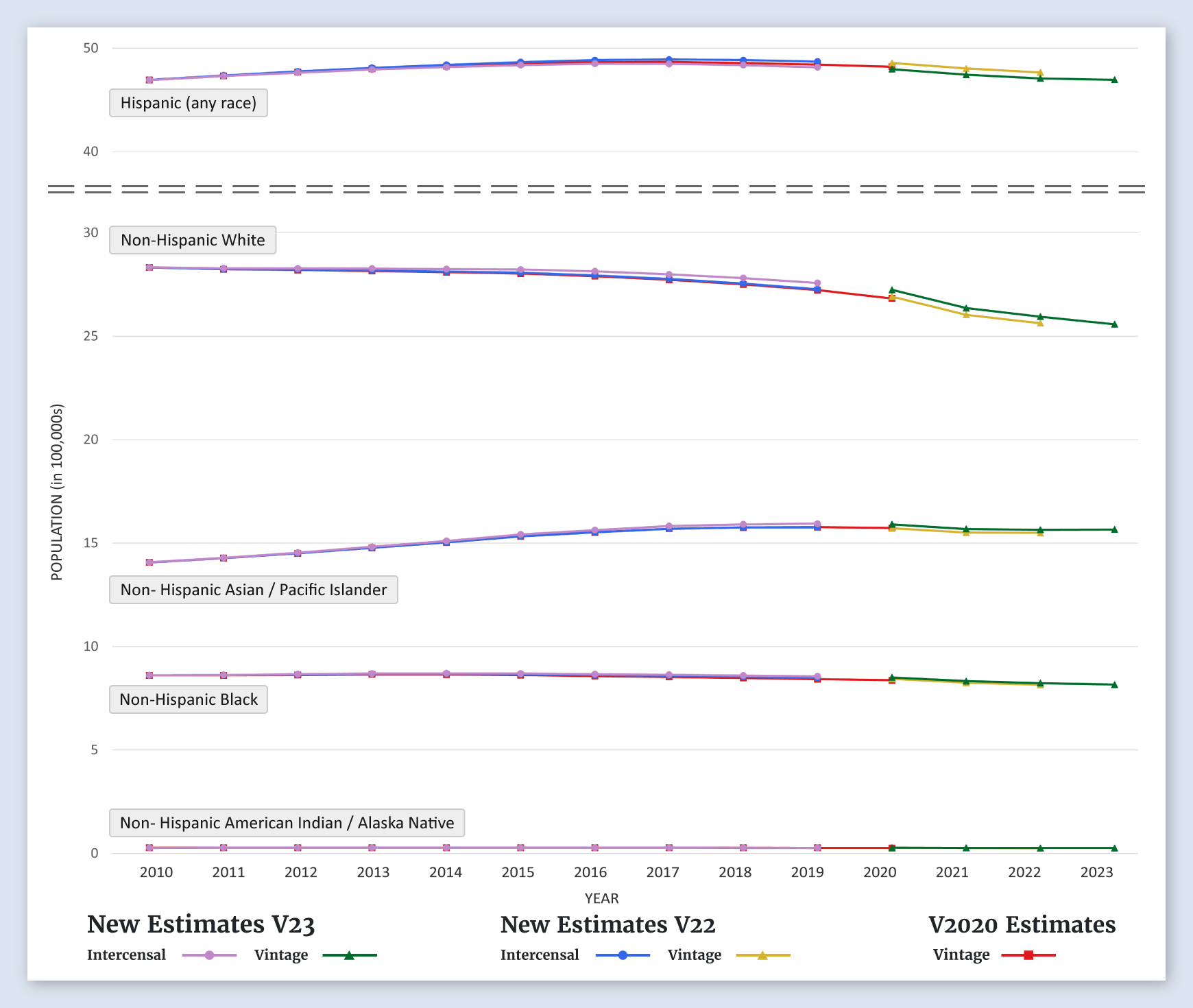
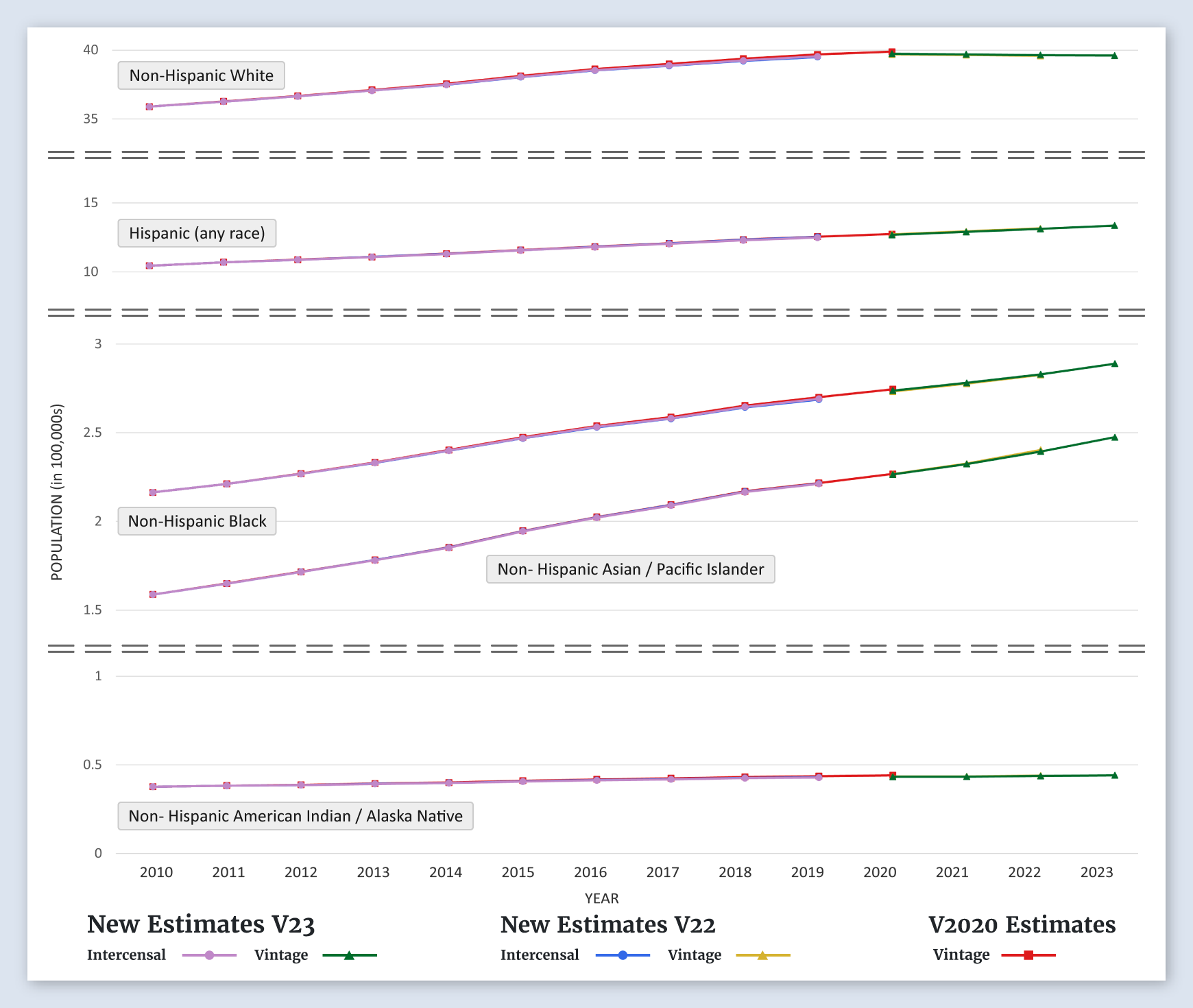
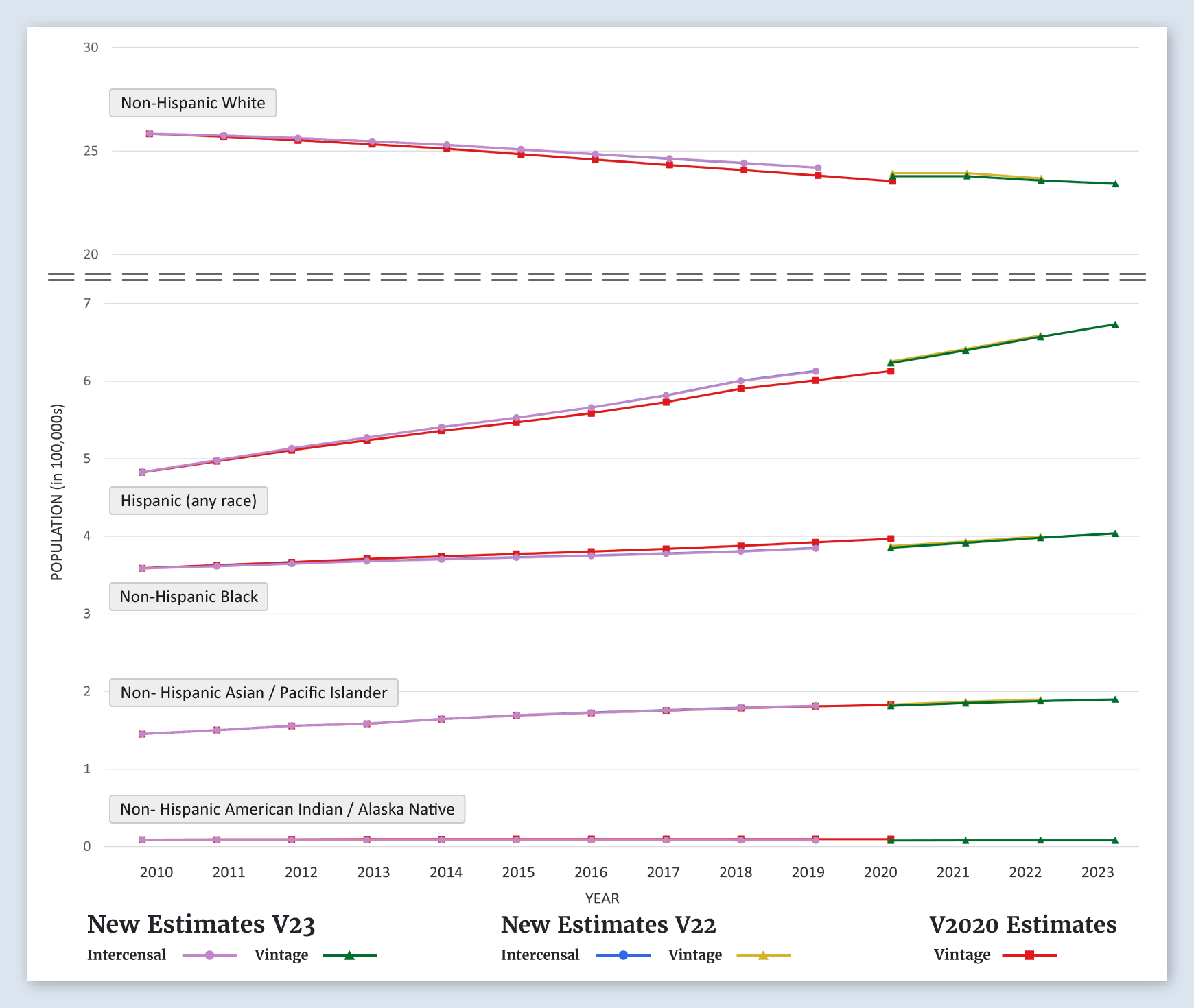
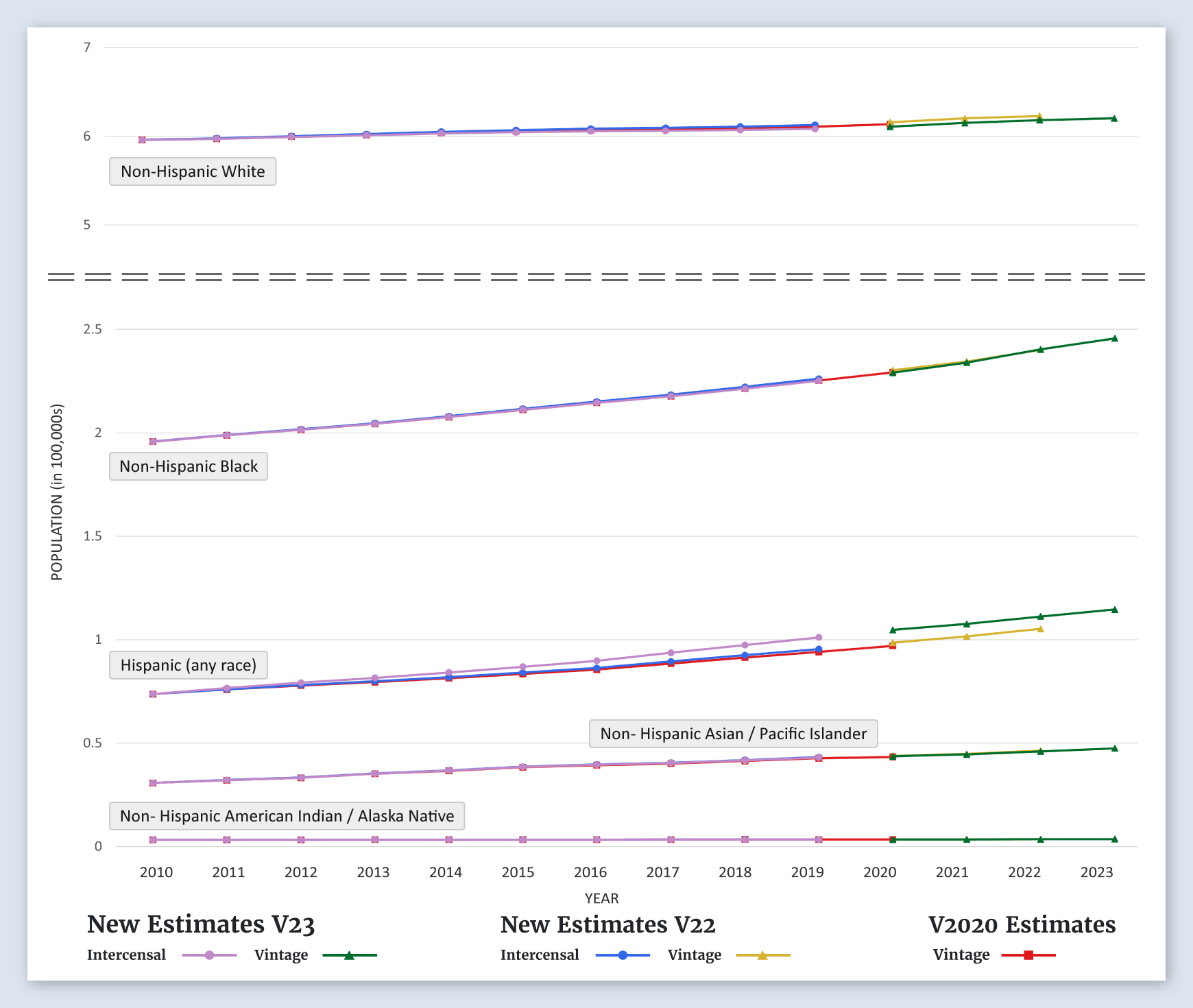
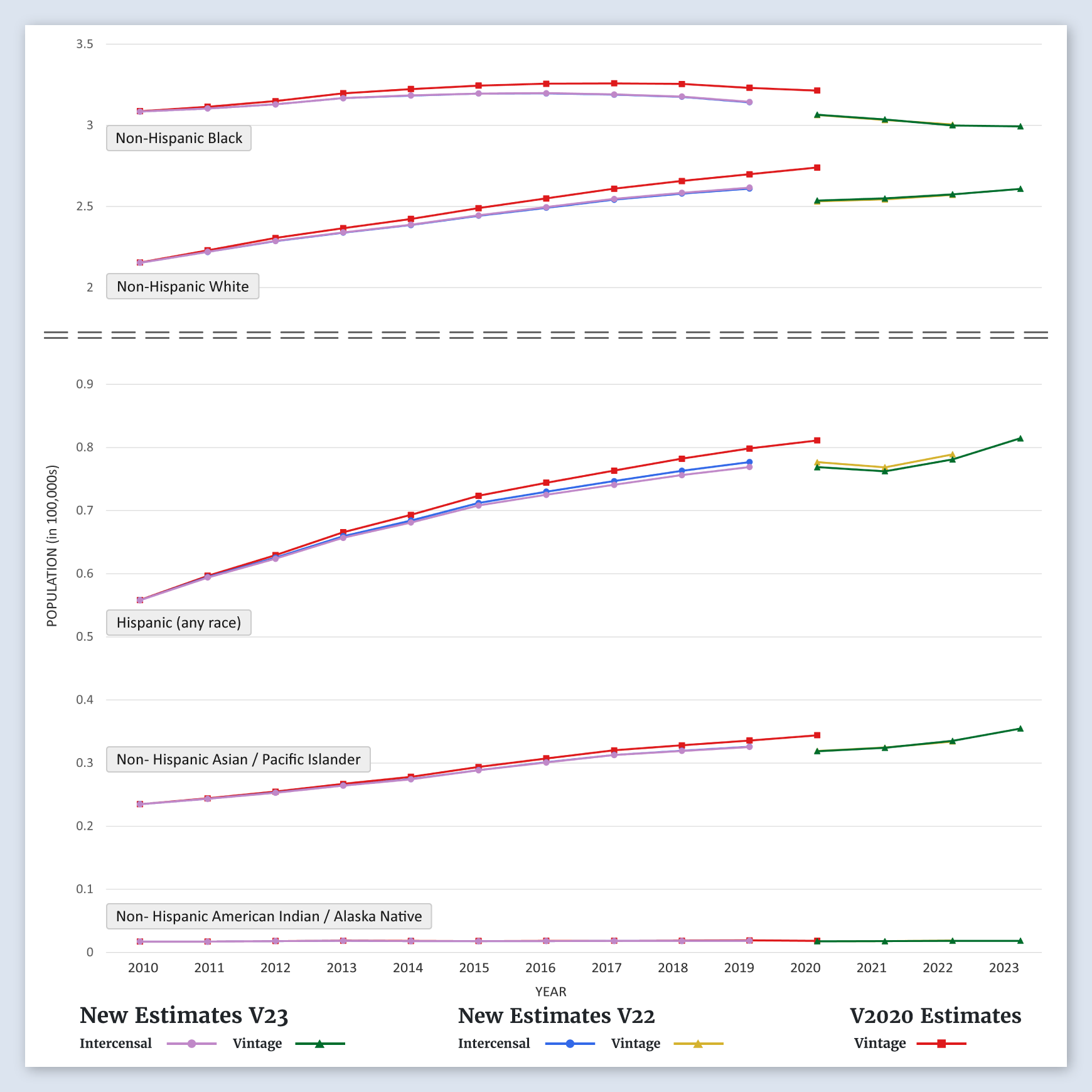
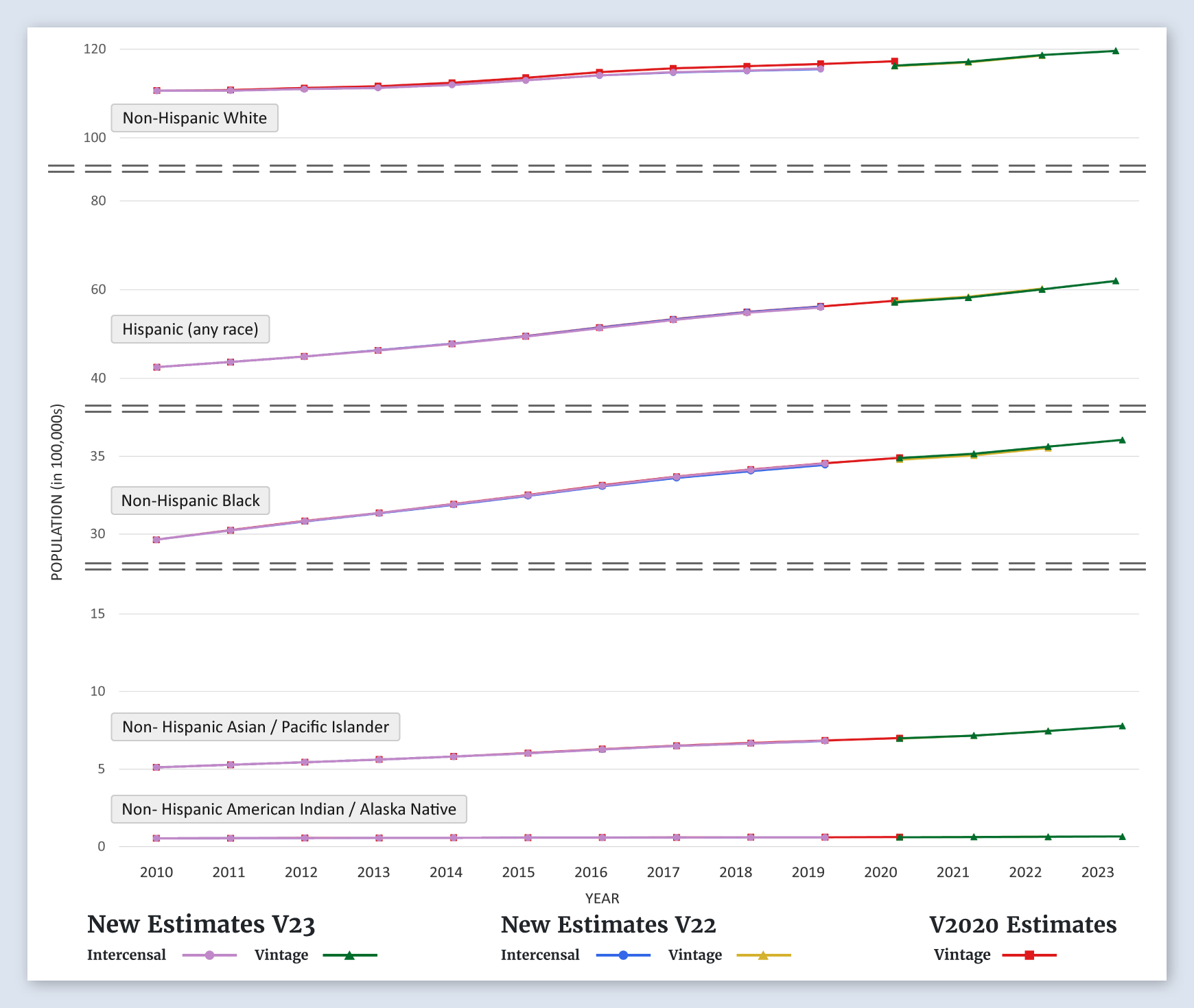
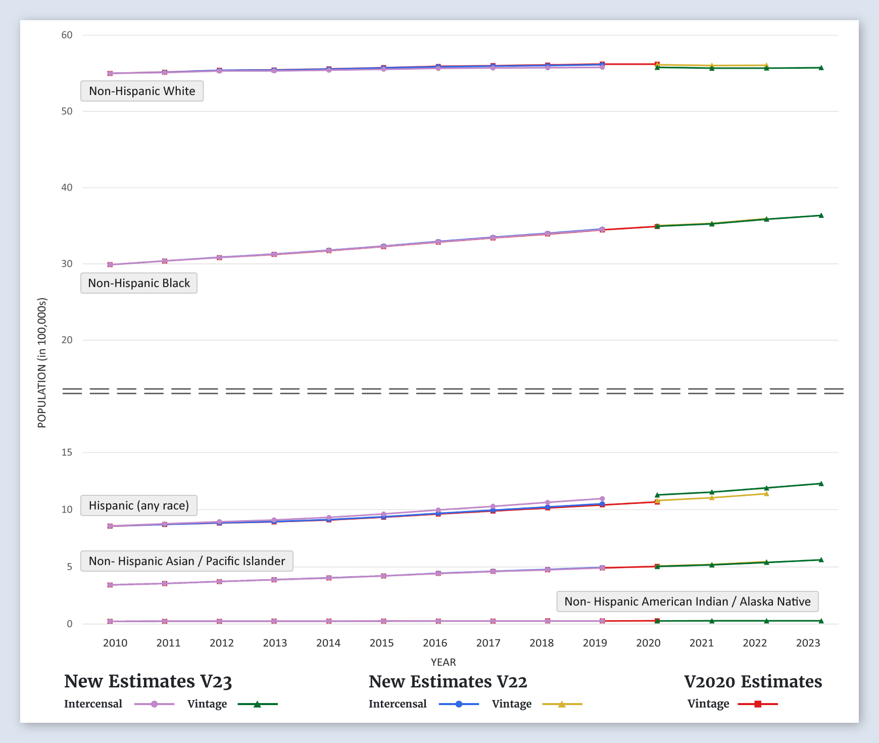
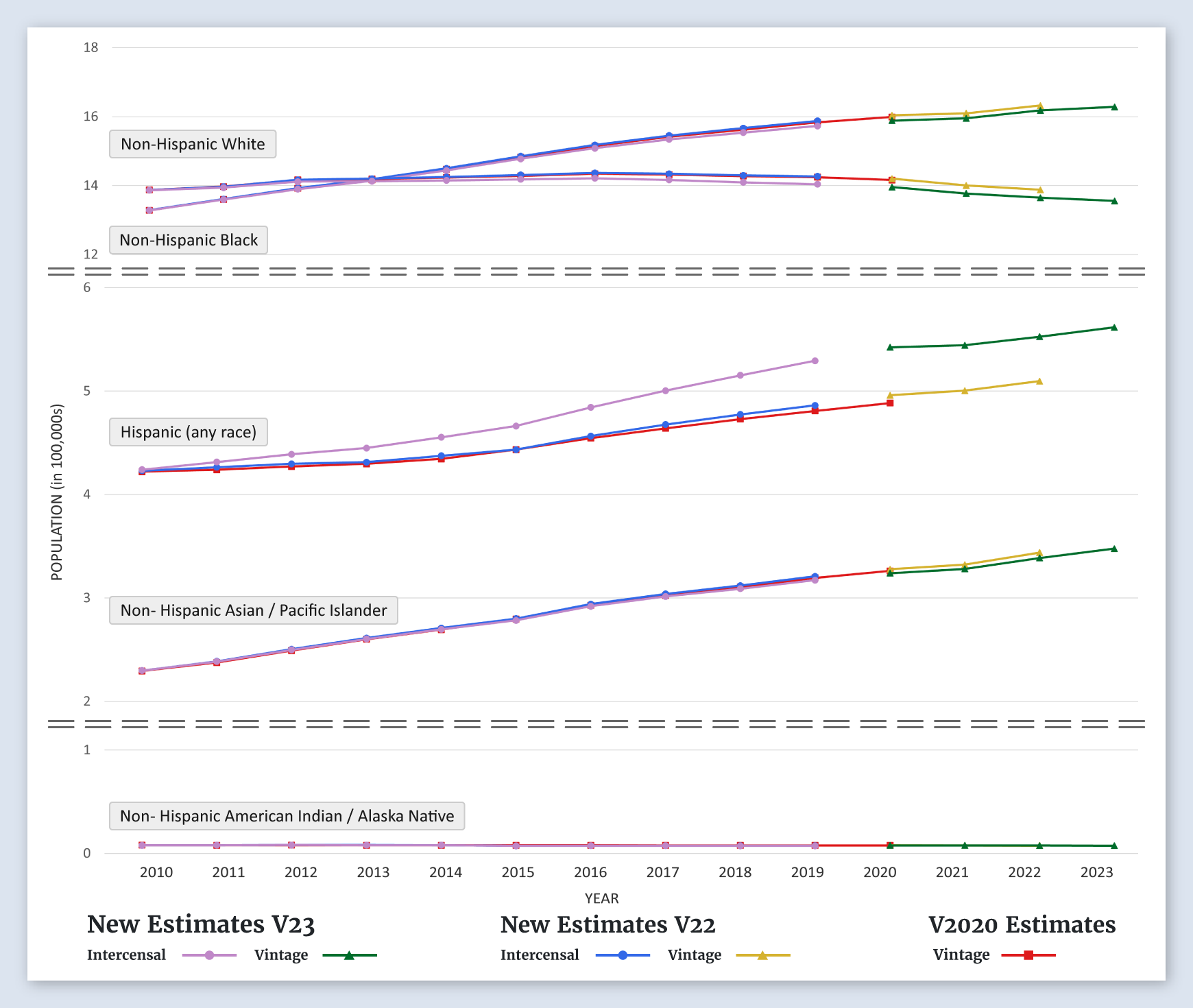
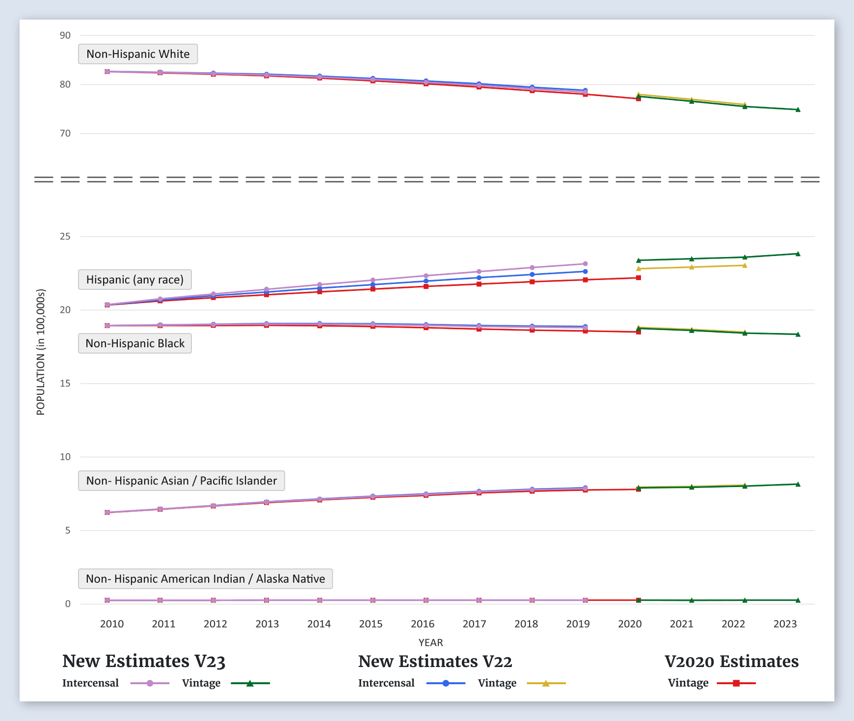
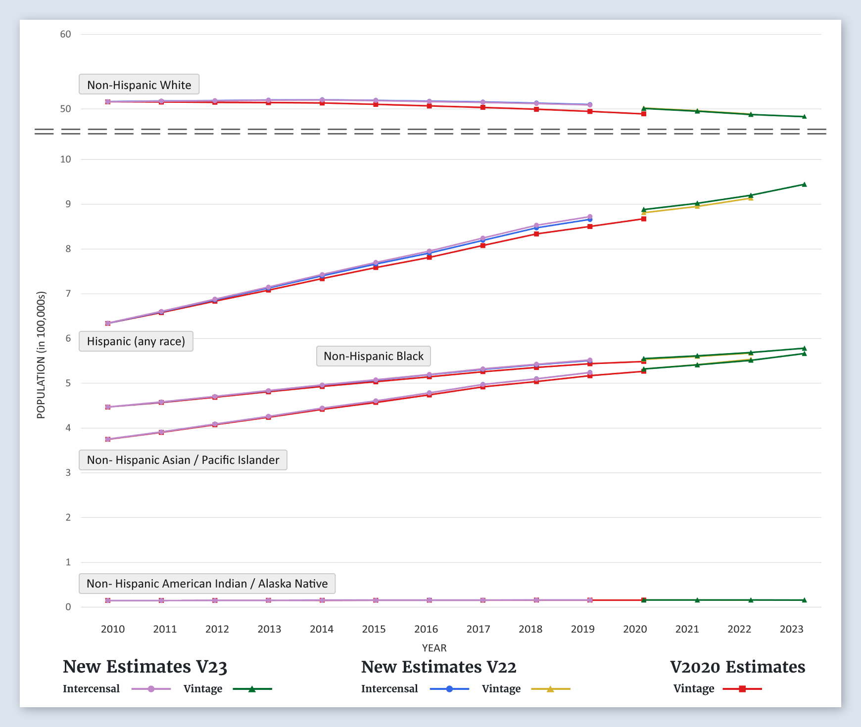
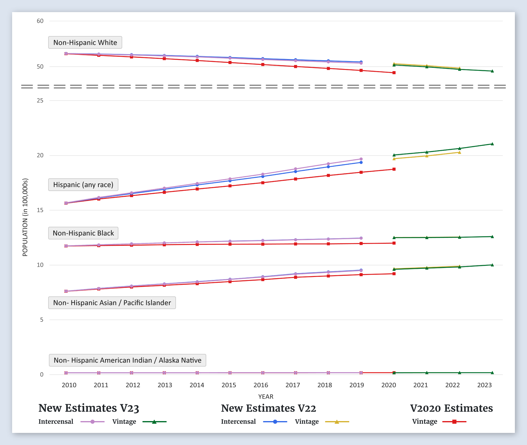
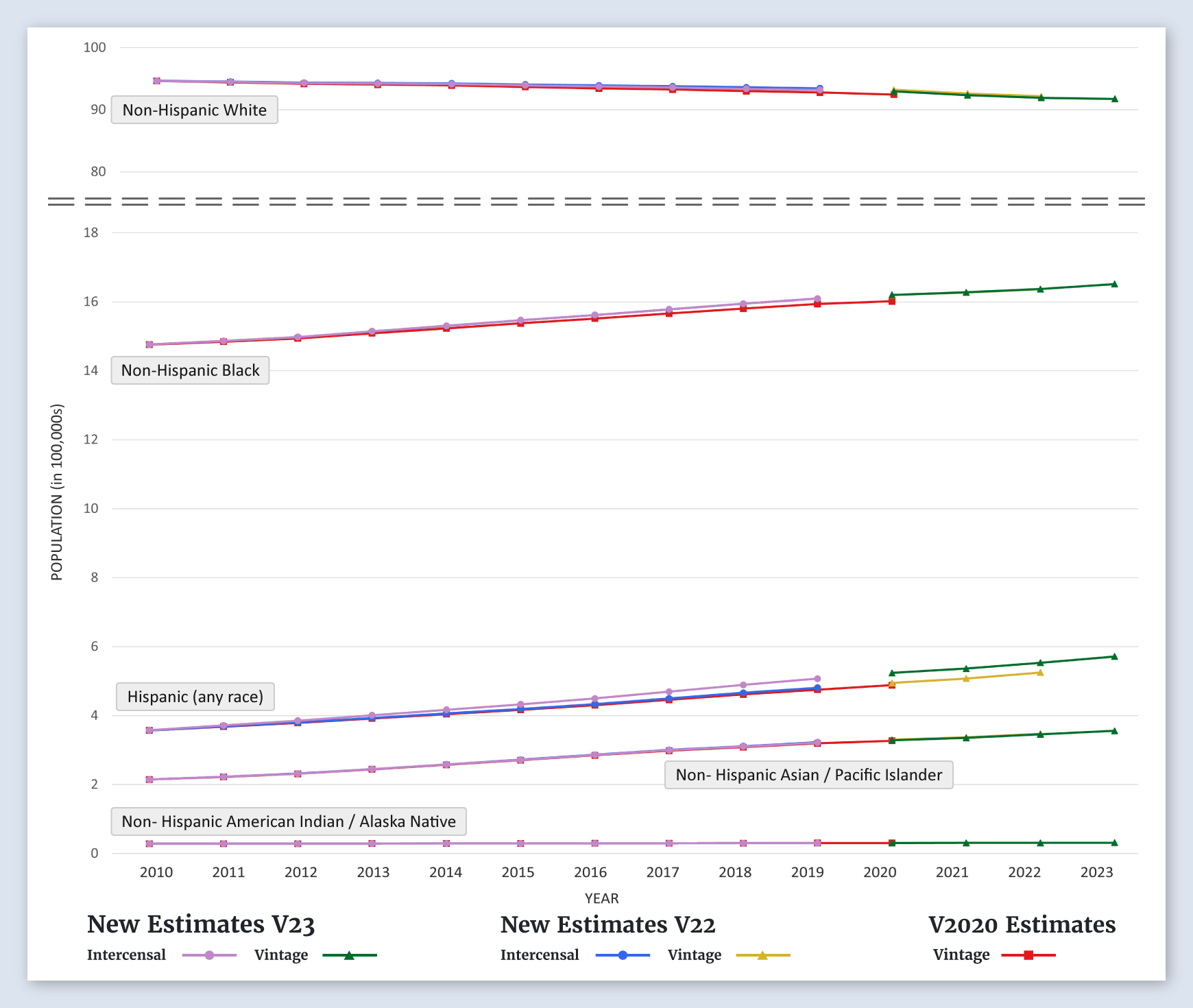
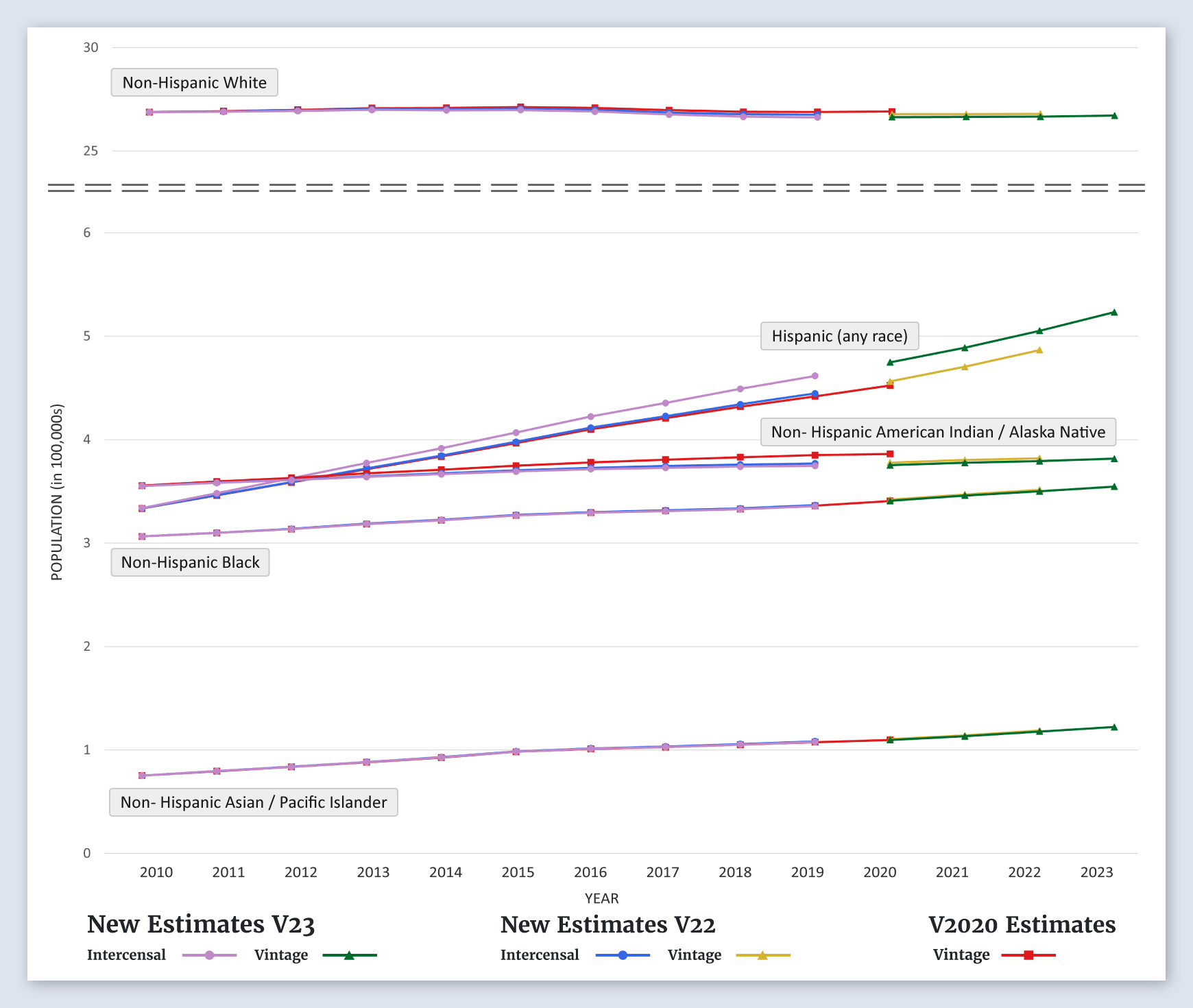
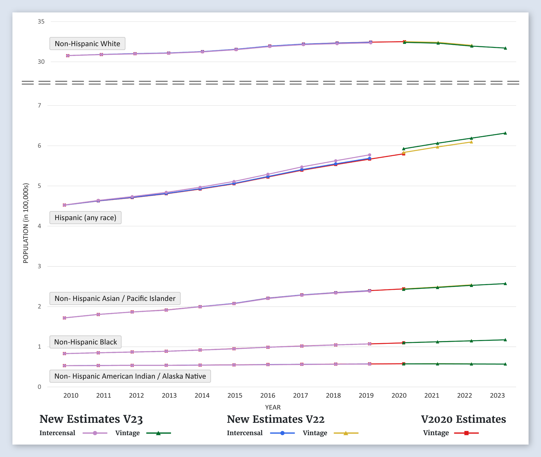
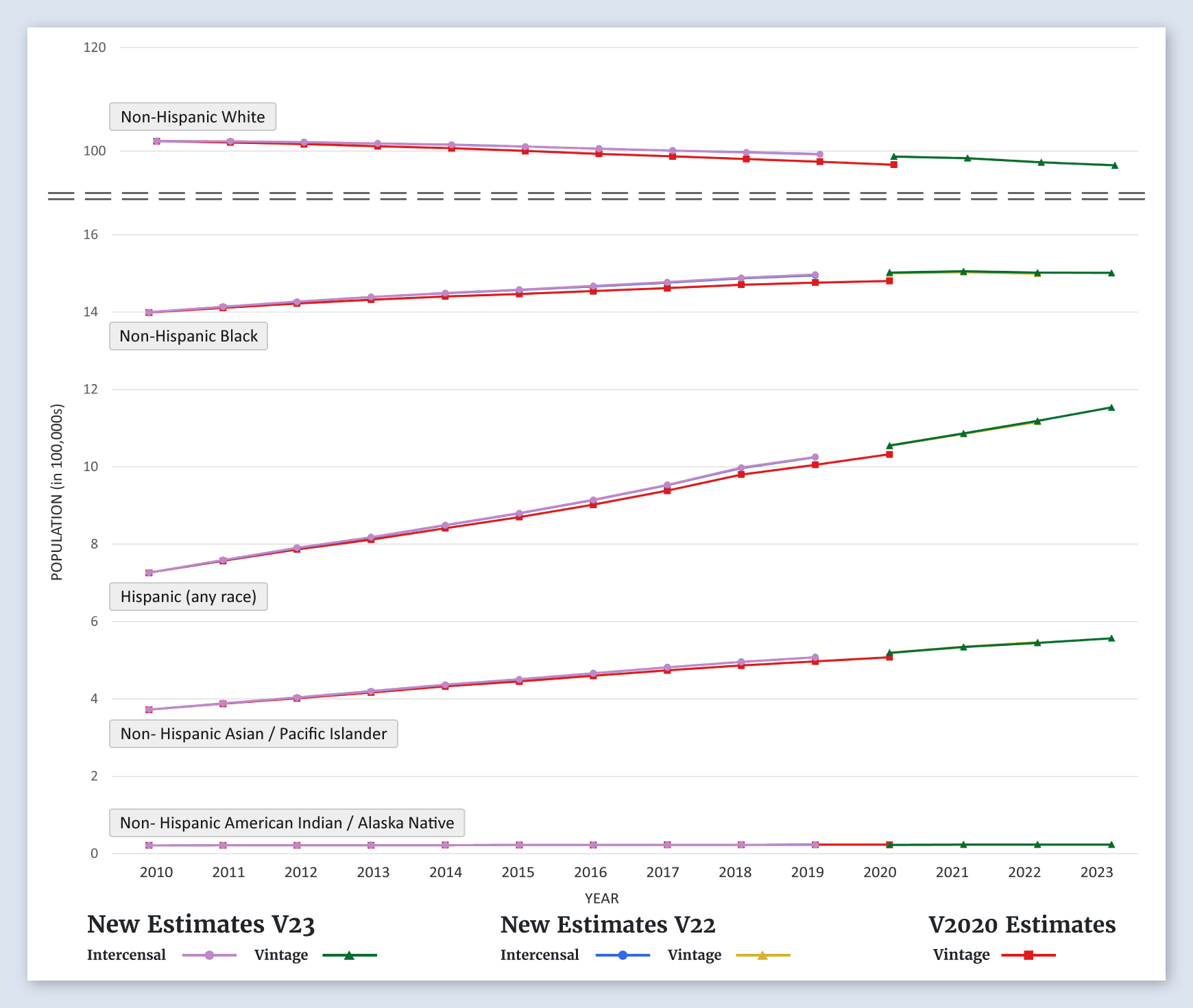
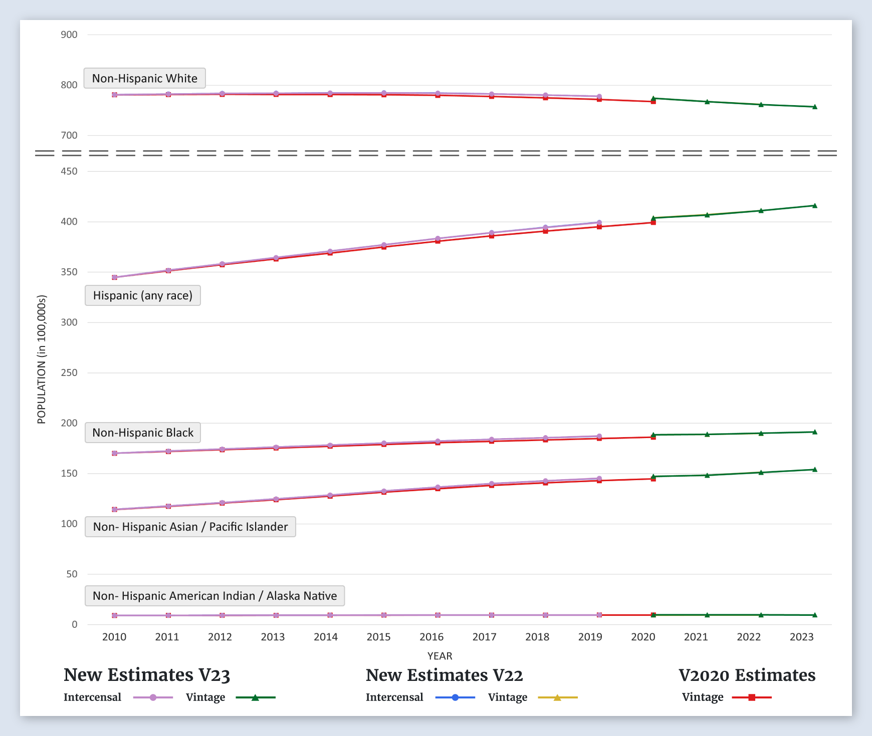
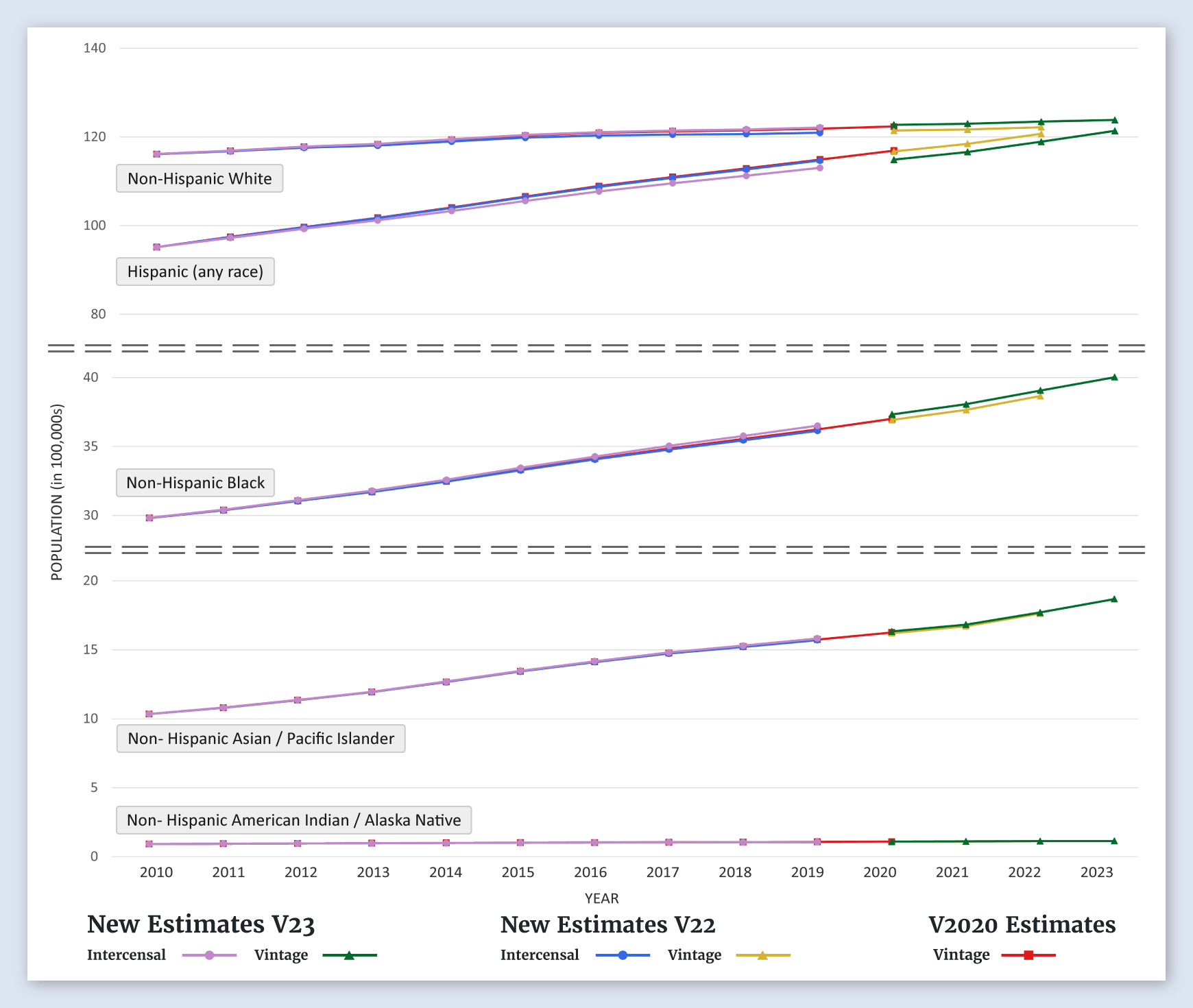
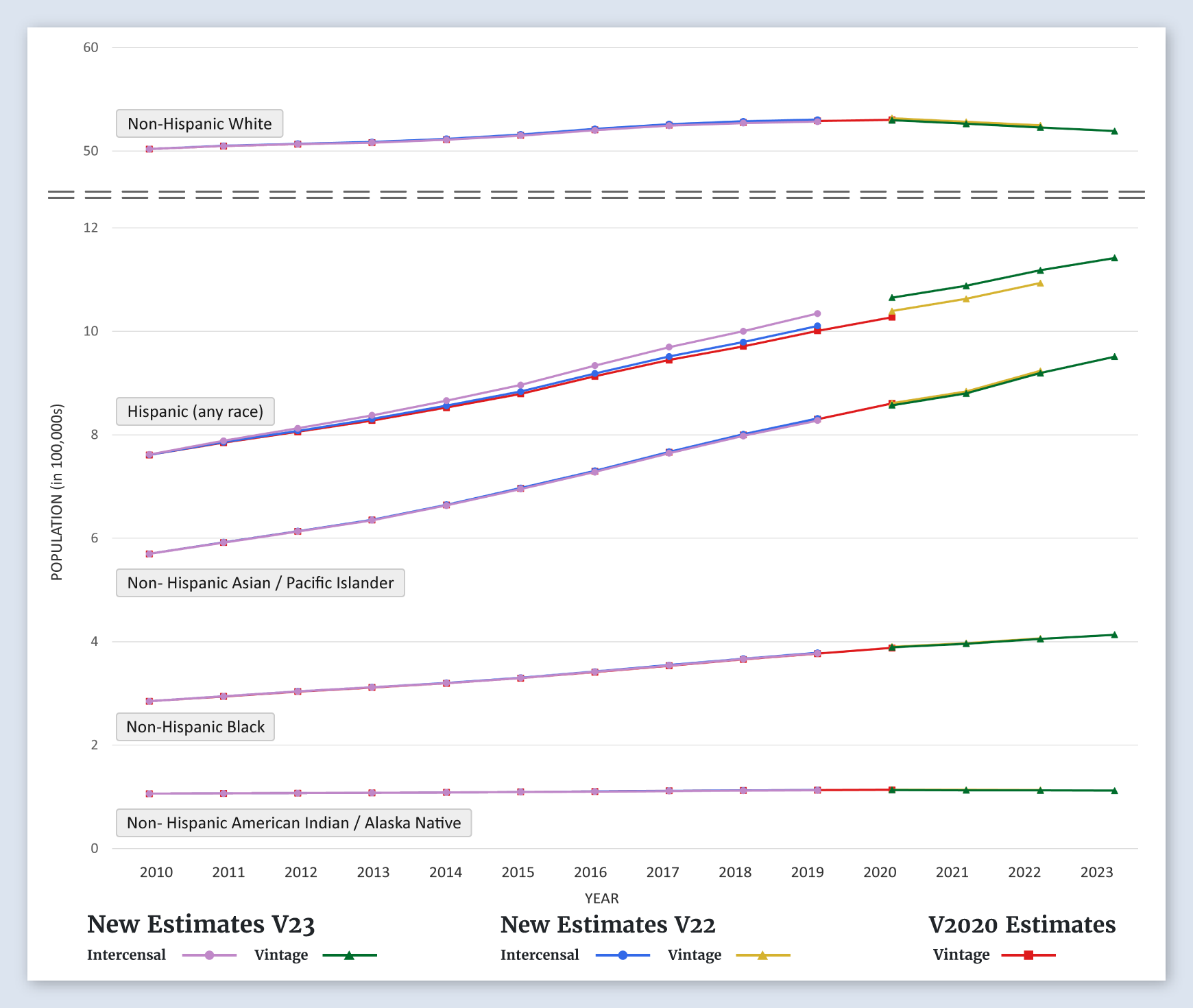
Total United States
Populations by Race/Ethnicity
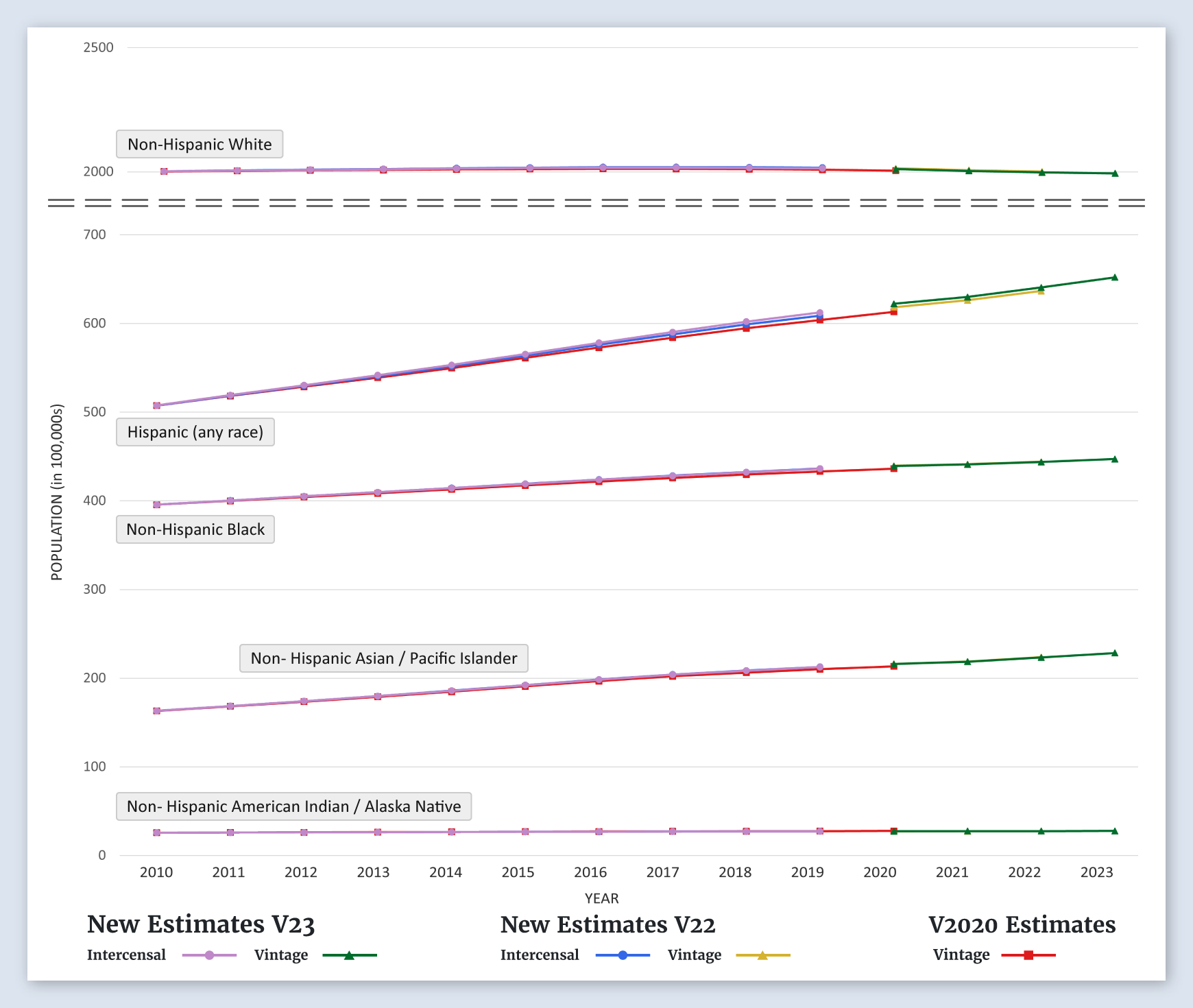
For the United States, the new estimates for non-Hispanic Whites, Hispanic, non-Hispanic Blacks, Non-Hispanic Asian/Pacific Islanders, and non-Hispanic American Indian/Alaska Natives are about the same as the previous estimates.
-
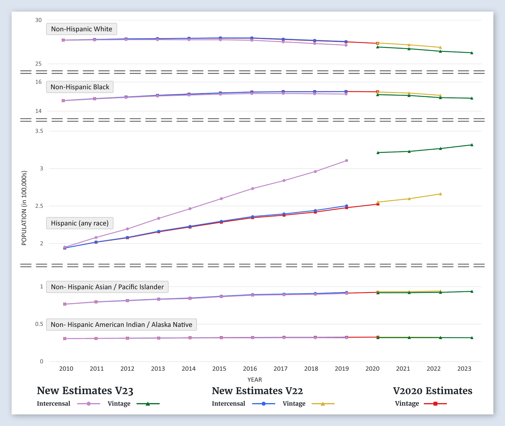
Alabama
Populations by Race/Ethnicity
For Alabama the new estimates for all race/ethnicity groups, non-Hispanic White, Hispanic, non-Hispanic Black, Non-Hispanic Asian/Pacific Islander, and non-Hispanic American Indian/Alaska Native, are about the same as the previous estimates.
-
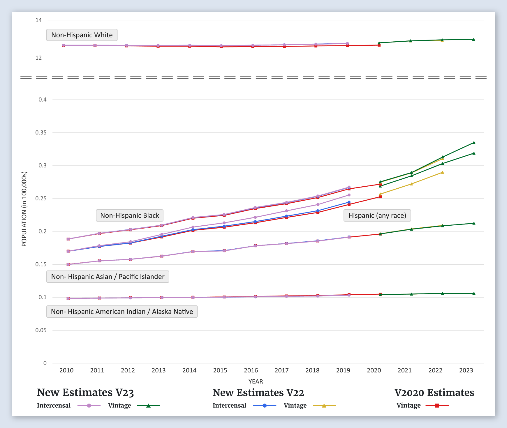
Alaska
Populations by Race/Ethnicity
For Alaska the new estimates for all race/ethnicity groups, non-Hispanic White, Hispanic, non-Hispanic Black, Non-Hispanic Asian/Pacific Islander, and non-Hispanic American Indian/Alaska Native, are about the same as the previous estimates.
-
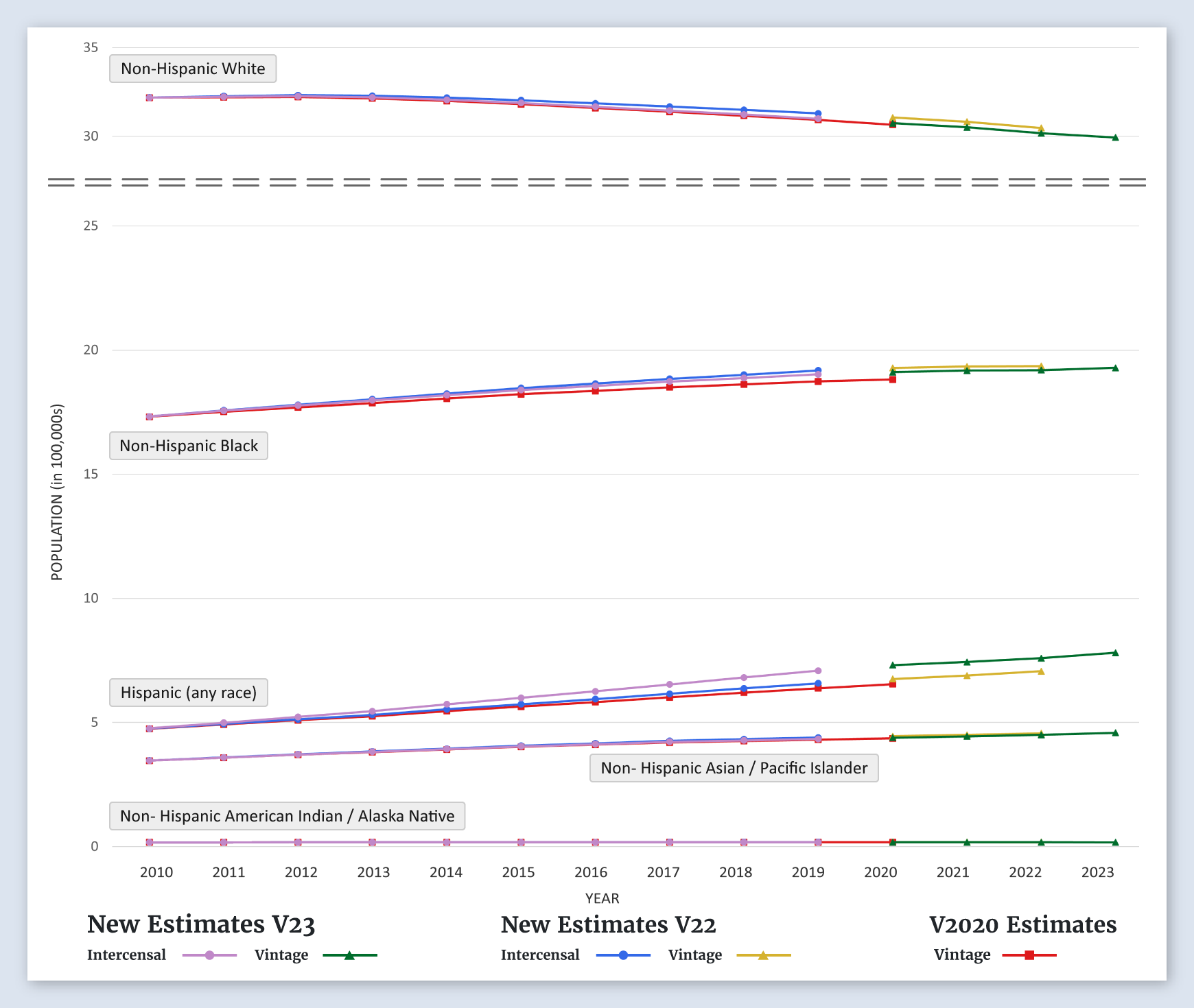
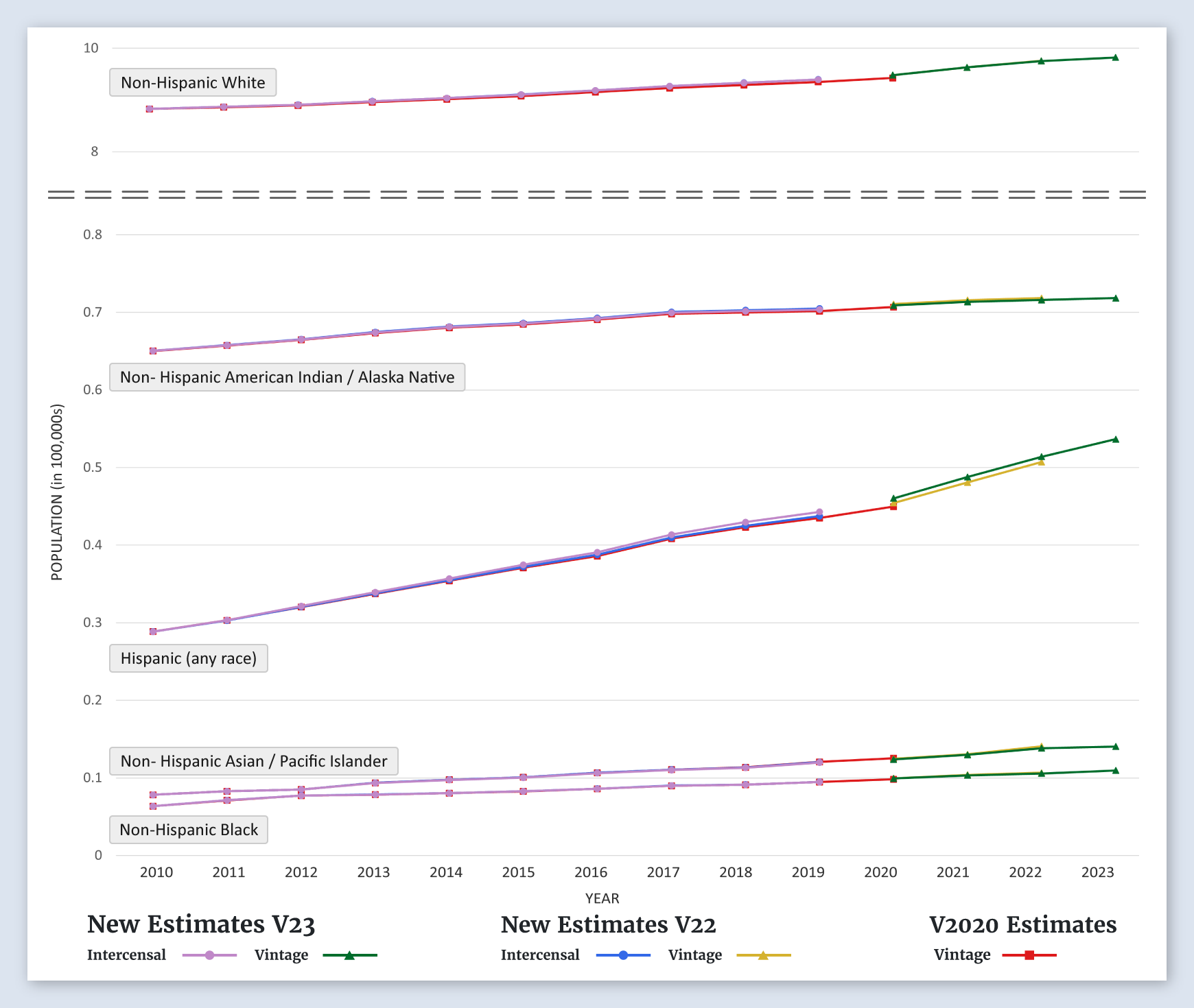
Arizona
Populations by Race/Ethnicity
For Arizona the new estimates for all race/ethnicity groups, non-Hispanic White, Hispanic, non-Hispanic Black, and Non-Hispanic Asian/Pacific Islander, are slightly lower than the previous estimates.
-
Arkansas
Populations by Race/Ethnicity
For Arkansas the new estimates for all race/ethnicity groups, non-Hispanic White, Hispanic, non-Hispanic Black, Non-Hispanic Asian/Pacific Islander, and non-Hispanic American Indian/Alaska Native, are about the same as the previous estimates.
-
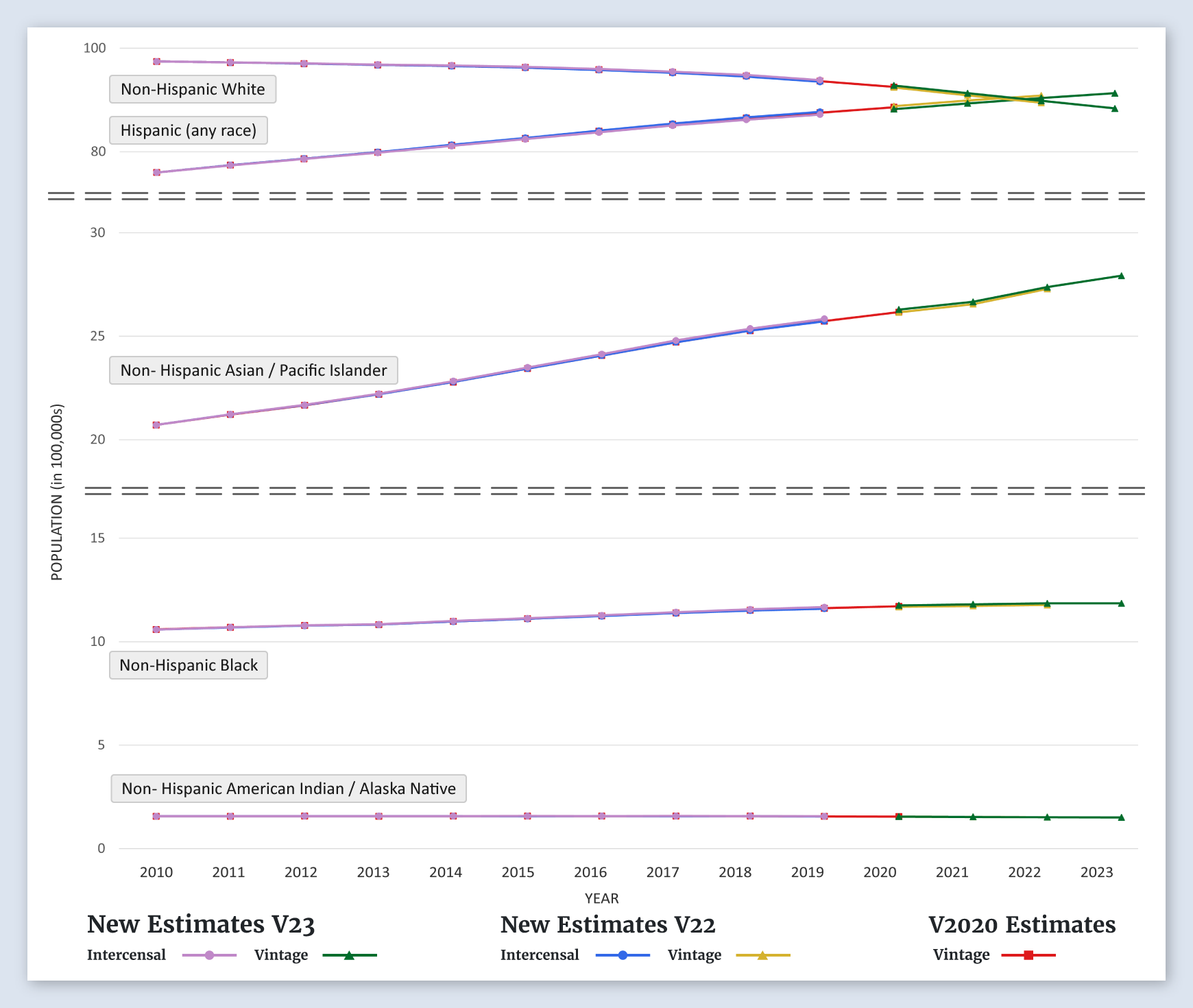
California
Populations by Race/Ethnicity
For California the new estimates for all race/ethnicity groups, non-Hispanic White, Hispanic, non-Hispanic Black, Non-Hispanic Asian/Pacific Islander, and non-Hispanic American Indian/Alaska Native, are about the same as the previous estimates.
-
Greater California SEER Area
Populations by Race/Ethnicity
For the greater California SEER area the new estimates for all race/ethnicity groups, non-Hispanic White, Hispanic, non-Hispanic Black, Non-Hispanic Asian/Pacific Islander, and non-Hispanic American Indian/Alaska Native, are about the same as the previous estimates.
-
San Francisco-Oakland SMSA SEER Area
Populations by Race/Ethnicity
For the San Fransisco-Oakland SEER area the new estimates for all race/ethnicity groups, non-Hispanic White, Hispanic, non-Hispanic Black, Non-Hispanic Asian/Pacific Islander, and non-Hispanic American Indian/Alaska Native, are about the same as the previous estimates.
-
San Jose-Monterey SEER Area
Populations by Race/Ethnicity
For the San Jose-Monterey SEER area the new estimates for all race/ethnicity groups, non-Hispanic White, Hispanic, non-Hispanic Black, Non-Hispanic Asian/Pacific Islander, and non-Hispanic American Indian/Alaska Native, are about the same as the previous estimates.
-
Los Angeles SEER Area
Populations by Race/Ethnicity
For the Los Angeles SEER area the new estimates for all race/ethnicity groups, non-Hispanic White, Hispanic, non-Hispanic Black, Non-Hispanic Asian/Pacific Islander, and non-Hispanic American Indian/Alaska Native, are about the same as the previous estimates.
-
Colorado
Populations by Race/Ethnicity
For Colorado, the new estimates for all race/ethnicity groups, non-Hispanic White, Hispanic, non-Hispanic Black, Non-Hispanic Asian/Pacific Islander, and non-Hispanic American Indian/Alaska Native, are about the same as the previous estimates.
-
Connecticut
Populations by Race/Ethnicity
For Connecticut, the new estimates for all race/ethnicity groups, non-Hispanic White, Hispanic, non-Hispanic Black, Non-Hispanic Asian/Pacific Islander, and non-Hispanic American Indian/Alaska Native, are about the same as the previous estimates.
-
Delaware
Populations by Race/Ethnicity
For Delaware, the new estimates for all race/ethnicity groups, non-Hispanic White, Hispanic, non-Hispanic Black, Non-Hispanic Asian/Pacific Islander, and non-Hispanic American Indian/Alaska Native, are about the same as the previous estimates.
-
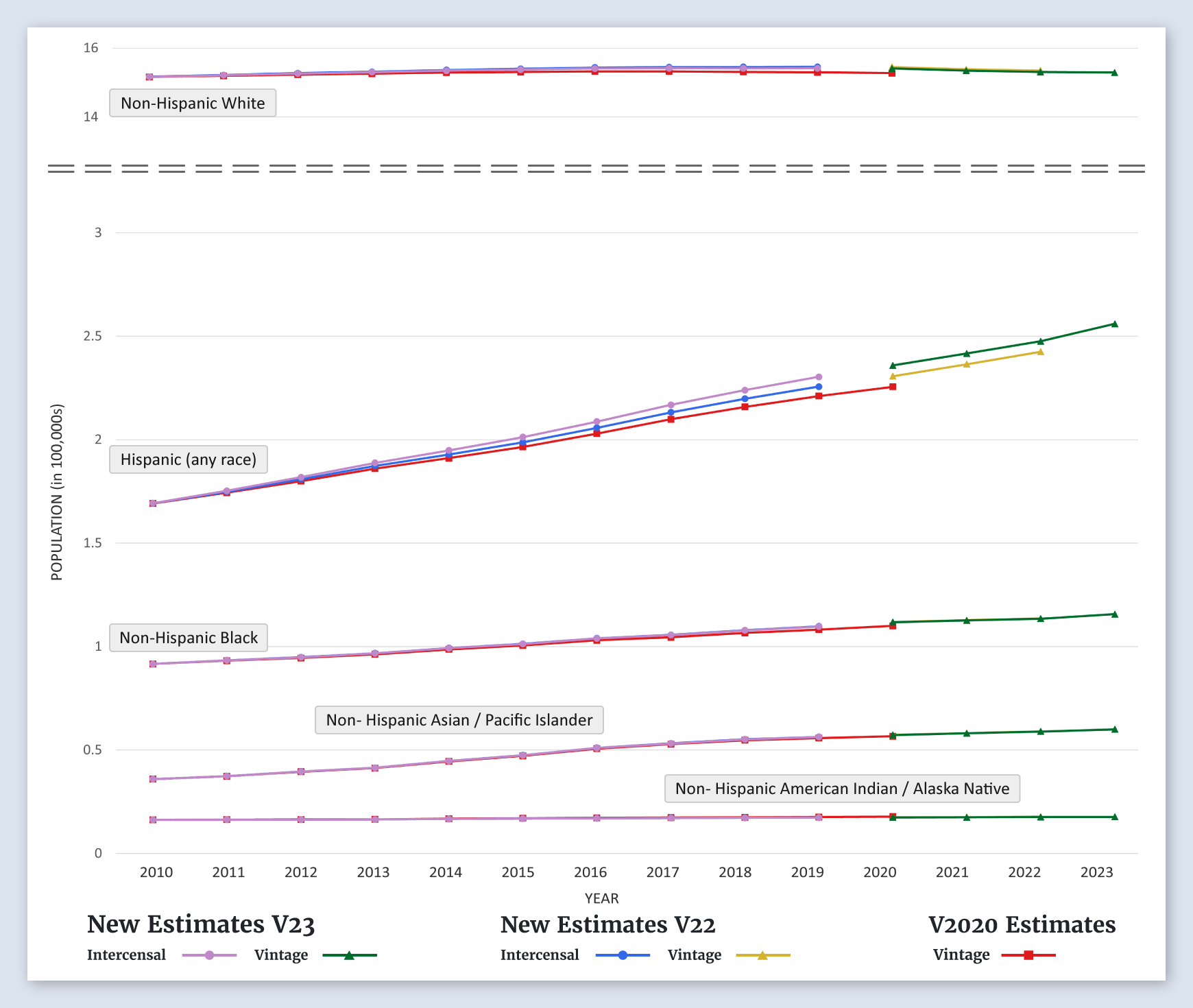
District of Columbia (Washington, D.C.)
Populations by Race/Ethnicity
For the District of Columbia, the new estimates for non-Hispanic Whites and non-Hispanic Blacks are lower than the previous estimates. The new estimates for Hispanics, Non-Hispanic Asian/Pacific Islanders, and non-Hispanic American Indian/Alaska Natives are about the same as the previous estimates.
-
Florida
Populations by Race/Ethnicity
For Florida, the new estimates for all race/ethnicity groups, non-Hispanic White, Hispanic, non-Hispanic Black, Non-Hispanic Asian/Pacific Islander, and non-Hispanic American Indian/Alaska Native, are about the same as the previous estimates.
-
Georgia
Populations by Race/Ethnicity
For Georgia, the new estimates for all race/ethnicity groups, non-Hispanic White, Hispanic, non-Hispanic Black, Non-Hispanic Asian/Pacific Islander, and non-Hispanic American Indian/Alaska Native, are about the same as the previous estimates.
-
Atlanta (Metropolitan) SEER Area
Populations by Race/Ethnicity
For the Atlanta (Metropolitan) SEER area, the new estimates for all race/ethnicity groups, non-Hispanic White, Hispanic, non-Hispanic Black, Non-Hispanic Asian/Pacific Islander, and non-Hispanic American Indian/Alaska Native, are about the same as the previous estimates.
-
Greater Georgia SEER Area
Populations by Race/Ethnicity
For the greater Georgia SEER area, the new estimates for all race/ethnicity groups, non-Hispanic White, Hispanic, non-Hispanic Black, Non-Hispanic Asian/Pacific Islander, and non-Hispanic American Indian/Alaska Native, are about the same as the previous estimates.
-
Rural Georgia SEER Area
Populations by Race/Ethnicity
For the rural Georgia SEER area, the new estimates for all race/ethnicity groups, non-Hispanic White, Hispanic, non-Hispanic Black, Non-Hispanic Asian/Pacific Islander, and non-Hispanic American Indian/Alaska Native, are about the same as the previous estimates.
-
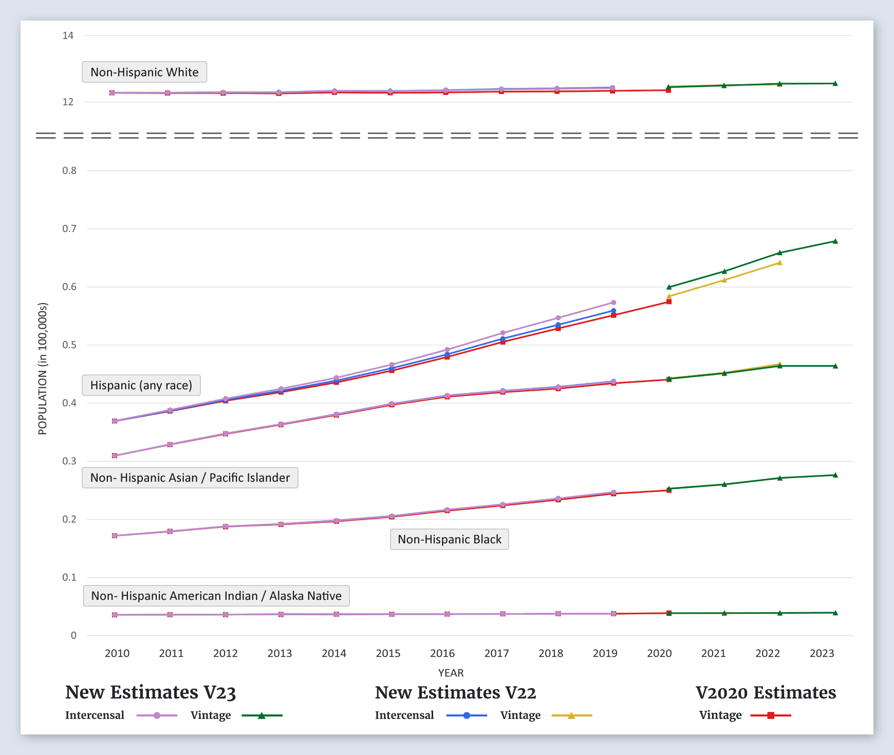
Hawaii
Populations by Race/Ethnicity
For Hawaii, the new estimates for non-Hispanic Whites and non-Hispanic Asian/Pacific Islanders, are higher than the previous estimates. The new estimates for Hispanics, Non-Hispanic Blacks, and non-Hispanic American Indian/Alaska Natives are about the same as the previous estimates.
-
Idaho
Populations by Race/Ethnicity
For Idaho, the new estimates for all race/ethnicity groups, non-Hispanic White, Hispanic, non-Hispanic Black, and Non-Hispanic Asian/Pacific Islander, are about the same as the previous estimates.
-
Illinois
Populations by Race/Ethnicity
For Illinois, the new estimates for all race/ethnicity groups, non-Hispanic White, Hispanic, non-Hispanic Black, Non-Hispanic Asian/Pacific Islander, and non-Hispanic American Indian/Alaska Native, are about the same as the previous estimates.
-
Indiana
Populations by Race/Ethnicity
For Indiana, the new estimates for all race/ethnicity groups, non-Hispanic White, Hispanic, non-Hispanic Black, Non-Hispanic Asian/Pacific Islander, and non-Hispanic American Indian/Alaska Native, are about the same as the previous estimates.
-
Iowa
Populations by Race/Ethnicity
For Iowa, the new estimates for all race/ethnicity groups, non-Hispanic White, Hispanic, non-Hispanic Black, Non-Hispanic Asian/Pacific Islander, and non-Hispanic American Indian/Alaska Native, are about the same as the previous estimates.
-
Kansas
Populations by Race/Ethnicity
For Kansas, the new estimates for all race/ethnicity groups, non-Hispanic White, Hispanic, non-Hispanic Black, Non-Hispanic Asian/Pacific Islander, and non-Hispanic American Indian/Alaska Native, are about the same as the previous estimates.
-
Kentucky
Populations by Race/Ethnicity
For Kentucky, the new estimates for all race/ethnicity groups, non-Hispanic White, Hispanic, non-Hispanic Black, Non-Hispanic Asian/Pacific Islander, and non-Hispanic American Indian/Alaska Native, are about the same as the previous estimates.
-
Louisiana
Populations by Race/Ethnicity
For Louisiana, the new estimates for all race/ethnicity groups, non-Hispanic White, Hispanic, non-Hispanic Black, Non-Hispanic Asian/Pacific Islander, and non-Hispanic American Indian/Alaska Native, are about the same as the previous estimates.
-
Maine
Populations by Race/Ethnicity
For Maine, the new estimates for all race/ethnicity groups, non-Hispanic White, Hispanic, non-Hispanic Black, Non-Hispanic Asian/Pacific Islander, and non-Hispanic American Indian/Alaska Native, are about the same as the previous estimates.
-
Maryland
Populations by Race/Ethnicity
For Maryland, the new estimates for all race/ethnicity groups, non-Hispanic White, Hispanic, non-Hispanic Black, Non-Hispanic Asian/Pacific Islander, and non-Hispanic American Indian/Alaska Native, are about the same as the previous estimates.
-
Massachusetts
Populations by Race/Ethnicity
For Massachusetts, the new estimates for non-Hispanic Whites, non-Hispanic Blacks, Hispanics, Non-Hispanic Asian/Pacific Islanders, and non-Hispanic American Indian/Alaska Natives are about the same as the previous estimates.
-
Michigan
Populations by Race/Ethnicity
For Michigan, the new estimates for non-Hispanic Whites, non-Hispanic Blacks, Hispanics, Non-Hispanic Asian/Pacific Islanders, and non-Hispanic American Indian/Alaska Natives are about the same as the previous estimates.
-
Minnesota
Populations by Race/Ethnicity
For Minnesota, the new estimates for non-Hispanic Whites, non-Hispanic Blacks, Hispanics, Non-Hispanic Asian/Pacific Islanders, and non-Hispanic American Indian/Alaska Natives are about the same as the previous estimates.
-
Mississippi
Populations by Race/Ethnicity
For Mississippi, the new estimates for all race/ethnicity groups, non-Hispanic White, Hispanic, non-Hispanic Black, Non-Hispanic Asian/Pacific Islander, and non-Hispanic American Indian/Alaska Native, are about the same as the previous estimates.
-
Missouri
Populations by Race/Ethnicity
For Missouri, the new estimates for non-Hispanic Whites, non-Hispanic Blacks, Hispanics, Non-Hispanic Asian/Pacific Islanders, and non-Hispanic American Indian/Alaska Natives are about the same as the previous estimates.
-
Montana
Populations by Race/Ethnicity
For Montana, the new estimates for all race/ethnicity groups, non-Hispanic White, Hispanic, non-Hispanic Black, Non-Hispanic Asian/Pacific Islander, and non-Hispanic American Indian/Alaska Native, are about the same as the previous estimates.
-
Nebraska
Populations by Race/Ethnicity
For Nebraska, the new estimates for non-Hispanic Whites, non-Hispanic Blacks, Hispanics, Non-Hispanic Asian/Pacific Islanders, and non-Hispanic American Indian/Alaska Natives are about the same as the previous estimates.
-
Nevada
Populations by Race/Ethnicity

For Nevada, the new estimates for all race/ethnicity groups, non-Hispanic White, Hispanic, non-Hispanic Black, Non-Hispanic Asian/Pacific Islander, and non-Hispanic American Indian/Alaska Native, are about the same as the previous estimates.
-
New Hampshire
Populations by Race/Ethnicity
For New Hampshire, the new estimates for non-Hispanic Whites, non-Hispanic Blacks, Hispanics, Non-Hispanic Asian/Pacific Islanders, and non-Hispanic American Indian/Alaska Natives are about the same as the previous estimates.
-
New Jersey
Populations by Race/Ethnicity
For New Jersey, the new estimates for non-Hispanic Whites and Hispanics are higher than previous estimates. The new estimates for non-Hispanic Blacks, Non-Hispanic Asian/Pacific Islanders, and non-Hispanic American Indian/Alaska Natives are about the same as the previous estimates.
-
New Mexico
Populations by Race/Ethnicity
For New Mexico, the new estimates for non-Hispanic Whites and Hispanics are higher than previous estimates. The new estimates for non-Hispanic Blacks, Non-Hispanic Asian/Pacific Islanders, and non-Hispanic American Indian/Alaska Natives are about the same as the previous estimates.
-
New York
Populations by Race/Ethnicity
For New York, the new estimates for non-Hispanic Whites are higher than previous estimates. The new estimates for Hispanics, non-Hispanic Blacks, Non-Hispanic Asian/Pacific Islanders, and non-Hispanic American Indian/Alaska Natives are about the same as the previous estimates.
-
North Carolina
Populations by Race/Ethnicity
For North Carolina, the new estimates for all race/ethnicity groups, non-Hispanic White, Hispanic, non-Hispanic Black, Non-Hispanic Asian/Pacific Islander, and non-Hispanic American Indian/Alaska Native, are about the same as the previous estimates.
-
North Dakota
Populations by Race/Ethnicity
For North Dakota, the new estimates for all race/ethnicity groups, non-Hispanic White, Hispanic, non-Hispanic Black, Non-Hispanic Asian/Pacific Islander, and non-Hispanic American Indian/Alaska Native, are about the same as the previous estimates.
-
Ohio
Populations by Race/Ethnicity
For Ohio, the new estimates for all race/ethnicity groups, non-Hispanic White, Hispanic, non-Hispanic Black, Non-Hispanic Asian/Pacific Islander, and non-Hispanic American Indian/Alaska Native, are about the same as the previous estimates.
-
Oklahoma
Populations by Race/Ethnicity
For Oklahoma, the new estimates for all race/ethnicity groups, non-Hispanic White, Hispanic, non-Hispanic Black, Non-Hispanic Asian/Pacific Islander, and non-Hispanic American Indian/Alaska Native, are about the same as the previous estimates.
-
Oregon
Populations by Race/Ethnicity
For Oregon, the new estimates for all race/ethnicity groups, non-Hispanic White, Hispanic, non-Hispanic Black, Non-Hispanic Asian/Pacific Islander, and non-Hispanic American Indian/Alaska Native, are about the same as the previous estimates.
-
Pennsylvania
Populations by Race/Ethnicity
For Pennsylvania, the new estimates for all race/ethnicity groups, non-Hispanic White, Hispanic, non-Hispanic Black, Non-Hispanic Asian/Pacific Islander, and non-Hispanic American Indian/Alaska Native, are about the same as the previous estimates.
-
Rhode Island
Populations by Race/Ethnicity
For Rhode Island, the new estimates for non-Hispanic Whites are higher than previous estimates. New estimates for Hispanics, non-Hispanic Blacks, Non-Hispanic Asian/Pacific Islanders, and non-Hispanic American Indian/Alaska Natives are about the same as the previous estimates.
-
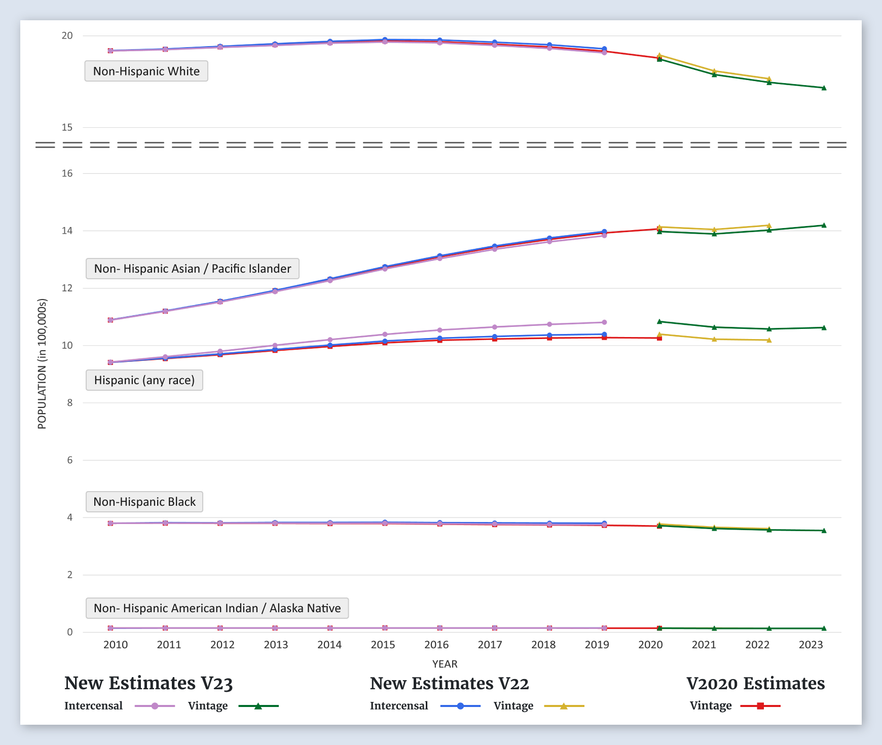
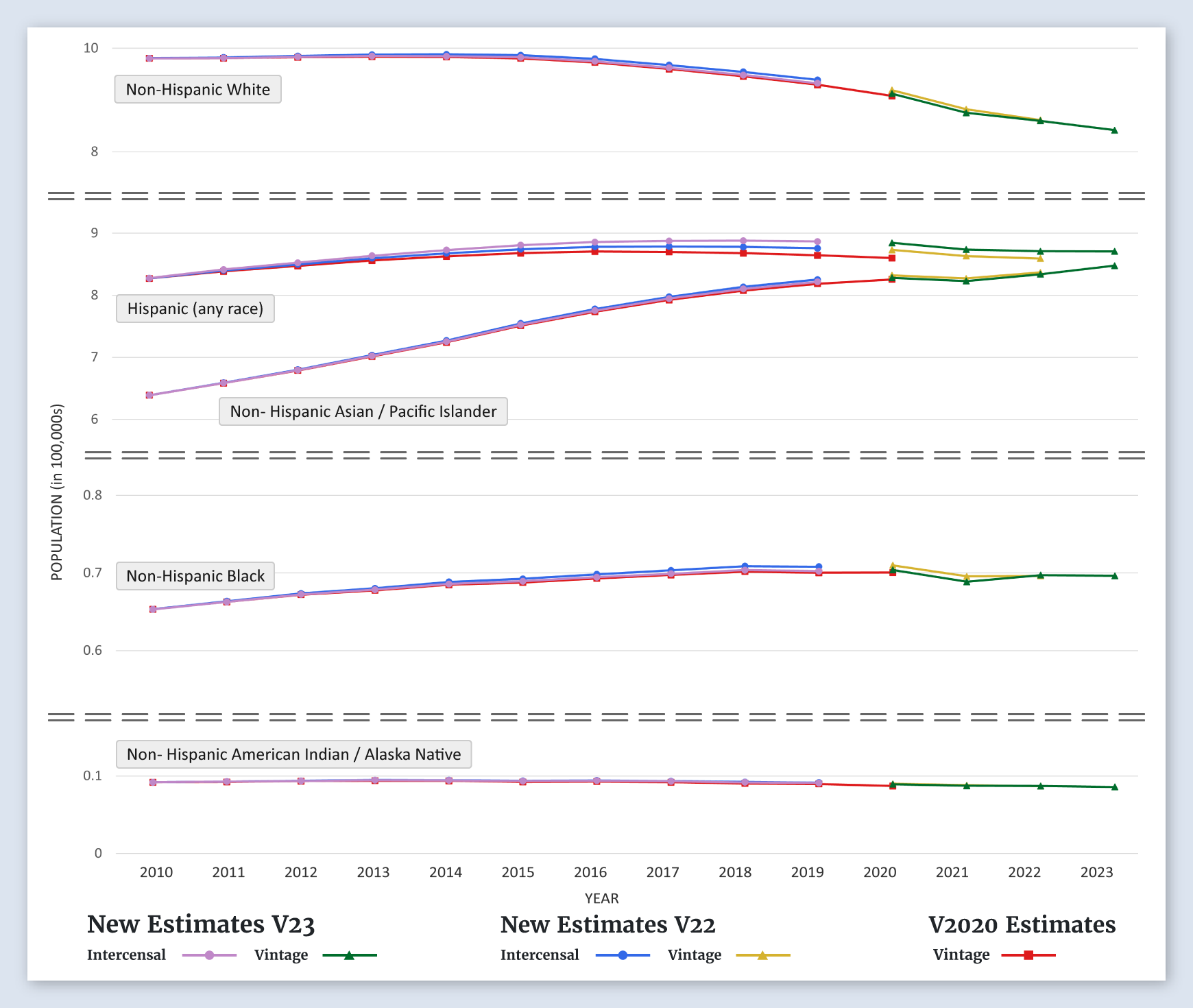
SEER 8 Registries
Populations by Race/Ethnicity
For SEER 8 registries, the new estimates for all race/ethnicity groups, non-Hispanic White, Hispanic, non-Hispanic Black, Non-Hispanic Asian/Pacific Islander, and non-Hispanic American Indian/Alaska Native, are about the same as the previous estimates.
-
SEER 17 Registries
Populations by Race/Ethnicity
For SEER 17 registries, the new estimates for all race/ethnicity groups, non-Hispanic White, Hispanic, non-Hispanic Black, Non-Hispanic Asian/Pacific Islander, and non-Hispanic American Indian/Alaska Native, are about the same as the previous estimates.
-
SEER 21 Registries
Populations by Race/Ethnicity
For SEER 21 registries, the new estimates for all race/ethnicity groups, non-Hispanic White, Hispanic, non-Hispanic Black, Non-Hispanic Asian/Pacific Islander, and non-Hispanic American Indian/Alaska Native, are about the same as the previous estimates.
-
South Carolina
Populations by Race/Ethnicity
For South Carolina, the new estimates for non-Hispanic Whites are lower than the previous estimate. The new estimates for Hispanics, non-Hispanic Blacks, Non-Hispanic Asian/Pacific Islanders, and non-Hispanic American Indian/Alaska Natives, are about the same as the previous estimates.
-
South Dakota
Populations by Race/Ethnicity
For South Dakota, the new estimates for all race/ethnicity groups, non-Hispanic White, Hispanic, non-Hispanic Black, Non-Hispanic Asian/Pacific Islander, and non-Hispanic American Indian/Alaska Native, are about the same as the previous estimates.
-
Tennessee
Populations by Race/Ethnicity
For Tennessee, the new estimates for all race/ethnicity groups, non-Hispanic White, Hispanic, non-Hispanic Black, Non-Hispanic Asian/Pacific Islander, and non-Hispanic American Indian/Alaska Native, are about the same as the previous estimates.
-
Texas
Populations by Race/Ethnicity
For Texas, the new estimates for all race/ethnicity groups, non-Hispanic White, Hispanic, non-Hispanic Black, Non-Hispanic Asian/Pacific Islander, and non-Hispanic American Indian/Alaska Native, are about the same as the previous estimates.
-
Utah
Populations by Race/Ethnicity
For Utah, the new estimates for all race/ethnicity groups, non-Hispanic White, Hispanic, non-Hispanic Black, Non-Hispanic Asian/Pacific Islander, and non-Hispanic American Indian/Alaska Native, are about the same as the previous estimates.
-
Vermont
Populations by Race/Ethnicity
For Vermont, the new estimates for non-Hispanic Whites are higher than previous estimates. The new estimates for Hispanics, non-Hispanic Blacks, Non-Hispanic Asian/Pacific Islanders, and non-Hispanic American Indian/Alaska Natives are about the same as the previous estimates.
-
Virginia
Populations by Race/Ethnicity
For Virginia, the new estimates for all race/ethnicity groups, non-Hispanic White, Hispanic, non-Hispanic Black, Non-Hispanic Asian/Pacific Islander, and non-Hispanic American Indian/Alaska Native, are about the same as the previous estimates.
-
Washington
Populations by Race/Ethnicity
For Washington, the new estimates for all race/ethnicity groups, non-Hispanic White, Hispanic, non-Hispanic Black, Non-Hispanic Asian/Pacific Islander, and non-Hispanic American Indian/Alaska Native, are about the same as the previous estimates.
-
Seattle (Puget Sound) SEER Area
Populations by Race/Ethnicity
For the Seattle (Puget Sound) SEER area, the new estimates for all race/ethnicity groups, non-Hispanic White, Hispanic, non-Hispanic Black, Non-Hispanic Asian/Pacific Islander, and non-Hispanic American Indian/Alaska Native, are about the same as the previous estimates.
-
West Virginia
Populations by Race/Ethnicity
For West Virginia, the new estimates for all race/ethnicity groups, non-Hispanic White, Hispanic, non-Hispanic Black, Non-Hispanic Asian/Pacific Islander, and non-Hispanic American Indian/Alaska Native, are about the same as the previous estimates.
-
Wisconsin
Populations by Race/Ethnicity
For Wisconsin, the new estimates for all race/ethnicity groups, non-Hispanic White, Hispanic, non-Hispanic Black, Non-Hispanic Asian/Pacific Islander, and non-Hispanic American Indian/Alaska Native, are about the same as the previous estimates.
-
Wyoming
Populations by Race/Ethnicity
For Wyoming, the new estimates for all race/ethnicity groups, non-Hispanic White, Hispanic, non-Hispanic Black, Non-Hispanic Asian/Pacific Islander, and non-Hispanic American Indian/Alaska Native, are about the same as the previous estimates.
New Population Impact on Rates
At the national level, the new population estimates are not very different from the previous estimates. However, there are more significant differences at the state and county levels that may result in changes in previously published cancer rates. Since mortality rates depend on both the number of deaths and the population at risk, changes in the population are only one factor that impacts the rates. Changes in the population denominator can cause shifts in either direction for disease rate calculations based on the new populations.
We evaluated the impact of the new intercensal populations on the 2020 rates by comparing the 2020 rates estimated using the new Vintage 2023 populations compared to Vintage 2022.
-
All Cancer Sites
Mortality Rates Absolute Value Percent Change for Diagnosis Year 2020 (New 2023 Vintage - 2022 Vintage)/Vintage 2022
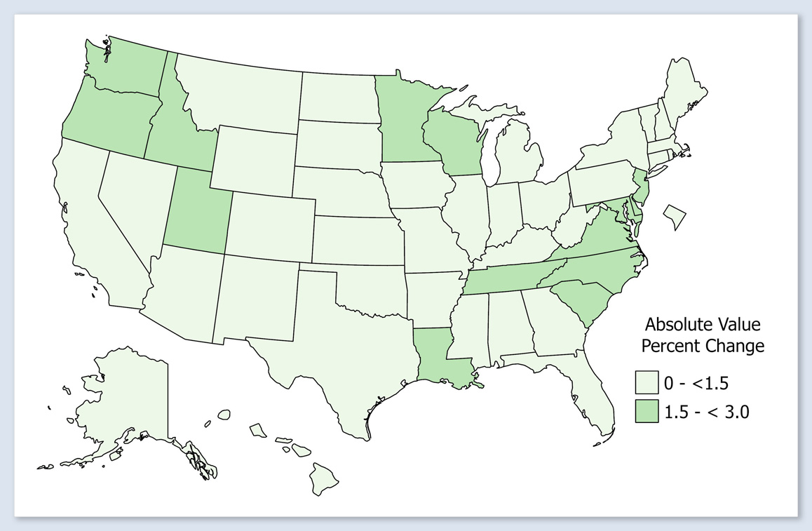
The percentage change in 2020 state death rates from Vintage 2022 to Vintage 2023 is 0 to 1.5% for most states.
-
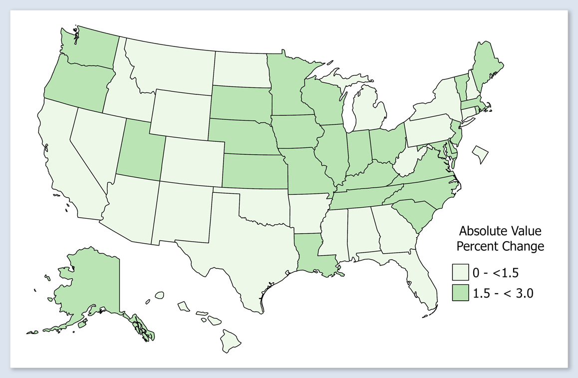
All Causes of Death
Mortality Rates Absolute Value Percent Change for Diagnosis Year 2020 (New 2023 Vintage - 2022 Vintage)/Vintage 2022
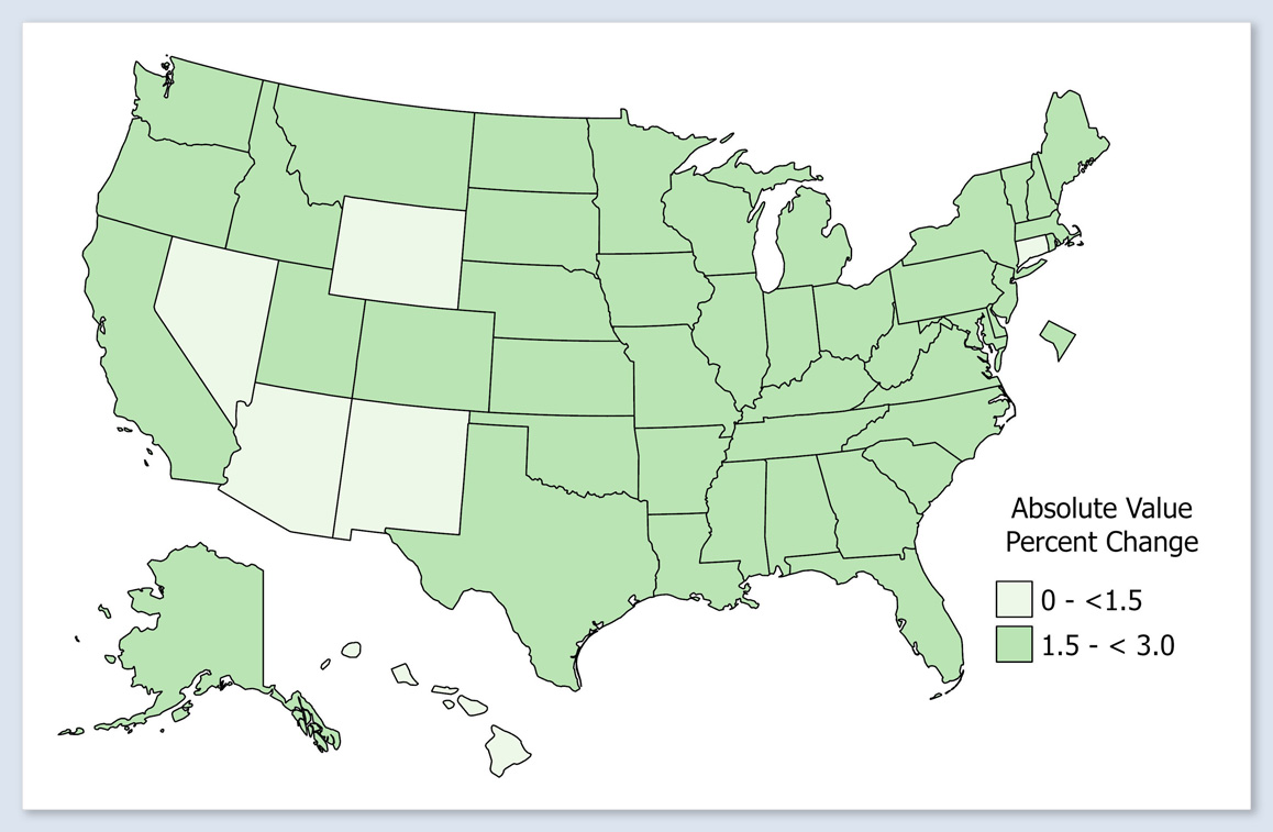
The percentage change in 2020 state death rates from Vintage 2022 to Vintage 2023 is 1.5 to 3.0% for most states.
-
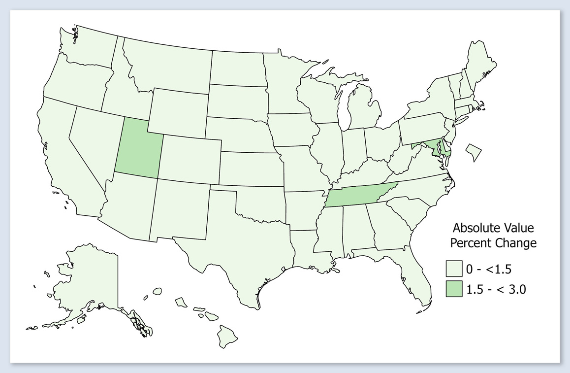
Breast
Mortality Rates Absolute Value Percent Change for Diagnosis Year 2020 (New 2023 Vintage - 2022 Vintage)/Vintage 2022
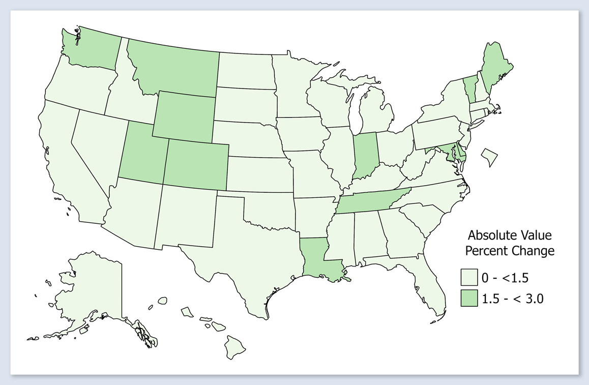
The percentage change in 2020 state death rates from Vintage 2022 to Vintage 2023 is 0 to 1.5% for most states.
-
Colon and Rectum
Mortality Rates Absolute Value Percent Change for Diagnosis Year 2020 (New 2023 Vintage - 2022 Vintage)/Vintage 2022
The percentage change in 2020 state death rates from Vintage 2022 to Vintage 2023 is roughly evenly distributed between the two categories: 0 to 1.5% and 1.5 to 3.0%.
-
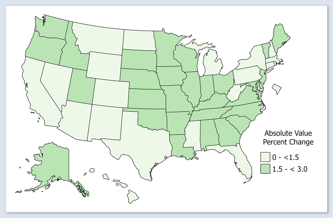
Lung and Bronchus
Mortality Rates Absolute Value Percent Change for Diagnosis Year 2020 (New 2023 Vintage - 2022 Vintage)/Vintage 2022
The percentage change in 2020 state death rates from Vintage 2022 to Vintage 2023 is 0 to 1.5% for most states. Three states have a percentage change of 1.5 to 3.0%.
-
Prostate
Mortality Rates Absolute Value Percent Change for Diagnosis Year 2020 (New 2023 Vintage - 2022 Vintage)/Vintage 2022
The percentage change in 2020 state death rates from Vintage 2022 to Vintage 2023 is roughly evenly distributed between the two categories: 0 to 1.5% and 1.5 to 3.0%.
[Download Data for Mortality Rates Absolute Value Percent Change for Diagnosis Year 2020 (New 2023 Vintage - 2022 Vintage)/Vintage 2022 (XLSX, 14 KB)]
